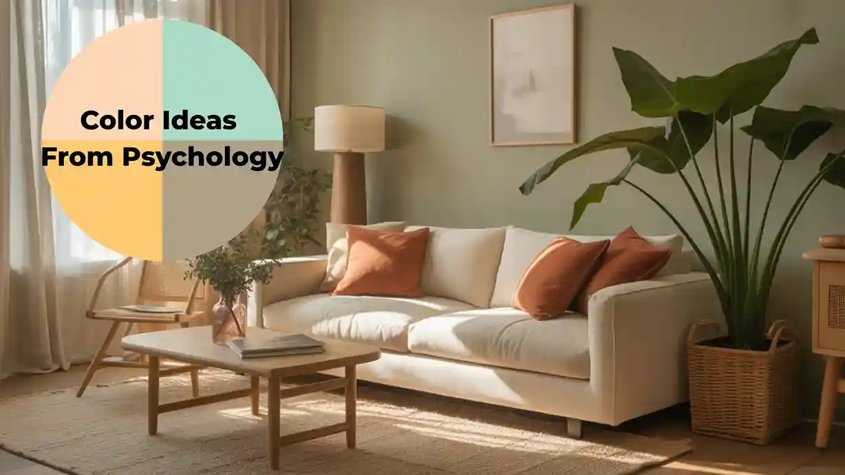
Color Ideas From Psychology: How the Right Hues Transform Your Home and Mood
The colors surrounding you right now are actively shaping how you feel your energy levels, your stress, your focus, and even your appetite. This isn’t interior design opinion; it’s backed by decades of environmental psychology research. Color ideas from psychology give us a science-informed framework for choosing hues that don’t just look good, but genuinely feel good to live with. Whether you’re redecorating a single room or reimagining your entire home, understanding the psychological impact of color will completely change how you approach every paint chip and fabric swatch. Color psychology is the foundation beneath the best home decorating ideas. When you understand why a color feels the way it does, every design decision becomes faster and more confident.
How Environmental Psychology Informs Color Selection
Environmental psychology studies how physical spaces affect human behavior and mental states. Color is one of the most potent variables in this relationship. Research shows that color can influence heart rate, cortisol levels, perceived room temperature, and even how long people stay in a space. But context matters enormously; the same blue that calms in a bedroom can feel clinical in a kitchen. The goal isn’t to apply blanket rules, but to understand the psychological principles behind each color and apply them with intention to each room’s specific purpose. Focal points deserve extra psychological consideration. These fireplace and focal point color ideas explore how the colors you choose around a hearth affect how the entire room feels.
Why This Matters
The home is where we recover, connect, create, and restore ourselves. When our color environment is misaligned with our needs, say, a stimulating red in a room where we need to wind down, we experience subtle but constant psychological friction. Conversely, when color choices align with a room’s purpose and our personal psychology, the home becomes a genuinely restorative environment. Given that most people now spend the majority of their time indoors, making psychologically informed color choices has never been more consequential for everyday well-being. Psychology gives you the theory, browse all our interior decorating ideas to see it applied across every room type, from calming bedrooms to energizing kitchens.
12 Color Ideas From Psychology for Every Room in Your Home
1. Soft Blue for Bedrooms: The Calm Color
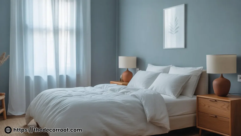
Blue is consistently ranked as the world’s most universally liked color, and from a psychological perspective, it’s easy to understand why. Soft, muted blues think dusty cornflower, faded denim, or pale slate activate the parasympathetic nervous system, lowering heart rate and blood pressure. In the bedroom, a soft blue wall encourages the body’s natural relaxation response, supporting better sleep quality. Pair with warm white trim and natural linen bedding to prevent the color from feeling cold or clinical.
2. Warm Terracotta for Living Rooms: Grounded Energy
Terracotta and warm earthy oranges draw from color psychology’s findings on grounding and social warmth. Unlike stimulating bright orange, the muted, clay-like quality of terracotta creates a sense of comfort and belonging; it’s the psychological color of fireside gatherings and unhurried conversation. Use it as a feature wall behind a sofa or as an all-over color in a social living room. It reads as sophisticated and current while remaining emotionally approachable. Peel-and-stick paint sample cards and premium interior paint tester sets, try before you commit to full walls. The living room is the ideal place to put color psychology into practice. These living room color palette ideas show exactly how warm, cool, and neutral hues perform in a real space.
3. Forest Green for Home Offices: Focus and Calm
Green occupies the exact center of the visible light spectrum, meaning the eye requires virtually no adjustment to focus on it, making it the least visually fatiguing color. Environmental psychology research links exposure to green tones with reduced mental fatigue and improved sustained concentration. For a home office or study, deep forest green or warm sage on the walls creates an environment that supports focused, productive work without inducing the alertness-related anxiety that whites and grays can cause over long hours.
4. Warm Yellow for Kitchens: Energy Without Anxiety
Yellow stimulates serotonin production and is psychologically associated with optimism, creativity, and appetite stimulation, making it a natural fit for kitchen spaces. However, intensity matters enormously. Bright, saturated yellow creates visual anxiety over time; soft, warm yellows like buttercream, maize, or antique gold feel energizing without overwhelming. Use warm yellow as a background for white cabinetry, or as an accent in tiles, a kitchen island, or soft furnishings.
5. Soft Lavender for Children’s Rooms: Creativity and Calm
Lavender and soft purple tones occupy an interesting psychological space. They combine the calming properties of blue with the creative stimulation of red, in a muted, balanced blend. Research from the Journal of Environmental Psychology suggests that lavender environments support both imaginative play and emotional regulation in children. Use soft lavender on walls with warm white woodwork, and introduce pops of yellow or peach for a complementary, playful palette.
6. Charcoal and Near-Black for Dining Rooms: Drama and Intimacy
Dark, enveloping colors in dining spaces create a psychological sense of intimacy and occasion. When the walls recede visually, attention focuses inward on the table, the food, the faces of the people across from you. This is why some of the most celebrated restaurant interiors use deep charcoal, navy, or near-black. Candlelight bouncing off dark walls creates a warmth and richness that pale walls simply cannot match. This is one of the boldest and most rewarding color ideas from psychology.
7. Warm White and Cream for Hallways: Expansion and Welcome
First impressions matter, and the psychology of color at the threshold of a home is significant. Pure, stark white in a hallway reads as institutional and cold; warm whites, with undertones of yellow, pink, or beige, feel welcoming and expansive. They bounce light effectively in often window-free spaces while creating a smooth visual transition into the rest of the home. Add interest through texture, linen curtains, rattan hooks, and natural fiber runners rather than color contrast. Color psychology books and home color guides are evidence-based resources for making informed color decisions
8. Dusty Rose for Dressing Rooms or Bathrooms: Self-Care Energy
Baker-Miller pink, the specific shade studied extensively in correctional settings, is too intense for domestic use, but its softer cousin, dusty rose, carries similar calming properties without the clinical baggage. Psychologically, muted rose tones are linked to self-nurturing, care, and gentle energy. In a bathroom or dressing room, dusty rose creates an environment that feels genuinely nurturing, a fitting backdrop for morning routines and wind-down rituals.
9. Bright White With Warm Undertones for Art Spaces: Neutral Clarity
If you make art, photograph, or engage in visual creative work at home, a near-neutral background is psychologically important, as it prevents the eye from making color adjustments that distort perception. But pure brilliant white creates visual fatigue over time. A warm white with slight yellow or pink undertones is the sweet spot: perceptually neutral enough for accurate color work, but warm enough to feel livable over extended creative sessions.
10. Navy Blue for Libraries and Reading Nooks: Deep Focus
Navy and midnight blue create a sense of depth and enclosure that many people find deeply focusing and comforting. The color is associated psychologically with reliability, intelligence, and depth qualities we instinctively want surrounding us while we read or think. A library or reading nook painted in rich navy, furnished with warm brass lighting and worn leather, creates one of the most psychologically satisfying domestic environments imaginable.
11. Sage Green for Kitchens and Dining Rooms: Nature-Informed Calm
Biophilic design research consistently shows that colors referencing natural environments reduce stress responses and improve mood. Sage green, with its visual reference to living plants, outdoor landscapes, and fresh herb gardens, is one of the most effective nature-inspired colors for domestic interiors. Unlike forest green, sage is light enough to work in kitchens without feeling dark. Pair with warm wood tones, natural stone, and wicker accessories for a complete biophilic effect.
12. Color Drenching in Your Favorite Color: Psychological Authenticity
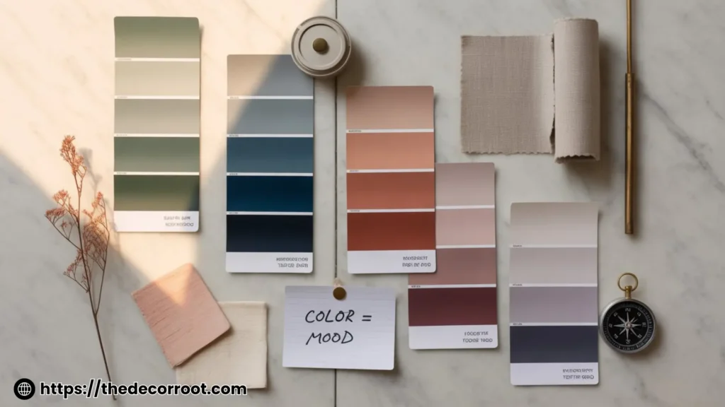
One of the most powerful but underused color ideas from psychology is the concept of personal chromatic resonance, the deeply individual way each person responds to specific colors based on memory, culture, and personal association. Color drenching (using a single color across walls, trim, ceiling, and furnishings) in a color with strong positive personal associations creates an environment of deep psychological comfort. Trust your instincts: research shows that personal positive associations with a color are more predictive of well-being than any universal color rule. Room-specific paint sets and digital color consultation tools find your perfect shade without guesswork
Quick Action Plan
This Weekend:
- Walk through each room and write one word for how you want to feel in it.
- Match those feelings to colors using the guide above.
- Order paint samples and live with them for 48 hours before committing.
- Observe how the color shifts in morning light versus evening lamplight.
- Walk through each room and write one word for how you want to feel in it.
Color psychology doesn’t stop at the front door; these outdoor color psychology ideas apply the same principles of hue and mood to exterior paint, landscaping, and curb appeal.
This Month:
- Start with one room, the one where a color change would have the biggest daily impact.
- Document before and after, both photographically and in a mood journal.
- Notice how the color change affects your daily routines and emotional state.
FAQs
Conclusion
The best color ideas from psychology are those that align the visible qualities of a room with its intended emotional experience. Blue for calm, green for focus, terracotta for warmth, navy for depth, these aren’t arbitrary aesthetic choices; they’re evidence-informed decisions about how you want to feel in your own home. Start with one room, trust the research, trust your instincts, and watch how profoundly a color change can transform your daily experience.
This post contains affiliate links. If you purchase through them, I may earn a small commission at no extra cost to you.
📌 Found this helpful? Save this post to your Pinterest home decor board and come back to it every time you’re planning a room refresh!