21 Nursery Color Ideas That Soothe Babies
Nursery Color Ideas: Most nursery color advice starts and ends with “pick a soft pastel,” which isn’t wrong exactly, but it also isn’t useful. Pastel pink and pastel neon coral are both technically pastels, and they create completely different moods in a room. What actually matters for a soothing nursery is saturation and warmth, not whether a color falls into the pastel family. Nursery colour ideas that genuinely soothe babies are one of the most research-backed home decorating ideas available; the science of infant colour perception, sleep psychology, and sensory stimulation gives parents a clear framework for choosing a nursery palette that supports the baby’s development rather than simply following aesthetic trends.
This post contains affiliate links. As an Amazon Associate, I earn from qualifying purchases. If you buy through these links, I may earn a small commission at no extra cost to you.
What Makes the Difference
The colors that read as “soothing” share two traits: low saturation (meaning they’re muted rather than bright and pure) and warm or neutral undertones rather than cool, stark ones. A bright, fully saturated blue and a soft, dusty, muted blue are worlds apart in how a room feels, even though they’d both get labeled “blue” on a paint chip. Babies’ visual systems are still developing in the first months, and while the research on color and infant mood is limited, most pediatric sleep specialists agree that a visually calm room supports the overall low-stimulation environment recommended for good sleep. That’s the lens for every color on this list: not just “is it pretty,” but “does it keep the room visually quiet.” Neutral nursery colours are not just aesthetically versatile; they are developmentally appropriate. These soothing neutral nursery ideas show why the warm whites, sandy beiges, and soft greens of a neutral palette provide the low-stimulation visual environment that supports infant sleep and calm without the developmental deprivation of a completely colour-free room.
French Nursery Color Wisdom
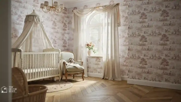
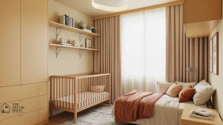
The French nursery tradition has instinctively used the palette that infant development research now validates: muted tones, warm neutrals, and soft naturals that provide visual interest without overstimulation. These French-inspired nursery design ideas show how that tradition expresses the same colour wisdom that developmental psychology is only now explaining scientifically. The boho nursery palette- terracotta, sage, dusty rose, and warm cream- happens to align almost perfectly with the colours developmental research identifies as most soothing for infant nervous systems. These boho nursery colour ideas show how to use those tones in specific combinations and proportions that are both aesthetically beautiful and genuinely supportive of a baby’s sleep and calm.
1. Muted Sage Green
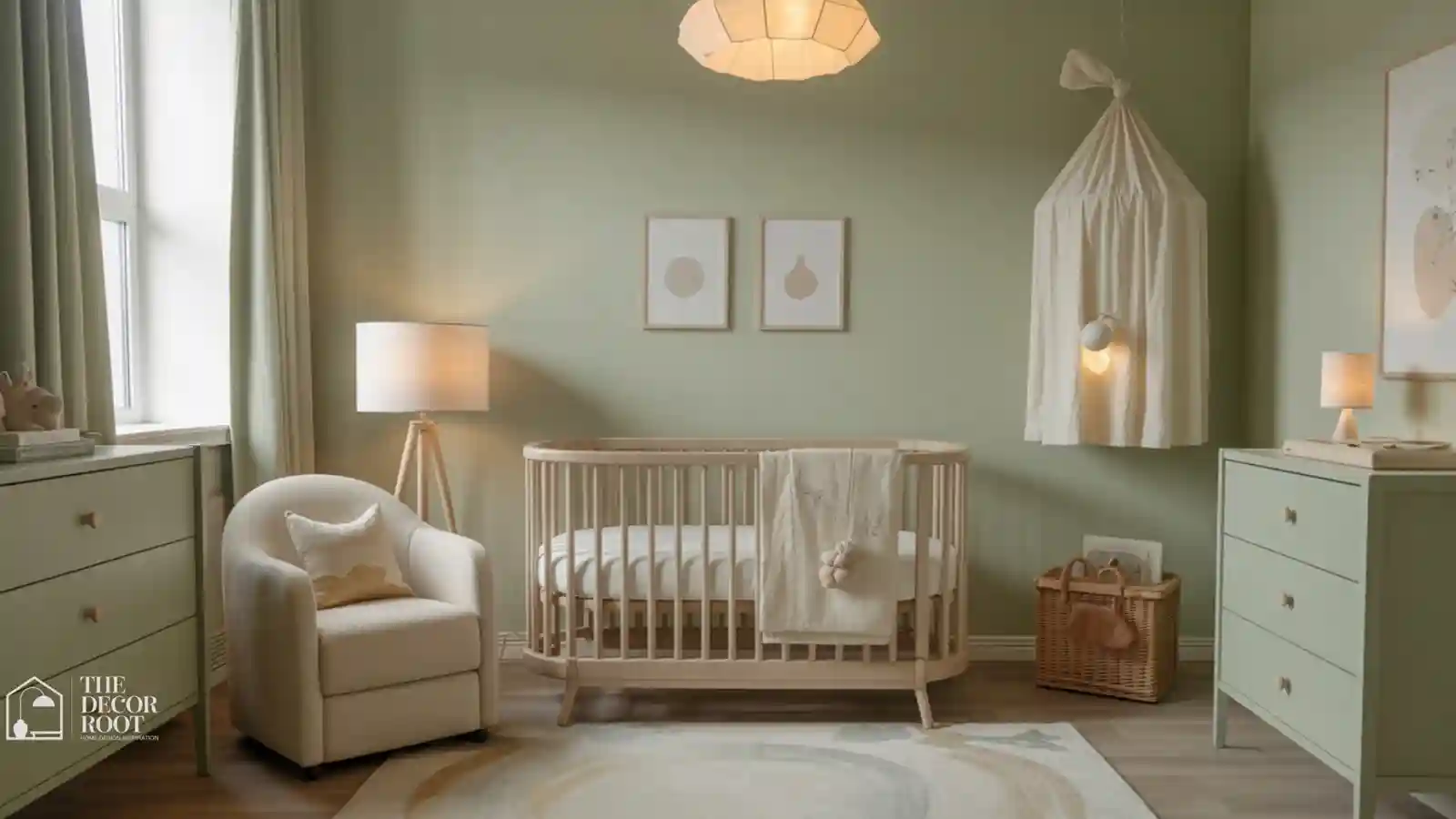
Sage green has become one of the most popular nursery colors of the past few years, and it earns that popularity because the grayed-out, muted quality of true sage (as opposed to a brighter kelly or emerald green) reads as calm and grounding rather than energizing. It also happens to work well regardless of gender-neutral or specific preferences, and it pairs easily with warm wood tones, cream textiles, and natural light. Test a sample on your actual nursery wall before committing, since sage shifts noticeably between warm and cool depending on the room’s natural light exposure throughout the day.
2. Warm Greige (Gray-Beige)
Greige splits the difference between gray’s coolness and beige’s warmth, landing on a genuinely versatile neutral that works as a full-room color or a backdrop for a bolder accent wall. Look specifically for a greige with warm undertones rather than a cooler, more blue-gray version, since warm greige photographs and feels noticeably cozier under both daylight and lamplight. This is a particularly good choice if you’re not settled on a full nursery theme yet, since greige works with nearly any accent color or decor style you might add later.
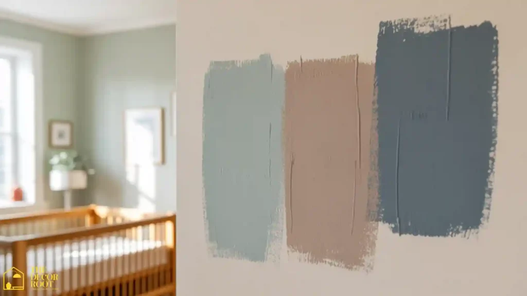
3. Add a low-VOC paint sample set to Test Colors Safely
Paint colors shift dramatically depending on a room’s specific light, so testing actual samples on your nursery wall, not just trusting a paint chip under store lighting, is a genuinely important step before committing to a full gallon. Choose low- or zero-VOC formulas specifically for a nursery, since off-gassing from standard paint can linger for days and a baby will be spending significant time in this room. Paint a sample patch at least a foot square in two or three spots around the room, since light exposure often varies significantly between walls.
EDITOR’S PICK
🛒Low-VOC Paint Samples For Safe, Accurate In-Room Color Testing
Test low VOC paint samples on multiple nursery walls before buying, since lighting changes color appearance and standard paint can off-gas for days.
(paid link)
4. Dusty Blue
Dusty or muted blue avoids the slightly clinical feeling that a brighter, truer blue can bring to a nursery, landing instead on something closer to a soft chambray or worn denim tone. It works particularly well paired with warm wood furniture, since the wood tone keeps the overall room from feeling too cool. This shade also has genuine staying power past the newborn stage, transitioning easily into a toddler or young child’s room without needing a repaint, which matters given how much work goes into prepping and painting a nursery in the first place.
5. Warm Terracotta (as an Accent, Not a Full Wall)
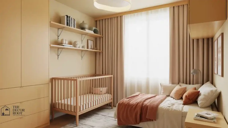
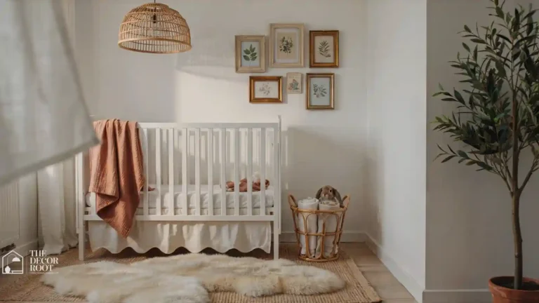
Terracotta brings real warmth and personality to a nursery, but it works best in smaller doses: a single accent wall, a textile, or decor pieces rather than covering every wall, since a full room in terracotta can start to feel visually heavy rather than calm. Choose a dustier, more muted terracotta over a bright, orange-leaning version for the softest effect. This color pairs particularly well with cream and warm wood tones, making it a strong choice for anyone wanting a warmer alternative to the more common sage or blue nursery palettes.
6. Soft Oatmeal or Cream
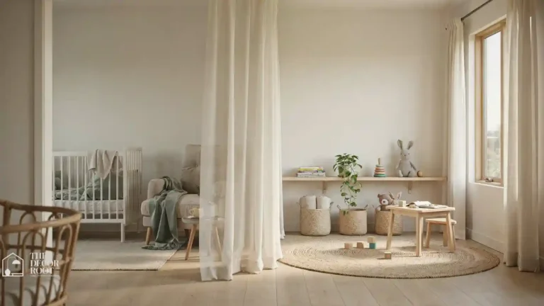
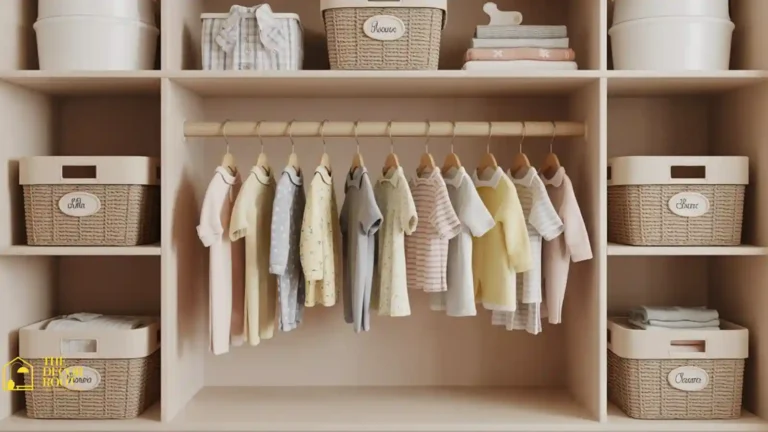
A true soft oatmeal or cream, warmer and slightly more textured-feeling than a stark white, is one of the safest, most universally soothing nursery base colors available, largely because it reflects light gently without any of the visual starkness of pure white. It also serves as an excellent backdrop for literally any other color or decor style, meaning it won’t limit your options as your child’s taste (or your own) changes over the years. This is a strong choice for anyone who wants to prioritize flexibility over a specific color statement.
7. Muted Blush Pink
A dusty, muted blush works very differently from a bright, saturated pink; the grayed-down quality keeps it feeling gentle and warm rather than loud or overly sweet. It’s a particularly good choice for anyone wanting a traditionally “girl” color without leaning into a stereotypically bright or saccharine palette. Pair it with warm neutrals and natural wood tones to keep the overall room balanced, since blush alone on every wall can start to feel one-note without some material or tonal contrast to break it up.
8. Add a dimmable warm-toned nightlight to support the Palette After Dark
Color choices matter for how the room looks during the day, but the light source matters just as much for how it feels during 2 a.m. feeds. A cool white or blue-toned light can wash out a warm, carefully chosen palette and make the room feel harsher than intended. A dimmable nightlight with a warm amber or soft yellow tone keeps the room’s overall feel consistent around the clock and is gentler on both your eyes and your baby’s during nighttime wake-ups. Look for one with a very low minimum brightness setting for true middle-of-the-night use.
EDITOR’S PICK
🛒Warm Dimmable Nightlight To Keep The Color Palette Calm During Night Feeds
A dimmable warm amber nightlight with a very low setting preserves your nursery’s warm palette and soothes both eyes during nighttime feeds better than cool-toned bulbs.
(paid link)
9. Warm Taupe
Taupe sits between beige and gray, and a warm-leaning version (rather than one with cooler purple undertones) creates a sophisticated, grounding backdrop that works well in nurseries meant to transition smoothly into an older child’s room. It’s a particularly popular choice for parents wanting a more “grown-up” feeling nursery rather than a traditionally babyish palette. Pair it with cream and soft gold accents for warmth, or with deeper wood tones for a slightly more dramatic, cozy effect.
10. Soft Sky Blue
A pale, soft sky blue much lighter and less saturated than the “dusty blue” mentioned earlier creates an airy, open feeling that works particularly well in smaller nurseries where a deeper or more saturated color might feel closing-in. This shade pairs beautifully with white trim and natural light, and it’s a classic choice that photographs well without feeling overly trendy or dated within a few years. It also works well as a ceiling color in a “fifth wall” application for anyone wanting a subtle, unexpected color detail.
11. Warm Ivory With a Single Accent Wall
Rather than committing an entire room to one color, painting the majority of the nursery in warm ivory and reserving a single wall (typically behind the crib) for a deeper accent color gives you flexibility and visual interest without overwhelming saturation. This approach also makes future changes easier, since repainting one accent wall as your child grows is far less work than repainting an entire room. It’s a strong strategy for anyone torn between a bold color choice and the safer, more neutral route.
12. Muted Lavender
A soft, grayed-down lavender avoids the sometimes-jarring brightness of a truer purple, landing instead on something calm and slightly dreamy without being overly saccharine. This shade has genuine research-backed associations with relaxation in general interior design contexts, which makes it a reasonable choice specifically for a room built around rest. Pair it with warm white trim and soft gray or cream textiles to keep the overall palette gentle rather than let the lavender read as a standalone statement color.
13. Add blackout curtain panels in a Color-Matched Neutral
Whatever wall color you land on, blackout curtains in a coordinating neutral tone (rather than a bold contrasting print) keep the room’s color story consistent while handling the very real, very practical job of blocking outside light for naps and early bedtimes. Choose a shade close to your wall color or trim for a seamless look, or a slightly deeper tone of your accent color for subtle contrast without disruption. This is one of the few nursery purchases where function (genuine light-blocking, not just a “blackout” label) should take priority over color matching if you have to choose.
EDITOR’S PICK
🛒Color-Matched Blackout Panels To Support Both Sleep And The Room’s Palette
Neutral blackout curtains that match your wall or accent color preserve the nursery’s palette while blocking light, and function should take priority over color if you have to choose.
(paid link)
14. Soft Butter Yellow
A soft, muted butter yellow avoids the intensity of a bright, primary yellow while still bringing genuine warmth and cheer to a nursery, making it a popular choice for anyone wanting a gender-neutral color with more personality than a plain neutral. It works particularly well in nurseries with limited natural light, since yellow tones can help a dim room feel brighter without needing a stronger, more stimulating color. Keep the saturation low and pair it with white or cream trim to prevent it from tipping into an overly energizing, nursery-inappropriate brightness.
15. Warm Charcoal (as an Accent)
A deep, warm charcoal used sparingly as a single accent wall, furniture, or textiles adds sophistication and grounding contrast to an otherwise light, neutral nursery. This isn’t a color for full-room application in most nurseries, since too much dark saturation can make a room feel smaller and more closed-in than a space meant for calm actually wants to feel. Used as an accent against warm cream or wood tones, though, it creates a striking, modern contrast that still reads as soothing rather than harsh.
16. Muted Seafoam
Seafoam, when muted and grayed-down rather than bright and minty, brings a cool but gentle freshness to a nursery that pairs particularly well with natural wood tones and cream textiles. It’s a strong alternative for anyone drawn to sage green’s calming quality but wanting something with slightly more blue undertone. As with most colors on this list, testing an actual sample against your room’s specific light is essential, since seafoam can shift more dramatically toward blue or green depending on lighting conditions than almost any other shade.
17. Warm White (Not Stark White)
If you want the flexibility of an all-neutral nursery without any color commitment at all, a warm white one with subtle cream or beige undertones rather than a cool, blue-based white avoids the slightly clinical feeling that stark white can bring to a room. This is the safest, most universally soothing option on this entire list, and it gives you maximum flexibility for decor, bedding, and accent colors that can change freely as your child grows without ever needing to repaint the base color.
18. Add a color-matched crib bedding set to complete the Palette
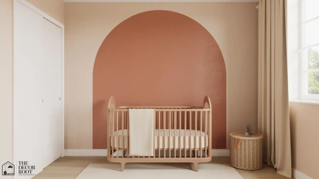
Once your wall color is settled, a coordinating crib bedding set in a matching or complementary tone ties the whole room’s palette together, since the crib is typically the single largest color block in the room after the walls themselves. Choose a set in a solid tone or subtle texture rather than a busy print if your priority is keeping the room visually calm and consistent with the soothing color strategy you’ve built everything else around. This is also one of the easier pieces to update later if your child’s preferences change, without needing to touch the walls at all.
EDITOR’S PICK
🛒Coordinating Crib Bedding Set To Tie The Wall Color Into The Room’s Largest Textile
A coordinating solid or textured crib bedding set unifies the nursery’s calm palette and is easy to swap later without touching the walls.
(paid link)
19. Soft Clay Pink
Distinct from the cooler “blush” mentioned earlier, soft clay pink leans warmer and slightly more earthy, closer to a muted terracotta-pink hybrid than a traditional baby pink. It pairs beautifully with warm wood tones and cream textiles, and it tends to feel more sophisticated and less overtly “nursery” than brighter pink tones, which matters to parents wanting the room to transition gracefully as their child grows older. This is a strong pick for anyone who likes the warmth of terracotta but wants something slightly softer for a full-room application.
20. Muted Denim Blue
A deeper, more saturated blue than “dusty blue” but still muted and grayed-down rather than bright, muted denim works particularly well as a single accent wall for parents wanting more visual depth than an all-pastel palette provides. Balance it with plenty of warm cream and natural wood elsewhere in the room, since a full room in this deeper tone could start to feel heavy without lighter elements to offset it. This shade also has strong staying power into a toddler or young child’s room, since it reads as more timeless than trend-specific.
21. Layer Two Muted Neutrals Instead of Committing to One Color
If no single color on this list feels quite right, layering two closely related muted neutrals a warm greige wall with cream trim, or a soft sage with an oatmeal ceiling gives you subtle depth and visual interest without introducing any real color intensity into the room. This approach is particularly forgiving for parents who aren’t confident making a bold paint decision, since two gentle neutrals together are almost impossible to get visually wrong, and the resulting room still reads as intentional and calm rather than plain.
Quick Action Plan
- Start by testing two or three sample colors directly on your nursery wall and living with them for at least a few days under both daytime and lamp light, since paint chips under store lighting are notoriously unreliable.
- Once you’ve settled on a base wall color, choose your window treatments and bedding to coordinate rather than compete, and save bolder accent decisions (a single accent wall, a bold textile) for after the base palette feels right.
- This order prevents the common and expensive mistake of painting first and realizing the color reads completely differently once the room is furnished and lit.
The science behind nursery colour choices comes directly from colour psychology research; these colour psychology ideas for babies and nurseries explain how infant visual development progresses, which hues support sleep and calm at each developmental stage, and how the same principles of hue temperature and saturation that affect adult wellbeing are even more powerful in a baby’s still-developing nervous system.
Frequently Asked Questions
Conclusion
The most soothing nursery colors aren’t about picking the “right” hue from a trend list; they’re about choosing muted, low-saturation tones with warm undertones, testing them properly in your actual room, and letting that calm base carry the rest of your decisions.
💾 Save this to your Nursery Color Palette board on Pinterest before you head to the paint store.