21 Color Psychology Ideas for Living Rooms That Feel Welcoming
Color Psychology Ideas for Living Rooms: Some living rooms make you want to sink into the couch and stay for hours. Others, even when they’re beautifully decorated, leave guests perched on the edge of their seats checking the time. That difference usually isn’t about the furniture at all; it’s about color. Warm, welcoming living rooms share specific psychological traits in their palette that trigger comfort, connection, and the desire to linger, while cooler, more formal palettes can unintentionally signal “look, don’t touch.”Color psychology ideas for living rooms that feel welcoming are one of the most socially valuable home decorating ideas available; the research on how hue affects perceived room temperature, social comfort, and the willingness to linger gives living room designers a set of tools that go far beyond the conventional wisdom of ‘use warm colours to feel cosy.
This post contains affiliate links. As an Amazon Associate, I earn from qualifying purchases. If you buy through these links, I may earn a small commission at no extra cost to you.
What Makes the Difference
Welcoming, sociable rooms lean warm, not necessarily bold or saturated, but warm in undertone, since warmth is the psychological trigger most closely tied to feelings of comfort, hospitality, and connection. This is different from the cool, calming palettes that work in a bedroom or the alert-calm blues that work in a home office; a living room’s job is social, so its colors need to invite conversation and relaxation rather than quiet the mind or sharpen focus. The living room and the kitchen are the two rooms where social chemistry happens most naturally, and color psychology affects both in complementary ways, these color psychology ideas for social gathering spaces show how the appetite-stimulating warmth of a well-chosen kitchen palette connects to the socially welcoming quality of a living room colour scheme in a way that makes open-plan spaces particularly powerful when both rooms are designed with the same psychological intent.
Master Living Room Color Psychology
Living room color psychology is one of the most studied applications of environmental color research because the living room is where most social interaction takes place. These color ideas from psychology provide the full theoretical context behind why certain hues make people feel instantly comfortable, and others create a subtle but persistent sense of unease. The living room and the bedroom serve related but distinct emotional functions; the living room needs to feel welcoming and socially comfortable, and the bedroom needs to feel private and deeply restful. These color psychology ideas for restful spaces show how the palette decisions that serve each room’s primary emotional purpose can be connected through a whole-home colour strategy that makes both rooms feel resolved.
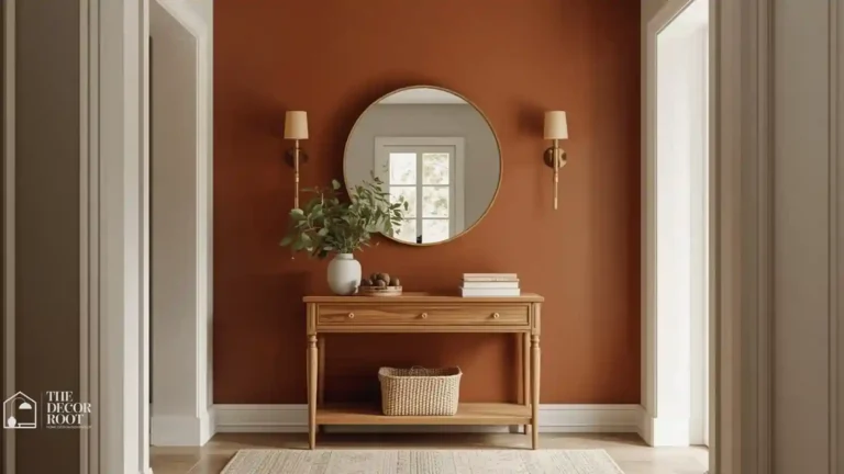
1. Warm Terracotta
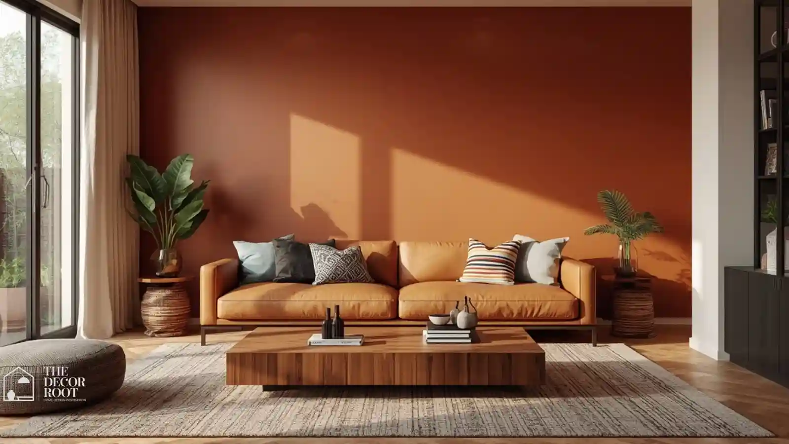
Terracotta has become one of the defining colors of the welcoming, warm-minimalist living room trend, and the psychology behind it is straightforward: earthy, sun-baked tones trigger comfort and hospitality associations almost universally. Use it on an accent wall behind the sofa or on a large-scale piece of furniture, paired with cream and warm wood to keep the overall room feeling collected rather than overwhelming. Terracotta also photographs beautifully in both natural daylight and warm evening lamp light, which matters if your living room is where you host most gatherings.
2. Soft Caramel
Caramel sits between beige and brown, carrying enough warmth to feel genuinely inviting while staying neutral enough to work with nearly any furniture style. It’s an excellent choice for a full-room wall color if you want warmth without committing to a bolder statement hue. Caramel walls paired with a leather sofa and warm brass lighting create one of the most timelessly welcoming combinations in living room design, largely because none of the elements compete with one another.
3. Dusty Rose
Pink carries a reputation as either too feminine or too soft for a living room, but a dusty, muted rose closer to clay than bubblegum reads as genuinely warm and welcoming rather than delicate. Muted pink tones have been shown in behavioral research to lower aggression and encourage calmer social interaction, which is exactly the mood a gathering space benefits from. Use it as an accent wall or in upholstery paired with warm wood and brass for a sophisticated, adult take on the color.
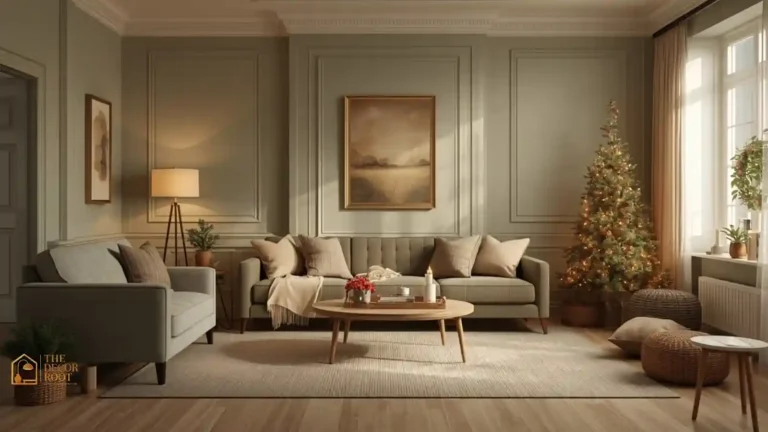
4. Olive Green
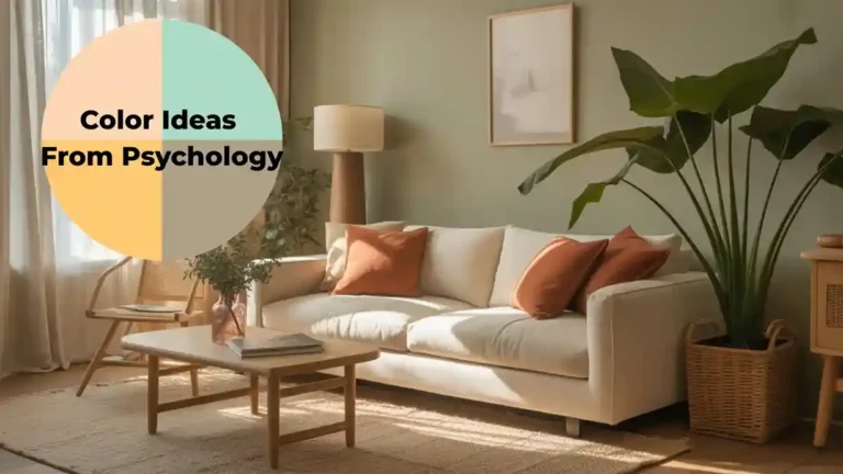
Olive brings an earthy, grounded warmth that reads as collected and lived-in rather than trendy or precious, making guests feel comfortable putting their feet up rather than sitting stiffly on the edge of a cushion. It pairs beautifully with warm wood, brass, and cream for a layered, welcoming palette. Complete the cozy feel with a set of textured throw pillows in a coordinating warm tone, since soft, touchable textiles are just as important to a room’s welcoming feel as the wall color itself.
EDITOR’S PICK
🛒Set Of Textured Throw Pillows
Olive’s earthy warmth feels collected and welcoming, pairs with wood and brass, and is best completed with textured throw pillows for a layered, cozy room.
(paid link)
5. Warm Honey Gold
Honey gold reads as warm, golden-hour light captured in paint form, and that association with the most flattering, relaxed time of day is exactly why it works so well in a social space. Use it on an accent wall, ceiling, or large piece of statement furniture for a room that feels sunlit and inviting even on a gray afternoon. It pairs particularly well with deep green houseplants and warm wood for a palette that feels both cozy and fresh.
6. Chestnut Brown
Rich, warm chestnut brings genuine depth and coziness to a living room without tipping into feeling dark or closed-in, especially when balanced with lighter neutrals on adjacent walls or furniture. It’s an excellent choice for a room used heavily for evening gatherings, since the color’s warmth only deepens and grows more inviting under lamplight after sunset. Chestnut lower walls paired with cream upper trim (a modern take on wainscoting) is a particularly welcoming combination for a more traditional living room.
7. Muted Clay Orange
A step softer and dustier than pure terracotta, clay orange carries all the same hospitality-triggering warmth with a slightly more subdued, adult feel. It’s especially effective as an accent wall behind a media console or fireplace, giving the room’s natural gathering point a warm visual anchor. Clay orange also pairs beautifully with both warm wood and matte black accents, giving you flexibility across different living room styles.
8. Warm Sandy Beige
Beige gets dismissed as boring, but a genuinely warm, sandy beige as opposed to a cool, gray-leaning one is one of the most reliably welcoming neutrals available precisely because it reads as soft and approachable rather than sterile. To reinforce the room’s cozy, gathering-focused feel, add a plush area rug underfoot, since a soft rug does as much psychological work signaling “settle in and relax” as the wall color does.
EDITOR’S PICK
🛒Plush Area Rug
Warm sandy beige is an approachable, soft neutral, and pairing it with a plush rug reinforces the room’s welcoming, relaxed feel as much as the wall color does.
(paid link)
9. Burnt Sienna
Deeper and more saturated than terracotta, burnt sienna brings real richness and warmth to a living room, particularly effective as an accent wall in a room with high ceilings where a lighter color might feel like it disappears. This shade works especially well in living rooms that also serve as a dining or entertaining space, since the warmth encourages longer, more relaxed gatherings. Pair with warm brass lighting and leather furniture for a grounded, masculine-leaning warmth.
10. Golden Mustard
Mustard’s cheerful, energetic warmth makes a living room feel lively and social rather than sedate, which is exactly the mood you want in a space designed for conversation and connection. Use it on an accent chair, a large area rug, or a single wall rather than the whole room, since mustard is intense enough that too much can overwhelm a space meant for lingering rather than stimulation. It pairs beautifully with deep green and warm wood for a rich, layered palette.
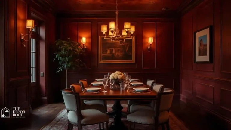
11. Soft Burgundy
A muted, dusty burgundy closer to a faded wine than a bright cranberry brings sophisticated warmth to a living room, particularly effective in rooms used for evening entertaining where the deeper tone feels intentional rather than overwhelming under lamp light. Balance with cream and warm wood so the room doesn’t skew too dark overall. This is an especially strong choice for a formal living room that still needs to feel genuinely welcoming rather than stiff.
12. Warm Walnut Brown
Named for the wood tone it echoes, warm walnut brown brings a rich, enveloping coziness to a living room, especially effective when paired with the actual wood furniture the color is inspired by for a cohesive, intentional look. To complete the warm, layered atmosphere, add a warm-toned floor lamp with a fabric shade, since ambient warm lighting reinforces every welcoming color on this list far more effectively than harsh overhead lighting alone.
EDITOR’S PICK
🛒Warm-Toned Floor Lamp
Warm walnut brown brings rich coziness to a living room, best paired with walnut furniture and a warm-toned floor lamp to reinforce the welcoming palette.
(paid link)
13. Apricot Blush
Softer and pinker than terracotta but warmer than dusty rose, apricot blush brings a gentle, cheerful warmth to a living room that works especially well in spaces that get a lot of natural daylight. It’s a good choice for a full accent wall in a smaller living room, since the lighter value keeps the space feeling open rather than closed-in while still delivering genuine warmth.
14. Warm Taupe
Taupe is the unofficial safest choice on this entire list, warm enough to feel welcoming, neutral enough to work with nearly any furniture and art style already in your home. It’s a strong pick if you’re repainting a living room for the first time and want a low-risk, high-reward color that won’t need to be redone as your style evolves. Layer in warmth and personality through textiles and accent colors rather than relying on the wall alone.
15. Forest Green
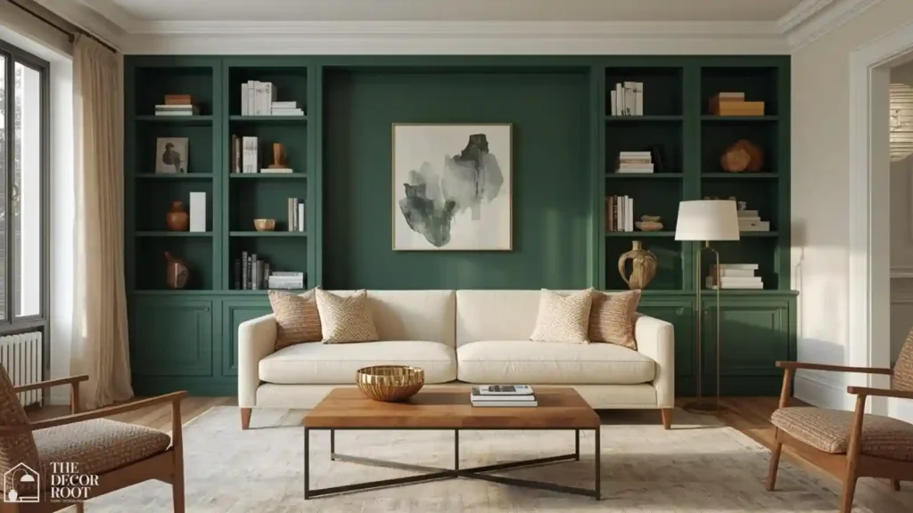
Deep forest green brings a grounded, cocooning warmth to a living room, particularly effective in rooms with good natural light and higher ceilings where the depth of color reads as rich rather than heavy. It pairs beautifully with warm wood, brass, and cream for one of the most enduringly popular welcoming living room combinations in current design. This shade works especially well behind a fireplace or built-in shelving as a natural focal point.
16. Warm Amber
Amber captures candlelight in paint form, and that warm, golden-hour association makes it one of the most effective colors for a living room specifically designed around evening gatherings. Complete the candlelit, welcoming atmosphere with a chunky knit throw blanket draped over the sofa, since visual and tactile coziness work together to make a room feel genuinely inviting rather than just look the part.
EDITOR’S PICK
🛒Chunky Knit Throw Blanket
Amber brings candlelit warmth to evening-focused living rooms, best completed with a chunky knit throw for a look and feel of genuine coziness.
(paid link)
17. Rustic Rust
Rust brings earthy, autumnal warmth that works year-round rather than feeling seasonal, making it a strong choice for an accent wall or a large area rug anchoring the seating area. It pairs particularly well with mixed metals brass and matte black together for a collected, welcoming look that doesn’t feel overly matched or showroom-styled.
18. Warm Cocoa Brown
Rich and enveloping, cocoa brown brings genuine coziness to a living room without the visual weight of an even darker color like true black or charcoal. It works especially well paired with cream boucle or linen upholstery, creating the kind of warm, tactile contrast that makes a room feel genuinely comfortable rather than just visually styled. This is an excellent choice for a living room that doubles as a media or movie-night space.
19. Soft Apricot Cream
Lighter and softer than full apricot blush, this pale, warm cream-orange hybrid works beautifully as a full-room wall color for anyone wanting warmth without much visual boldness. It reflects lamp light particularly well, making evening gatherings feel warmer and more golden than the same room would under a cooler neutral.
20. Deep Amber Gold
A richer, deeper cousin of warm amber, this shade brings real depth and warmth to a living room’s focal wall, particularly effective behind a media console or built-in shelving unit. Finish the welcoming palette with a curated gallery wall art set in warm, complementary tones, since personal, curated art is one of the strongest signals of a lived-in, welcoming home rather than a staged showroom.
EDITOR’S PICK
🛒Curated Gallery Wall Art Set
A deeper amber on a living room focal wall adds rich warmth, best paired with a curated gallery wall in warm tones for a lived-in, welcoming feel.
(paid link)
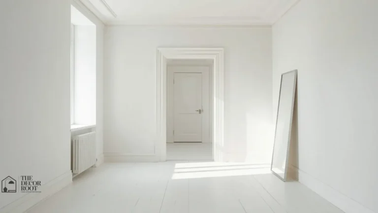
21. Warm Ivory
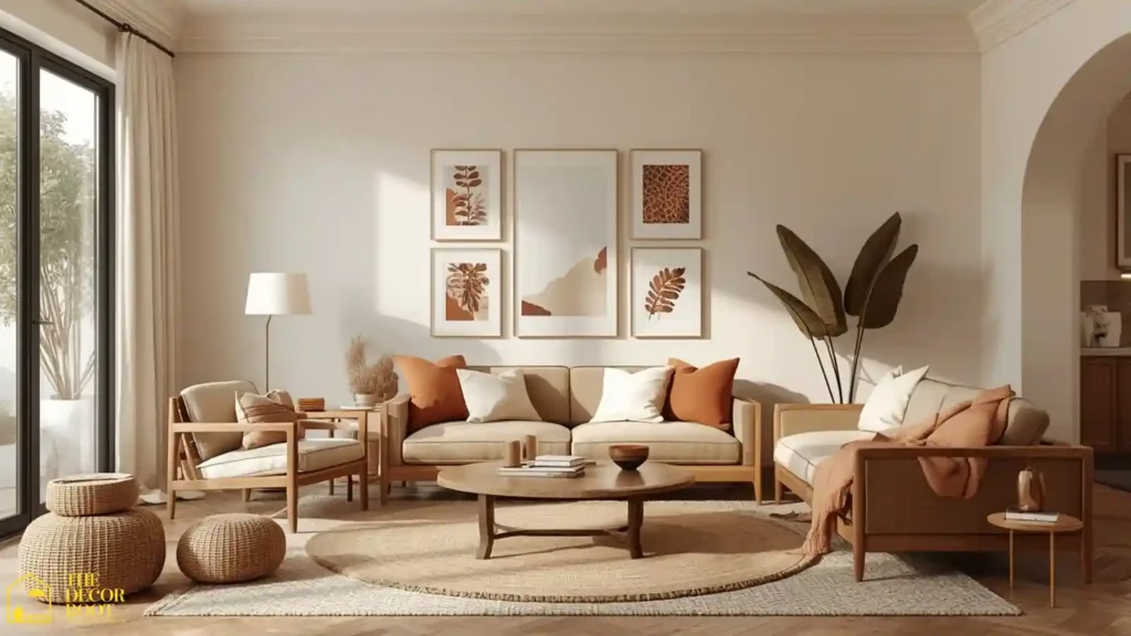
The final color on this list is a soft, warm ivory that works as a flexible, welcoming base for nearly every bolder accent color mentioned above. It’s brighter and airier than taupe or greige while still avoiding the sterile coldness of a true white, making it one of the most universally livable “welcoming” colors for a living room that needs to work for years of evolving style. Layer in warmth and personality through furniture, textiles, and art rather than relying on the wall color alone to do all the work. The white living room is one of the most powerful tests of color psychology in a domestic setting, these welcoming living room color and design ideas show why warm whites and the specific way they interact with natural light, upholstery, and wood tone create a living room that feels genuinely inviting from the moment a guest crosses the threshold, while cool whites and stark neutrals produce the opposite effect despite appearing almost identical in a paint chip.
Quick Action Plan
- Start with the wall your guests see first when they walk in. Since that first color impression sets the emotional tone for the entire room before anyone even sits down, choose a warm terracotta, caramel, or amber tone from this list rather than trying to repaint the whole space at once.
- Layer in warmth through textiles next, since a plush rug, throw blanket, and pillow set do nearly as much psychological work as the wall color itself.
- Finish with warm ambient lighting rather than relying on a single overhead fixture, since warm ambient light is what makes any of these colors feel genuinely golden and welcoming once the sun goes down.
Frequently Asked Questions
Conclusion
A welcoming living room isn’t really about matching furniture or a perfectly styled coffee table; it’s about a color palette quietly telling everyone who walks in that they’re welcome to stay a while. Choose two or three warm shades from this list that fit your existing style, layer in texture and warm lighting, and watch how much longer your guests linger on the couch.
💾 Save this post to your Pinterest living room board so these welcoming colors are ready for your next refresh.