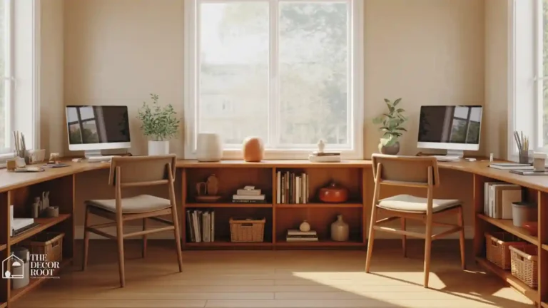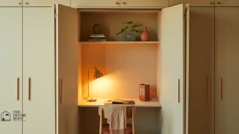
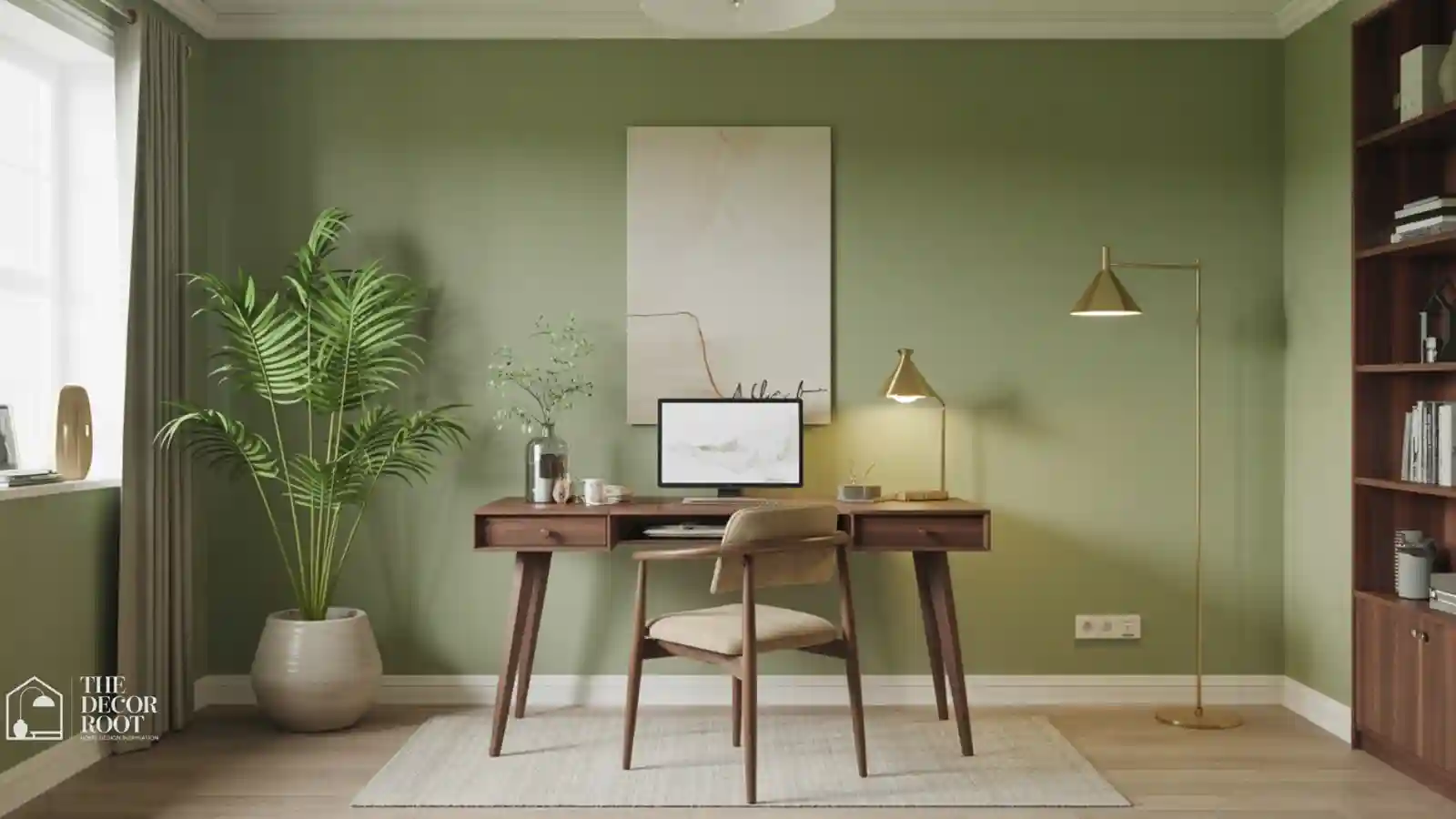
21 Home Office Color Ideas That Improve Concentration
Home Office Color Ideas That Improve Concentration. Color gets treated as an afterthought in most home office planning, something to pick once the desk and shelving are already sorted, but it’s actually one of the first things worth deciding, because the wrong wall color can work against your focus every single day without you ever consciously noticing why. Stark white can feel sterile and fatiguing under artificial light. Deep, cool grays can flatten a room’s energy by mid-afternoon. Home office colour ideas that genuinely improve concentration are one of the most evidence-based home decorating ideas available; the research on how hue, saturation, and light temperature affect cognitive performance gives home office designers a set of tools that most residential colour choices never access.
This post contains affiliate links. As an Amazon Associate, I earn from qualifying purchases. If you buy through these links, I may earn a small commission at no extra cost to you.
The Thinking Behind This
Color affects mood and alertness through fairly well-documented associations: cooler tones (blues, greens) tend to read as calming and are associated with steady, sustained focus, while warmer tones (oranges, yellows) tend to read as energizing and are better suited to short bursts of creative work rather than long stretches of deep concentration. Neither is universally “better”; the right choice depends on the kind of work you actually do most. Someone doing long analytical work benefits from a calmer palette that won’t fatigue over hours, while someone doing short creative sprints might genuinely focus better with a bit more visual energy in the room. “A minimalist home office makes the colour decision even more critical; when there is nothing else in the room to distract the eye, the wall colour becomes the entire visual environment. These minimalist home office colour ideas show which palettes deliver the most sustained focus and which shades create a beautiful, resolved backdrop for a desk and nothing else.
Tailor Colour to Your Task
Colour is the most psychologically significant decision in a home office, these home office design ideas show how paint colour integrates with lighting, Colour and lighting are inseparable in a home office, the same wall colour reads completely differently under warm incandescent light and cool daylight, which means the paint decision and the lighting decision must be made together. These home office lighting and colour ideas show how to test and select both simultaneously so the workspace looks and feels right at every time of day. Furniture and layout to create a workspace that supports the specific type of work you do rather than defaulting to a generic neutral.
1. Sage Green Walls
Sage is one of the most consistently recommended home office colors because it sits in the calming, cool-toned family without tipping into the coldness that pure blues or grays can carry. It pairs naturally with warm wood furniture and brass accents, which softens any starkness, and it works across a wide range of lighting conditions, reading warm in golden afternoon light and cool under overhead LED lighting. This makes it one of the safer full-wall choices on this list for anyone unsure which direction to go.
2. Soft Powder Blue
A pale, dusty blue rather than a bright or navy blue creates a calm backdrop associated with steady concentration, without the visual weight a darker blue would bring to a full wall. This works especially well in offices that get strong natural light, since powder blue can read as slightly cold in a dim room but softens nicely once sunlight hits it. Balance it with warm wood or gold accents to avoid the room tipping too cool overall.
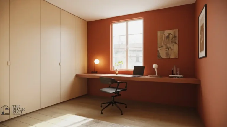
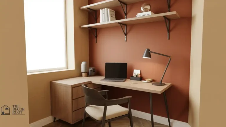
3. Warm Terracotta Accent
Rather than a full wall, terracotta works best as a single accent wall or a color introduced through decor, since its warmth and energy suit short creative bursts more than long focus sessions. It pairs particularly well with a sage or cream base palette, adding warmth without overwhelming the calming effect of the room’s primary color. This is a strong pick for anyone whose work alternates between focused tasks and more creative, brainstorming-heavy sessions.
4. Muted Lavender
A dusty, grayed-down lavender rather than a bright purple brings a similar calming quality to sage or powder blue while feeling slightly warmer and more unusual than either. A peel-and-stick wallpaper in a muted lavender tone is a low-commitment way to test the color on an accent wall before committing to paint.
EDITOR’S PICK
🛒Peel-And-Stick Removable Wallpaper In Muted Lavender For Accent Walls
Muted lavender peel-and-stick wallpaper offers a low-commitment way to test this calming, warmer alternative to sage on an accent wall.
(paid link)
Keep lavender to one wall or a smaller accent area, since it can read as slightly precious or overly soft across an entire room, working better as a supporting color than the room’s dominant tone.
5. Greige (Gray-Beige)
Greige splits the difference between a cool gray’s calm and a warm beige’s coziness, making it one of the most versatile full-wall colors for anyone who wants a neutral base that still supports focus rather than reading as sterile. It works well as a backdrop for almost any accent color on this list, which makes it a strong pick for offices where furniture and decor colors haven’t been fully settled yet.
6. Deep Navy Accent Wall
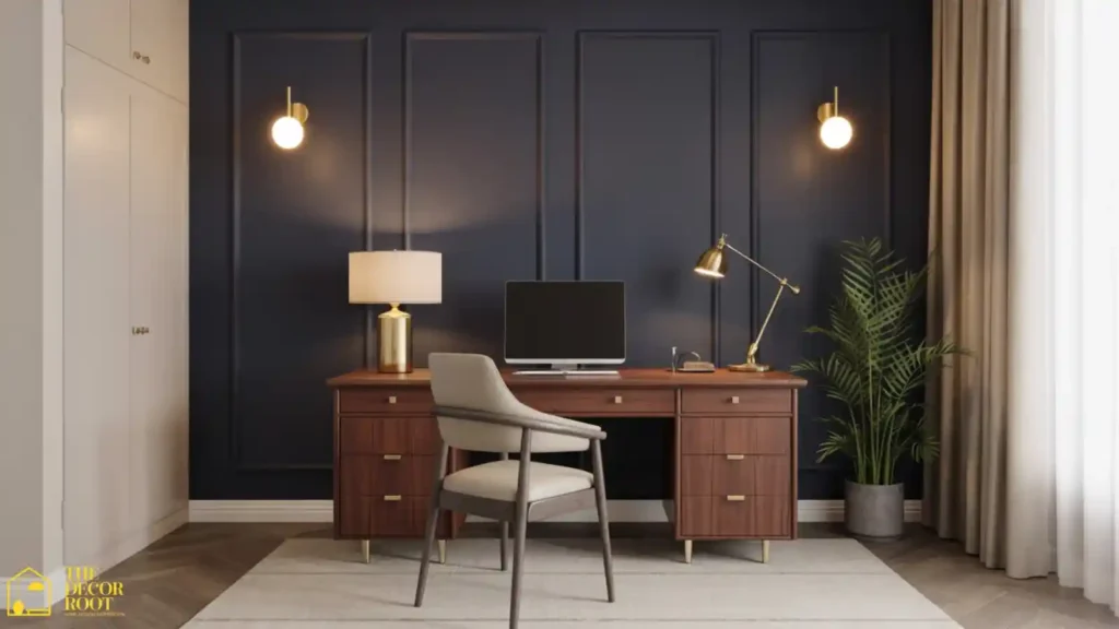
A single deep navy wall, rather than a full room, adds sophistication and a strong sense of enclosure that can help with focus in an open or oversized room, since a dark wall visually pulls the space inward. Pair it with lighter furniture and ample lighting to avoid the room feeling cave-like, and keep navy to one wall, ideally the one behind your monitor, not the one in front of you, so it isn’t in your direct line of sight all day.
7. Soft Buttery Yellow
A very pale, muted yellow reads as gently energizing without the intensity of a bold yellow, which makes it one of the few warm-toned colors on this list that can work as a full wall rather than just an accent. It suits offices that get limited natural light particularly well, since the warmth compensates for a room that would otherwise feel dim and flat.
8. Clay Pink
A dusty, earthy pink (closer to terracotta than to a true pastel pink) brings warmth and a slightly unexpected character to a home office without feeling overly soft or juvenile. It pairs especially well with dark wood and brass accents, and works best as either a full wall in a smaller room or an accent wall in a larger, open-concept office space.
9. Olive Green
A deeper, more muted green than sage, olive brings an earthy, grounded feeling that suits offices used for long, focused analytical work particularly well. An olive green desk accessory set is an easy way to introduce the color through decor if a full wall feels like too large a commitment.
EDITOR’S PICK
🛒Coordinated Olive Green Desk Accessory Set
Olive green brings an earthy, grounded feel ideal for focused analytical offices, and a desk accessory set is an easy, low-commitment way to introduce the color without painting a wall.
(paid link)
Olive pairs particularly well with warm wood, cream textiles, and brass hardware, giving the room an earthy, cohesive palette without needing more than one or two additional colors layered in.
10. Dusty Blue
Slightly more muted and gray-leaning than powder blue, dusty blue brings a similar calming quality with a bit more depth and sophistication, making it a strong choice for offices used for extended focus work. It reads well in both north-facing rooms with cooler light and south-facing rooms with warmer light, which gives it more flexibility than some of the more light-dependent colors on this list.
11. Warm White
Not every focus-friendly palette needs a strong hue; a warm white (as opposed to a stark, cool-toned white) provides a clean, bright backdrop without the sterile feeling pure white can carry under artificial lighting. This works particularly well as a base in smaller offices where a darker or more saturated color might feel closing-in, and it lets accent colors and furniture do more of the visual work.
12. Charcoal Accent Wall
For anyone who wants more visual weight than navy but still wants to stay in a focus-supporting neutral family, a charcoal accent wall behind the desk adds depth and a sense of enclosure similar to navy, with a slightly more modern, less traditionally “cozy” feel. Balance it with warm lighting to prevent the room from reading as cold, since charcoal without warm accents can tip into feeling stark rather than grounded.
13. Forest Green
A darker, richer green than either sage or olive, forest green makes a strong statement as either a full wall in a well-lit room or an accent wall in a smaller space, and it carries the same calming, focus-supporting associations as its lighter green relatives while adding more drama and depth to the room’s overall feel.
14. Burnt Orange
Like terracotta, burnt orange works best in smaller doses as an accent wall, decor, or textiles rather than as a dominant full-wall color, since its energy suits short creative bursts better than sustained, quiet focus. A burnt orange accent throw pillow is a low-commitment way to add warmth and energy without repainting anything.
EDITOR’S PICK
🛒Burnt Orange Accent Throw Pillow For A Reading Chair Or Window Seat
Burnt orange is best used sparingly on accents or textiles, as its high energy suits creative bursts better than calm focus, and a throw pillow is a simple, paint-free way to try it.
(paid link)
Use burnt orange sparingly against a calmer base palette; sage, greige, or warm white all work well so the color reads as an intentional pop rather than overwhelming the room’s overall calm.
15. Mushroom Taupe
A warm, slightly gray-leaning taupe with brownish undertones, mushroom has become a popular alternative to greige for anyone wanting a neutral with a bit more depth and coziness. It works as a full-wall color in almost any lighting condition and pairs particularly well with the warm wood accents and layered lighting covered in our cozy home office guide.
16. Powder Blue Built-Ins
Rather than a full wall, powder blue on built-in shelving or cabinetry adds a soft pop of calming color to the room’s storage elements while keeping the walls themselves neutral. This works especially well in offices with existing built-ins that need a refresh, since painting cabinetry is a smaller, faster project than repainting an entire room.
17. Warm Gray
A gray with warm rather than cool undertones avoids the flat, sterile feeling that a true cool gray can bring to a workspace, while still offering the sophisticated, neutral backdrop many people want in a home office. Check the undertone carefully in your specific room’s lighting before committing, since the same gray swatch can read warm in one room and cool in another depending on the direction and quality of natural light.
18. Soft Teal
A muted, grayed-down teal splits the difference between calming blue and grounding green, offering a slightly more distinctive option than either color on its own. It works particularly well as an accent wall or in decor for anyone who wants something a bit more unusual than sage or powder blue while staying within the same calming color family.
19. Ochre Accent
A muted, earthy yellow-gold, ochre brings warmth and a sense of richness in small doses of decor, an accent wall, or trim without the full-room intensity a brighter yellow would carry. A paint sample kit covering a few ochre and warm-neutral shades lets you test how the color reads in your specific room’s lighting before buying a full can.
EDITOR’S PICK
🛒 Paint Sample Kit For Testing Warm Accent Colors Before Committing
Ochre adds warm richness to accent walls or small decor without the intensity of bright yellow, and testing with a paint sample kit ensures it works in your room’s light.
(paid link)
Test any sample on at least two different walls, since natural light shifts dramatically between morning and afternoon and a color that looks perfect at 10 AM can read completely differently by 4 PM.
20. Blush Neutral
A very muted, dusty blush works similarly to clay pink but leans slightly cooler and more neutral, making it a versatile full-wall option for anyone who wants warmth without the more overtly “pink” feeling that clay or true pink would carry. It pairs especially well with warm gray, cream, and brass accents for a soft, cohesive palette.
21. Two-Tone Color Blocking
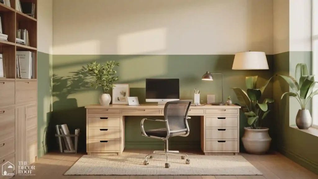
Rather than committing to a single color across every wall, splitting the room with a darker, calming color on the wall behind the desk and a lighter neutral on the remaining walls gives you the focus benefits of a deeper color in your direct line of sight while keeping the rest of the room feeling open and bright. This approach works particularly well in smaller offices, where a single dark color on every wall can feel closing-in, but a strategic accent wall adds depth without the same drawback.
Quick Action Plan
- Start by identifying the type of work you do most; sustained analytical focus points toward the cooler, calmer colors early in this list, while frequent creative or brainstorming work points toward the warmer accent tones.
- Test your top two or three choices as physical paint samples on the actual wall, checked at different times of day, before committing to a full room.
- If a full repaint feels like too large a step, start with an accent wall or decor in your chosen color and expand from there once you’ve lived with it for a few weeks.
The evidence behind home office colour choices comes directly from colour psychology research, these color psychology ideas for concentration and focus explain which hues measurably improve working memory, reduce distraction, and sustain attention across a long working day, and translate that research into specific paint and material recommendations for a home office.
Frequently Asked Questions
Conclusion
The color on your office walls is quietly doing more work than most people give it credit for, and choosing it deliberately, based on the kind of focus your work actually requires, is one of the simplest, lowest-cost changes on this entire list.
. 💾 Save this to your Home Office Pinterest board before your next paint run.