23 Fall Bookshelf Styling Ideas That Feel Curated
Fall Bookshelf Styling Ideas. There’s a specific kind of bookshelf that looks like it belongs in a magazine, and a specific kind that looks like everything just got shoved on there during a move. The frustrating part is that the “curated” version often has fewer objects on it, not more. If you’ve added candles, framed photos, and a plant to your shelves and it still looks busy instead of intentional, the problem usually isn’t what you added; it’s spacing, grouping, and restraint.
Fall bookshelf styling ideas that feel curated are one of the most detail-conscious home decorating ideas of the autumn season, a bookshelf that looks considered rather than collected for any season requires the same discipline of grouping, height variation, and negative space, but autumn offers the specific material vocabulary of amber glass, dark spines, dried botanicals, and candlelight that makes the fall version of the same shelf uniquely atmospheric.
This post contains affiliate links. As an Amazon Associate, I earn from qualifying purchases. If you buy through these links, I may earn a small commission at no extra cost to you.
What Ties These Ideas Together
Every genuinely curated shelf follows the same underlying logic, whether or not the person who styled it could explain it: negative space is treated as a design element, not space to be filled. Objects are grouped in odd numbers, varied in height, and given breathing room on either side. Color is limited to a tight, repeating palette rather than “whatever I own.”A fall bookshelf and a fall coffee table are the two living room display surfaces that define the room’s seasonal identity. These fall living room styling surface ideas show how to design both displays from the same autumn palette and botanical vocabulary so the vertical shelf and the horizontal table read as parts of the same composed room rather than two separately styled zones.
Display Autumn Bookshelf Charm
A bookshelf is the living room’s most characterful display surface; browse all our living room decorating ideas to see how fall bookshelf styling connects to candle arrangements, Candles on a bookshelf are the most atmospherically effective autumn styling addition available, these autumn bookshelf and candle styling ideas show how to position candles at different heights within the shelf composition so the amber light warms the books and objects around them, creating the specific quality of glow that distinguishes a styled autumn shelf from a year-round one throw blankets, and the autumn color palette for a living room where every vertical surface feels as considered as every horizontal one.
1. Pull 60% of Your Books Off the Shelf
The single biggest curated-vs-cluttered signal is how much of the shelf is actually books versus how much is negative space and objects. A fully packed shelf of spine-out books, no matter how nice the covers, reads as a working library rather than a styled room feature. Pull roughly 40% of your books off entirely, store the overflow in a closet or another room, and use the remaining space for a mix of stacked books, vertical books, and empty breathing room. This alone transforms most shelves before any new decor gets added.
2. Group Books by Spine Color, Not Genre
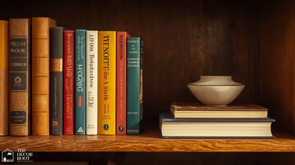
Sorting by color rather than author or subject is a purely visual decision, but it’s the fastest way to make a mismatched book collection look intentional. For fall, group warm-toned spines cream, tan, burgundy, olive, rust together in clusters rather than scattering them randomly across shelves. If a book’s spine color clashes badly with your palette, turn it spine-in so only the warm-toned page edges show, or stack it horizontally with the spine facing away from the main sightline.
3. Stack Some Books Horizontally as a Pedestal
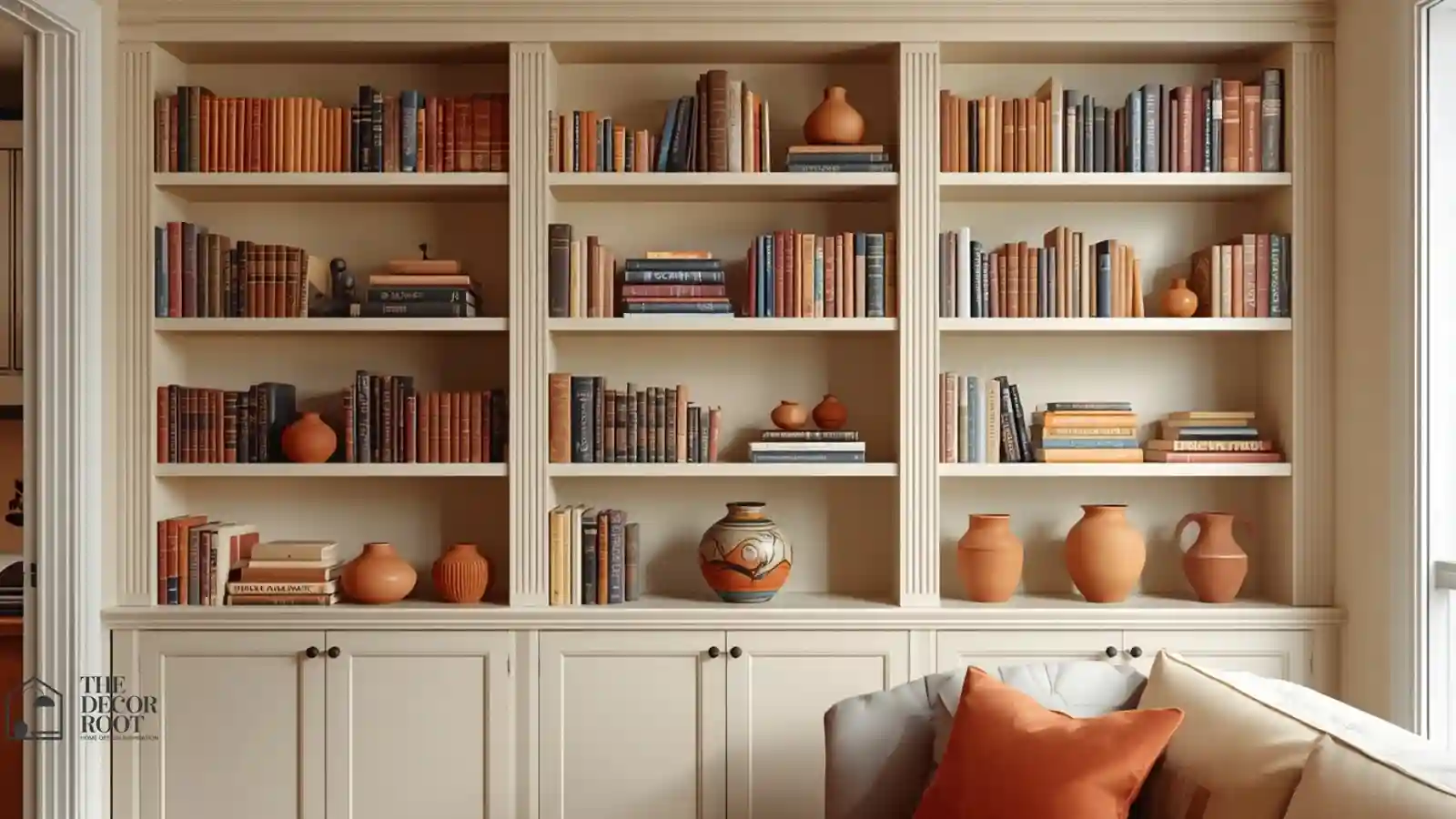
Horizontal stacks of 3-5 books do double duty: they break up the visual monotony of an all-vertical shelf, and they create a small elevated surface to display an object on top, like a small vase or a piece of pottery. This “pedestal” trick makes a small decorative object look more intentional than simply setting it directly on the shelf. Vary the stack height across different sections of the same shelf unit so no two stacks read as identical or too matched.
4. Use Bookends as a Styling Tool, Not Just a Function
Decorative bookends do more than keep books upright; a well-chosen pair in a warm material like brass, wood, or ceramic acts as a visual bracket that signals “this section is intentional,” the same way a picture frame signals “this is meant to be looked at.” Choose bookends with some visual weight rather than thin, purely functional metal ones, and don’t feel obligated to use them symmetrically across every shelf; one styled section with bookends and one loose, book-stack-only section creates helpful visual variety.
EDITOR’S PICK
🛒Decorative Sculptural Bookends, Warm Neutral Finish
A pair of sculptural wood or ceramic bookends adds structure to a shelf section without looking like a purely functional object.
(paid link)
5. Follow the Rule of Odd Numbers for Object Groupings
Groups of three objects (rarely two, rarely four) read as more visually settled to the eye than even-numbered groupings, which is why stylists default to triads almost everywhere. On a bookshelf, this means clustering a book stack, a small object, and a plant together rather than spacing four separate items evenly across the shelf. If you only have two objects for a given shelf, add a stack of books as the informal “third” element to complete the triad rather than leaving the pairing feeling incomplete.
6. Bring In One Textured Ceramic Piece Per Shelf
A single textured ceramic vase, bowl, or sculptural object per shelf section adds tactile variety against the flatness of book spines. For fall, look for pieces in matte stoneware finishes rather than glossy glazed ceramics; the matte texture reads warmer and more seasonal, and photographs better in the softer natural light common in autumn. Avoid adding more than one statement ceramic piece per shelf section; multiple competing textures in the same small area start to look cluttered rather than curated.
7. Add Height Variation With a Small Riser or Books
Every object placed directly on the shelf surface at the same height creates a flat, monotonous line across the shelf when viewed straight on. Using a small wood riser, a stack of two books, or even an upside-down small bowl underneath an object adds height variation that makes the eye travel across the shelf rather than skimming past it. This is one of the cheapest fixes on this list since it typically uses objects you already own repurposed as risers.
8. Leave at Least One Shelf Section Mostly Empty
Counterintuitively, one of the fastest ways to make a full bookshelf feel curated is to leave an entire shelf section or a significant portion of one almost empty, with just one or two objects. This “breathing” shelf gives the eye a resting point among the busier sections and signals confidence rather than a need to fill every inch. Position this emptier section at eye level if possible, since that’s where the contrast with fuller shelves above and below reads most clearly.
9. Layer In a Small Framed Print Leaning Against Books
A small framed art print or photo, leaned against a stack of books rather than hung on the wall, adds a vertical element that breaks up the horizontal lines of stacked books and shelf edges. Choose a frame in a warm wood or brass tone for fall rather than a stark black or white frame, which can read too modern and cool against a warm palette. Overlap the frame slightly with the book stack in front of it to create depth rather than placing it flush against the back of the shelf.
EDITOR’S PICK
Ceramic Vase Set, Varied Heights, Neutral Warm Tones
A small set of warm-toned ceramic vases in varying heights gives you flexible styling pieces across multiple shelf sections.
(paid link)
10. Use Faux or Dried Botanicals Sparingly
A small stem of dried pampas grass, faux eucalyptus, or a single dried floral pick adds organic softness to counter the hard lines of shelving and book spines. The key word is sparingly; one or two stems per full bookshelf unit is usually enough; more than that starts to look like a florist’s display rather than a styled shelf. Trim stems shorter than you think you need to; oversized botanicals on a shelf can look disproportionate compared to the same stems in a floor vase.
11. Repeat One Material Across Multiple Shelves
Choosing one material brass, rattan, matte black, light wood and repeating it in small doses across several shelf sections creates a visual thread that ties an otherwise disconnected shelving unit together. This doesn’t mean every object needs to match; it means one recurring material appears somewhere on nearly every shelf, whether that’s a brass bookend on one shelf and a small brass frame two shelves down. This repetition is what makes a large built-in unit read as one cohesive styled piece rather than several unrelated shelves.
12. Turn Some Book Spines Inward for a Monochrome Section
For a more editorial, minimalist look, try turning an entire small cluster of books spine-in so only the neutral page edges show, creating a solid block of cream or tan with no text or graphic design visible at all. This works especially well combined with a single accent object placed in front of the block. It’s a striking technique but works best used in moderation one section per shelving unit, not applied to every shelf, or the room loses the ability to identify it as a bookshelf at a glance.
13. Add a Small Vintage Object With a Story
A curated shelf almost always has at least one object that looks slightly worn or collected rather than freshly purchased: an old wood box, a vintage brass candlestick, a weathered ceramic jar. This kind of piece adds authenticity that brand-new matching decor sets can’t replicate on their own. If you don’t have vintage pieces on hand, thrift stores and estate sales are the fastest, most affordable sources, and even one such piece per shelving unit changes the overall feel significantly.
14. Use a Low Wood Tray to Corral Small Objects
Small decor pieces like matchboxes, tiny bowls, or trinket dishes can look scattered and messy if placed loosely on a shelf. Containing them within a small wood or woven tray instantly makes the same objects read as an intentional vignette instead of clutter. This trick is especially useful on lower shelves that get used functionally for remote controls or coasters, since it keeps practical items visually corralled without hiding them entirely.
EDITOR’S PICK
🛒Small Decorative Wood Tray, Warm Finish
A shallow decorative wood tray is one of the most versatile styling tools for corralling small objects into an intentional-looking cluster.
(paid link)
15. Don’t Center Every Object, Use Off-Center Placement
Perfectly centered objects on every shelf, repeated across the whole unit, create a rigid, almost showroom-like symmetry that reads as staged rather than curated. Instead, place most groupings slightly off-center closer to the left or right edge and let the negative space fall unevenly across the shelf. Vary which side the “weight” of each shelf sits on as you move up or down the unit, which creates a more natural, collected-over-time visual rhythm.
16. Add a Small Table Lamp on One Shelf
A small accent lamp placed on a mid-level or lower shelf adds a warm point of light that photographs beautifully in the dimmer natural light of fall afternoons, and provides functional ambient lighting in the evening. Choose a lamp with a fabric or paper shade rather than a stark metal shade for the warmest light quality. This also breaks up the “everything is decor, nothing is functional” feeling that can make some styled shelves look more like a display than a lived-in room feature.
17. Introduce Texture With a Woven Basket on a Lower Shelf
Lower shelves, which are viewed from a steeper angle and often hold heavier or more functional items, benefit from a woven basket or seagrass container that adds warmth and texture while concealing less photogenic storage items, extra blankets, board games, or cords. This keeps the practical function of the lower shelves intact without them visually clashing with the more curated styling happening at eye level and above.
18. Add Warm Under-Shelf Lighting for Evening Ambiance
Small battery-powered or plug-in LED puck lights installed under the lip of each shelf create a soft glow that highlights the styled objects even after the sun goes down, particularly valuable in fall when daylight hours shrink and living rooms get used more in the evening. Choose warm white (2700K) bulbs rather than cool white, since cool lighting will fight against the warm color palette of the rest of the styling.
EDITOR’S PICK
🛒Warm White LED Puck Lights, Remote Dimmer, Battery Or Plug-In
Warm white LED puck lights with a remote dimmer are an easy no-wiring upgrade for evening bookshelf ambiance.
(paid link)
19. Use a Small Framed Mirror to Add Light and Depth
A small mirror leaned against the back of a shelf, angled slightly forward, reflects light into the room and creates the illusion of more depth on an otherwise flat shelf surface. This works particularly well on shelves that don’t get much direct natural light, helping the styled objects in front of the mirror catch and bounce whatever ambient light is available, which is especially useful during fall’s shorter, dimmer days.
20. Rotate a Seasonal “Hero” Object In and Out
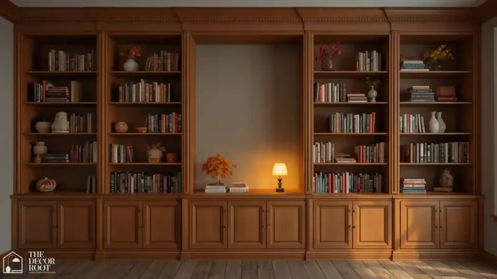
Rather than fully restyling an entire bookshelf every season, choose one or two “hero” spots, usually the most visually prominent shelf at eye level, and swap just the objects there for the season. In fall, this might mean a small pumpkin-shaped ceramic vase or a dried wheat bundle. This targeted approach keeps the shelf feeling current without the time investment of a full restyle, and it’s a technique you can repeat every season using the same “hero spot” logic.
21. Balance Matte and Glossy Finishes
An entirely matte shelf can start to feel flat and dull under lower fall light levels, while an entirely glossy shelf can feel cold and showroom-like. Mixing in at least one glossy or metallic finish a brass frame corner, a glazed ceramic vase among predominantly matte materials like wood, linen-bound books, and stoneware creates just enough contrast to keep the eye interested without breaking the overall warm, cozy feeling of the styling.
22. Add One Small Faux Greenery Stem for Life
Even the warmest, most textural fall shelf can start to feel static without any green in it. A single small faux stem eucalyptus, olive branch, or a compact trailing pothos placed in a low vase adds a living, organic note that keeps the palette from feeling entirely brown and beige. Choose realistic, matte-finish faux greenery over shiny plastic versions, which read as artificial from across the room.
EDITOR’S PICK
🛒Realistic Faux Greenery Stem, Matte Finish
A realistic faux greenery stem in a low vase adds a living note without any plant maintenance.
(paid link)
23. Step Back and Photograph the Shelf Before Calling It Done
The final and most useful styling trick isn’t an object at all it’s taking a photo of the finished shelf on your phone and reviewing it zoomed out. Cameras flatten a scene the same way a glance from across the room does, and issues like uneven spacing, competing colors, or an accidentally centered symmetry become far more obvious in a photo than in person. Adjust based on what the photo reveals, then reshoot, repeating until the shelf reads as intentional at a glance rather than only up close.
Related reading: For more on how warm tones affect a room’s overall feel, see our color psychology guide and our luxury living room color palette ideas.
Quick Action Plan
- Start by removing about 40% of your books to create real negative space, then group the remaining books by spine color rather than genre.
- Add height variation with risers or horizontal stacks, cluster objects in threes, and limit yourself to one standout piece per shelf section rather than filling every inch.
- Finish by photographing the shelf and adjusting anything that reads as too centered, too even, or too matched; that’s almost always the difference between “styled” and “cluttered.”
Frequently Asked Questions
Concluison
A curated bookshelf isn’t a purchase; it’s an editing exercise, and most living rooms already own everything needed to get most of the way there.
💾 Save this to your Fall Living Room Ideas board on Pinterest for your next shelf-styling session.