22 Color Psychology Ideas for Small Spaces That Feel Bigger
Color Psychology for Small Spaces. You didn’t choose a small apartment, a cramped guest room, or a narrow hallway, but you did choose what color goes on the walls, and that choice is doing more work than your furniture arrangement ever will. Color psychology isn’t just about mood in small spaces; it’s about tricking depth perception itself: how light bounces, where the eye stops, and whether a wall reads as a boundary or a suggestion. These 22 ideas are built specifically for square footage you can’t change, using color as the one renovation tool you already have. Color psychology ideas for small spaces that feel bigger are one of the most practically valuable home decorating ideas available; the research on how hue, value, and saturation affect perceived spatial volume gives small-room designers a set of evidence-based tools that most ‘how to make a room look bigger’ advice never accesses.
This post contains affiliate links. As an Amazon Associate, I earn from qualifying purchases. If you buy through these links, I may earn a small commission at no extra cost to you.
What Ties These Ideas Together
Every idea below works on the same underlying principle: contrast creates visual stopping points, and stopping points make a room read as smaller. When trim, walls, and ceiling all fight each other in different tones, your eye keeps hitting edges, and your brain calculates a boundary sooner than it needs to. Low-contrast, light-reflective, and cool-leaning palettes let the eye travel further before it registers a “wall,” which is what actually reads as spaciousness, not square footage, but how far your eye is allowed to travel before it stops. Bathrooms are the most common small space color psychology challenge in any home, these small bathroom color ideas show how the same principles of hue temperature and value contrast that expand any small room apply with particular urgency in a bathroom where the ceiling is low, the window is small, and every surface is within arm’s reach of every other.
Small Space Color Psychology
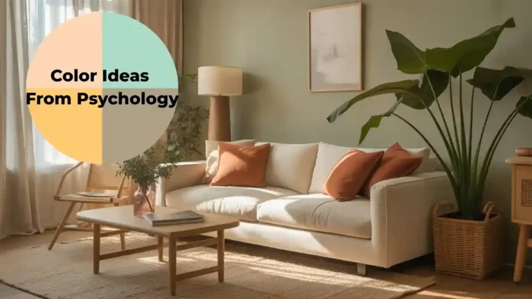
Small space color psychology is one specific application of a broader body of environmental psychology research; these color ideas from psychology provide the full theoretical framework behind spatial perception, showing how hue temperature, value contrast, and saturation all affect whether a room feels larger or smaller than its actual dimensions. The warm versus cool distinction is the most consequential color decision in a small room; these warm and cool color ideas for small rooms show exactly how cool hues recede walls and expand perceived volume while warm hues advance surfaces and create intimacy, and when each approach serves a small space better than the other.
1. Monochrome floor-to-ceiling
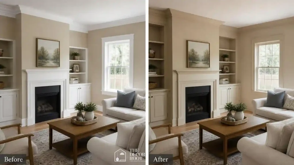
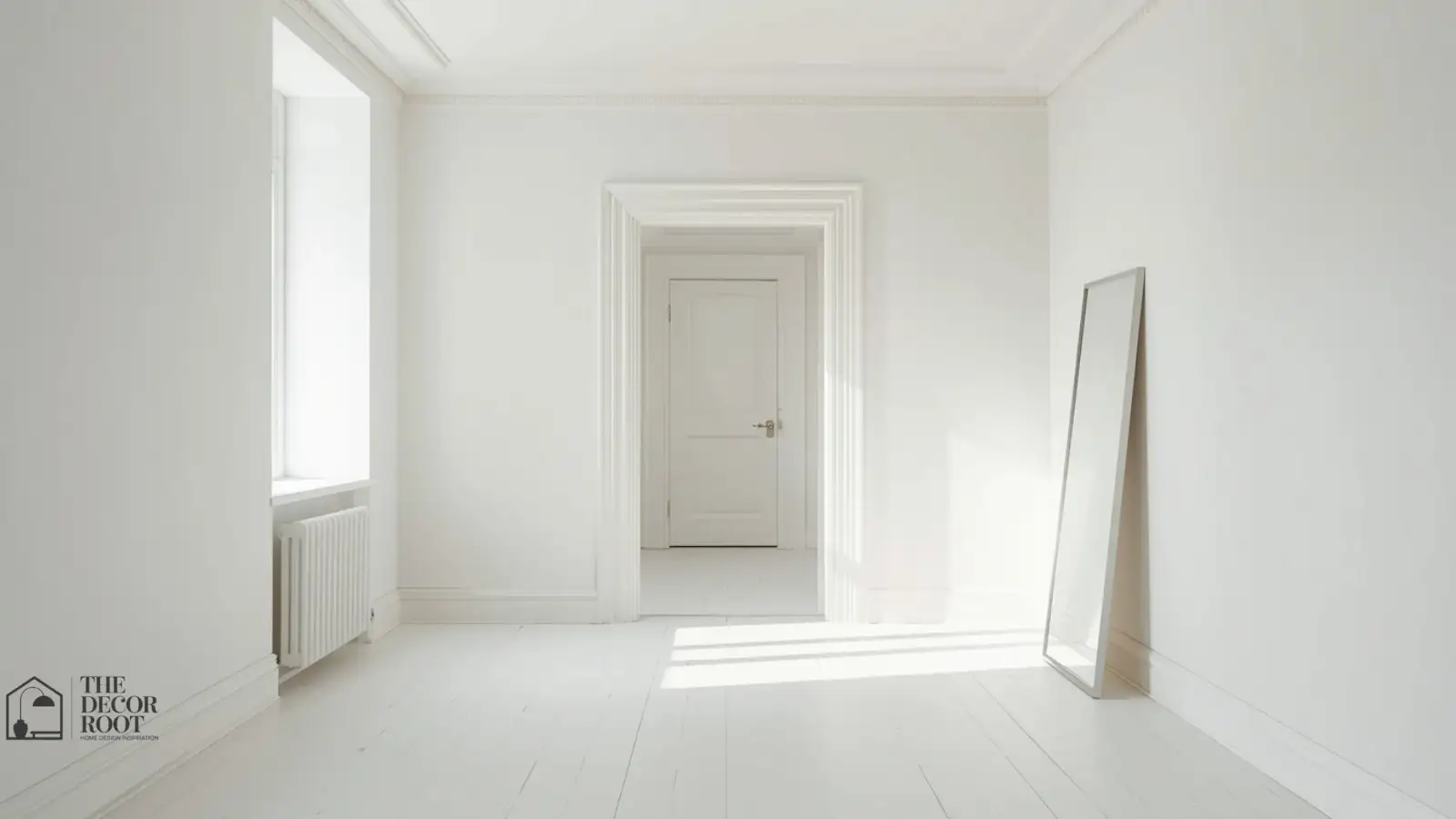
Painting walls, trim, and ceiling the same light color removes every stopping point in the room, which is consistently the single most effective trick for visually expanding a small space.
2. Pale sky blue on the ceiling
A cool, pale blue “sky ceiling” pushes the ceiling plane visually upward, borrowing the same trick that makes outdoor spaces feel expansive.
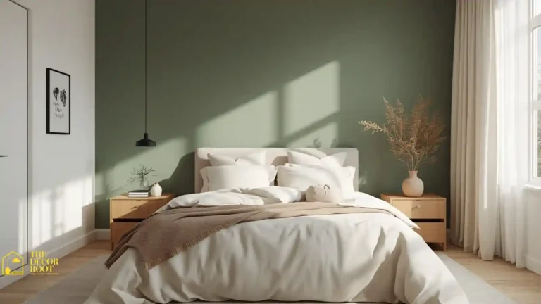
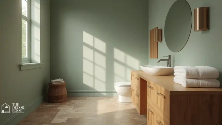
3. Soft sage instead of stark white
Stark white can flatten a small room under artificial light, while soft sage retains a hint of color that reads as intentional rather than blank, without adding visual weight. The white living room is the most widely adopted domestic application of small-space color psychology; these color and space expansion ideas show why warm white consistently outperforms cool white, grey, and cream in rooms where the goal is maximum perceived volume, and how the specific undertone of white paint affects the result more dramatically than the shade of white itself.
4. Light-reflective satin finish over flat matte
Finish matters as much as hue. Satin and eggshell finishes bounce more ambient light than flat matte, which physically brightens a room regardless of color choice. An oversized wall mirror amplifies this same reflective effect.
EDITOR’S PICK
🛒Oversized Wall Mirror Amplifies
Satin or eggshell finishes brighten a room more than flat matte, and an oversized mirror amplifies that reflective effect.
(paid link)
5. Cool lavender-gray in a narrow hallway
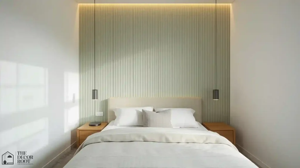
Narrow hallways benefit specifically from cool tones because warm saturated colors visually advance toward the eye, making an already-tight passage feel tighter.
6. Pale blush instead of deep rose
Blush retains warmth’s coziness without the visual weight of a saturated rose or burgundy, which can make a small bedroom feel enclosed rather than intimate.
7. Matching curtain color to wall color
When curtains match the wall within a shade or two, the window boundary disappears into the wall plane, extending the perceived width of the room.
8. Cool mint in a home office nook
A cool mint tucked into a small office corner keeps the space feeling calm rather than cramped, especially paired with a light wood desk instead of dark furniture.
9. Pale celadon in a reading corner
Celadon carries just enough green undertone to feel grounded without darkening a small nook the way deeper greens do. Monochrome sheer curtain panels keep the window line continuous with the wall.
EDITOR’S PICK
🛒Monochrome Sheer Curtain Panels
Celadon’s light green undertone grounds a small nook without darkening it, and sheer monochrome curtains keep the window line visually continuous with the wall.
(paid link)
10. Warm cream instead of cool white in low-light rooms
In rooms with little natural light, cool whites can read gray and flat; warm cream keeps brightness without the sterile cast.
11. Vertical color blocking
Painting a stripe of the same color from floor to ceiling on one wall draws the eye upward, borrowing height the way vertical stripes borrow height in clothing.
12. Light dove gray in a small entryway
Dove gray reads as neutral and expansive rather than dim, which matters in entryways that often lack windows entirely.
13. Pastel yellow in a windowless bathroom
A soft, pale yellow mimics daylight in rooms with no natural light source, counteracting the “cave” feeling small windowless bathrooms tend to have.
14. Cool-toned LED lighting layered with paint color
Cooler color-temperature LED strips under cabinets or shelving reinforce a cool wall palette and add depth without adding visual clutter. An LED strip lighting kit is an easy way to layer this in.
EDITOR’S PICK
🛒 LED Strip Lighting Kit
Cooler LED strips under cabinets reinforce a cool palette and add depth without clutter, easily achieved with a basic strip kit.
(paid link)
15. Soft periwinkle in a small kids’ bedroom
Periwinkle keeps a small child’s room feeling playful without the visual heaviness of brighter primary colors, which can overwhelm a space under 100 square feet.
16. Pale terracotta instead of full-saturation rust
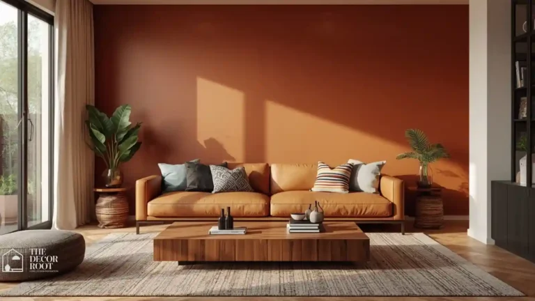
You can still get warmth’s coziness in a small space if you dial the saturation down; pale terracotta warms a room without advancing the walls inward the way a bold rust would.
17. Same-tone furniture upholstery
Choosing sofa or chair upholstery close in value to the wall color prevents furniture from reading as a separate, space-dividing object.
18. Light aqua in a small laundry nook
Aqua keeps a utilitarian, often windowless laundry space from feeling purely functional, while its coolness keeps it visually receding rather than closing in.
19. Glossy or satin trim in a lighter tone than semi-gloss white
A slightly warm-white satin trim, rather than stark bright white, prevents trim from becoming its own high-contrast boundary line. Light reflective satin paint is the specific finish to look for.
EDITOR’S PICK
🛒Light Reflective Satin Paint
Warm white satin trim prevents harsh contrast, and a light reflective satin finish is the specific paint type to use.
(paid link)
20. Cool seafoam in a small home gym
Small home gyms benefit from the same perceived-openness trick as any tight room, and cool seafoam has the added benefit of feeling energizing without being visually loud.
21. Pale champagne in a small dining nook
Champagne carries enough warmth to stay inviting for meals while staying light enough to avoid closing in a nook that often has a table pushed right against the wall.
22. Single accent color used sparingly, not as a full wall
In genuinely tiny spaces, a full accent wall can backfire; using your accent color only on a pillow, art frame, or single object keeps the expansive light palette intact while still adding personality.
Quick Action Plan
- Walk through your smallest room and count how many different colors are competing for attention: walls, trim, ceiling, curtains, furniture. If that number is higher than two, that’s your starting point.
- Bring the trim and ceiling closer to the wall color first, since that single change removes the most visual stopping points for the least effort, then reassess whether the room actually needs an accent color at all.
Frequently Asked Questions
Conclusion
Small square footage isn’t a design limitation; it’s a design brief, and color is the cheapest tool you have to answer it.
💾 Save this to your small space color board so you can reference it the next time you’re staring at paint chips.