24 Warm vs Cool Color Psychology Ideas for Every Room
Warm vs Cool Color Psychology Ideas: You’ve stood in the paint aisle holding two swatches that look almost identical, and somehow one makes you feel cozy just looking at it while the other makes you feel calm and clear-headed. That’s not your imagination. Warm and cool tones trigger measurably different responses in how a room feels to live in, and once you understand which temperature does what, you stop guessing and start designing on purpose. This isn’t a “pick your favorite color” list; it’s a room-by-room breakdown of when warmth pulls people together and when coolness gives a space room to breathe. Understanding warm versus cool color psychology is the single most transferable home decorating idea available. Once you understand how hue temperature affects perceived room size, emotional warmth, and physiological arousal, every other color decision in every other room becomes faster, more confident, and more likely to produce the result you actually wanted.
This post contains affiliate links. As an Amazon Associate, I earn from qualifying purchases. If you buy through these links, I may earn a small commission at no extra cost to you.
The Thinking Behind This
Color temperature isn’t about literal heat; it’s about the psychological pull each hue creates. Warm tones reds, oranges, ambers, warm yellows sit closer to firelight and sunset light, so they read as energizing, social, and grounding. Cool tones blues, greens, cool grays, lavenders echo sky, water, and shade, so they read as calming, spacious, and mentally quiet. The trick most home decor advice skips is that the right choice depends on the room’s function, its natural light, and how long you actually spend in it. The warm versus cool framework applies room by room; these whole-home color temperature ideas show how the living room is the room where the warm-cool balance most directly affects the social quality of the space, and how the palette decision there sets the emotional tone that makes every other room’s color choice feel either coherent or discordant.
Warm vs. Cool Color Balance
Warm versus cool is the foundational dimension of color psychology; these color ideas from psychology expand the framework into every specific room application, showing how the warm-cool principle interacts with saturation, value, and light temperature to produce the full complexity of how color affects human experience. The entryway is where the warm versus cool decision has the most immediate and irreversible effect; these color psychology ideas for first impressions show how the hue temperature of an entry hall determines whether visitors feel welcomed or cautioned before they have taken a second step, and why getting this decision right is more important than any other color choice in the home.
1. Terracotta in the entryway
A warm terracotta accent wall in your entryway acts like a handshake; it signals warmth before a guest even reaches the living room. Because entryways are transitional spaces people pass through quickly, the warmth needs to register instantly, which is why saturated warm tones outperform pale ones here. Pair it with a jute rug and a wood console table so the warmth feels earthy rather than loud. A terracotta throw pillow set on an entryway bench extends the tone without repainting.
EDITOR’S PICK
🛒A Terracotta Throw Pillow Set
A warm terracotta entryway wall instantly signals welcome, best grounded with jute and wood, while a matching throw pillow on the bench extends the tone without repainting.
(paid link)
2. Sage green in a home office
Cool, muted greens lower visual stimulation, which matters when your job depends on focus rather than energy. Unlike a stark cool gray, sage still carries warmth from its yellow undertone, so the room stays inviting instead of clinical, a common complaint with all-cool office palettes.
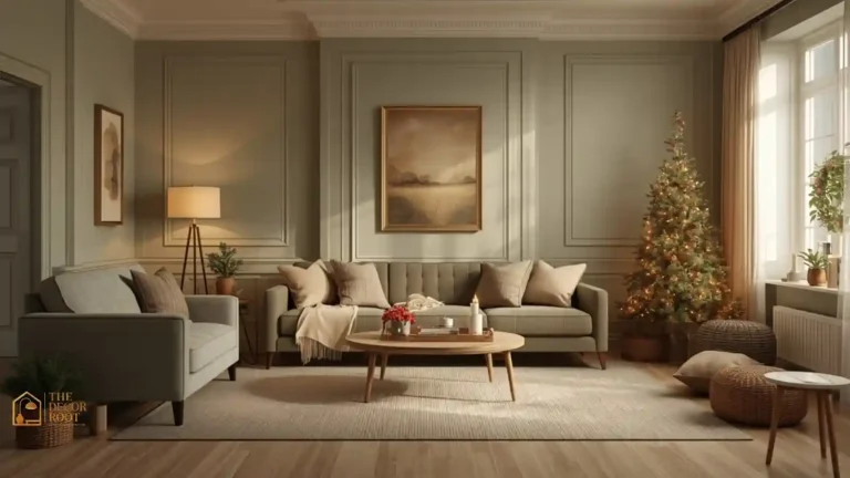
3. Amber accent lighting in the living room
Warm-temperature bulbs (2700K–3000K) in table lamps make even a cool-painted living room feel lived-in after sunset, because their color temperature can offset the wall color temperature when timed for evening use.
4. Warm blush in a reading nook
Blush pink reads as warm without the intensity of red, making it ideal for a small nook meant for slowing down. Layer a matching tone from the nook into the entryway for continuity.
EDITOR’S PICK
Terracotta Throw Pillow Set
Blush pink brings gentle warmth to a relaxing nook, and extending the same tone into the entryway creates seamless continuity.
(paid link)
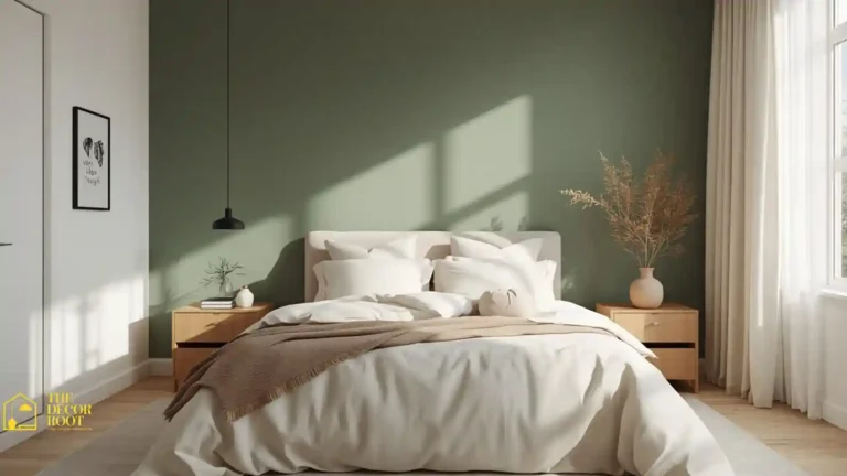
5. Cool slate blue in a primary bedroom
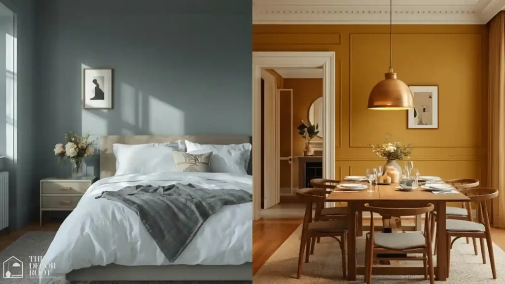
Slate blue is consistently linked to lower resting heart rate in sleep-environment studies, which is exactly the physiological state you want heading into bed. Keep trim white or off-white so the cool tone doesn’t tip into cold.
6. Warm mustard in a dining room
Mustard and warm gold tones are proven appetite stimulants, which is precisely why they show up in restaurant interiors more than any other hue family. Use it on a single wall behind the table rather than all four walls to avoid overwhelming the eye during long meals.
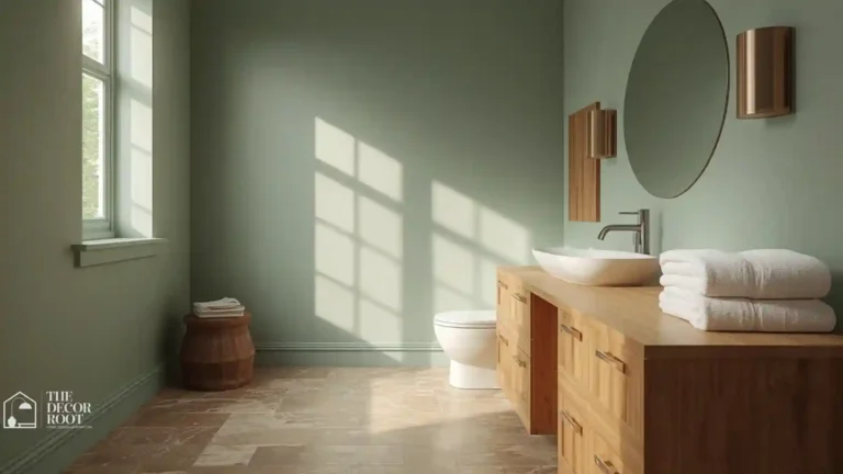
7. Cool eucalyptus in a bathroom
A cool, spa-adjacent green makes a small bathroom feel like an extension of nature rather than a purely functional box, especially when paired with brushed nickel fixtures instead of warm brass.
8. Warm cognac leather in a den
If you’re not repainting, warm-toned furniture alone can shift a room’s temperature. A cognac leather chair against neutral walls injects warmth without a full color commitment.
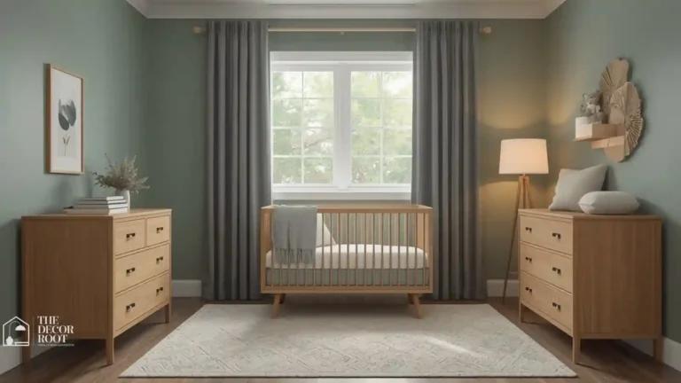
9. Cool dusty blue in a kids’ shared bedroom
Cool tones are associated with calmer play behavior in shared spaces, which matters more in a room where two kids’ energy compounds. Warm dimmable smart bulbs let you soften a cool room at bedtime without repainting. The warm versus cool distinction is most consequential in a small space where the choice directly affects whether the room feels enclosed or expansive. These color psychology ideas for small spaces show exactly how cool hues recede and warm hues advance in a limited footprint, and which specific tones produce the most dramatic perceived size increase without sacrificing the warmth that makes a small room feel genuinely comfortable.
EDITOR’S PICK
🛒Warm Dimmable Smart Bulbs
Cool tones encourage calmer shared play, while warm dimmable bulbs soften the room for bedtime without a repaint.
(paid link)
10. Warm coral in a laundry room
Utility spaces get skipped in color-psychology conversations, but a warm coral or peach can make a windowless laundry room feel less like a chore closet and more like an intentional space.
11. Cool seafoam in a home gym
Cool greens and blues are shown to reduce perceived exertion during exercise, which is a real performance argument for painting a home gym cool rather than the energetic red many people default to.
12. Warm chestnut brown in a library or study
Deep warm browns create the enclosed, “held” feeling that makes long reading sessions comfortable, echoing traditional wood-paneled libraries without the expense of actual paneling.
13. Cool lavender-gray in a guest room
Lavender-gray splits the difference between calming and welcoming, which is ideal for a room meant to feel restful to people who don’t live there full-time.
14. Warm honey oak flooring paired with cool walls
If your home already has warm oak floors, cool wall tones like dove gray or pale blue create balance instead of an all-warm room that can feel heavy. Cool-tone sheer curtains soften the contrast at the window.
EDITOR’S PICK
🛒Cool-Tone Sheer Curtains
Cool wall tones like dove gray balance warm oak floors, and sheer curtains in a similar cool shade ease the contrast at the windows.
(paid link)
15. Warm rust in a home bar or entertaining corner
Rust and burnt orange are strongly linked to conviviality, making them a smart choice for the specific corner of a room where people gather to talk.
16. Cool periwinkle in a nursery closet or built-in
Small enclosed spaces benefit from cool tones because they visually recede, making a closet interior feel less cramped when the door is open.
17. Warm terracotta tile in a kitchen backsplash
Warm backsplash tones photograph better for the golden-hour “cozy kitchen” aesthetic that consistently performs on Pinterest, while also making a north-facing kitchen feel less cold.
18. Cool teal in a powder room
A small, infrequently used room is the lowest-risk place to commit to a bold cool tone, and teal specifically reads as sophisticated rather than sterile the way pure blue can.
19. Warm ivory instead of stark white for trim
Stark white trim against warm walls creates jarring contrast; warm ivory trim lets the wall color’s temperature carry through uninterrupted. Color-changing peel-and-stick paint swatches let you test warm vs cool trim combinations before committing.
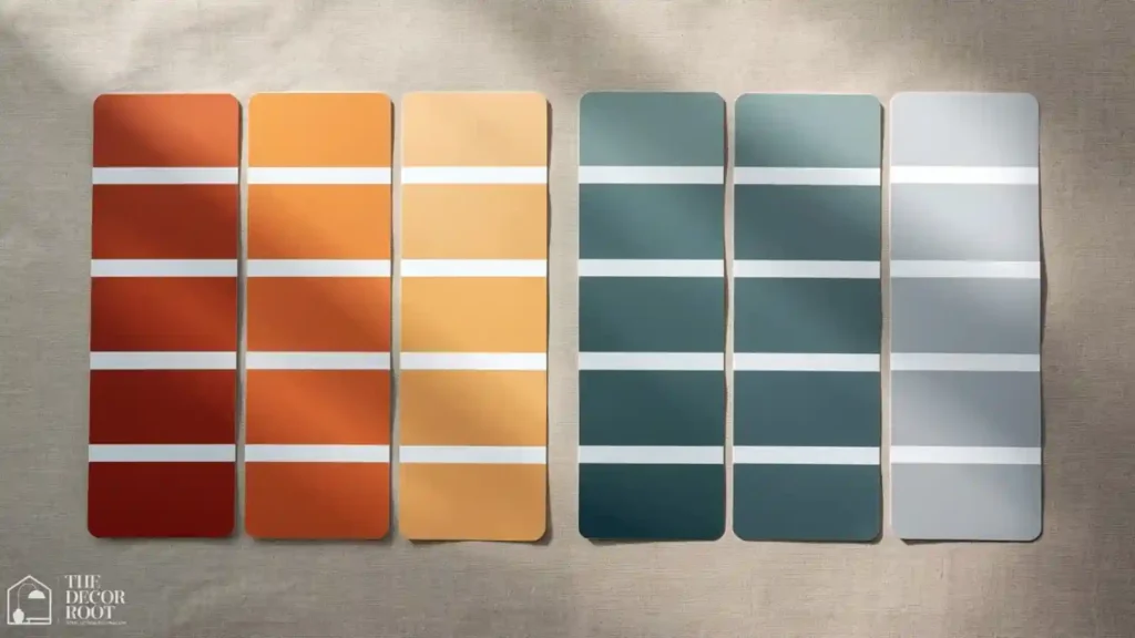
EDITOR’S PICK
🛒Peel-And-Stick Paint Swatches
Warm ivory trim blends seamlessly with warm walls, unlike stark white, and peel-and-stick swatches let you test trim tones before painting.
(paid link)
20. Cool charcoal in a home theater or media room
Dark cool neutrals reduce screen glare and visual competition, which is a functional reason cool charcoal outperforms warm brown in dedicated media rooms.
21. Warm apricot in a north-facing room
North-facing rooms get flat, cool-cast natural light all day, so warm apricot or peach actively corrects for the missing warmth rather than just adding decoration.
22. Cool sky blue in a sunroom
A sunroom already delivers warmth through direct sunlight, so cool sky blue on the walls balances the temperature instead of compounding it into an overheated-feeling space.
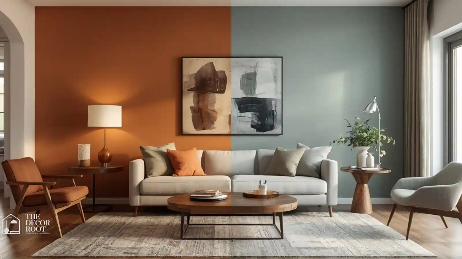
23. Warm terracotta and cool sage combined in an open-concept space
Open floor plans benefit from zoning temperature by function: warm in the kitchen/dining side for appetite and gathering, cool in the living side for relaxation rather than one flat color throughout.
24. Warm brass fixtures under any cool wall color
If you commit to a cool wall palette, warm brass hardware and lighting prevent the room from feeling cold, giving you the calming benefit of cool tones without losing warmth entirely. Warm brass picture lights add exactly this kind of warm accent to a cool room.
EDITOR’S PICK
🛒Warm Brass Picture Lights
Warm brass hardware and picture lights balance cool wall palettes, preventing a cold feel while preserving the calming effect.
(paid link)
Quick Action Plan
- Start with the one room you spend the most waking hours in, and ask honestly whether it currently energizes you or calms you, then check whether that matches what the room is actually for.
- If your home office is painted a warm, stimulating tone but you struggle to focus by afternoon, that’s your first repaint. If your bedroom leans warm and you struggle to wind down, that’s your second.
- You don’t need to overhaul the whole house at once; shifting even one accent wall or swapping bulb temperature can measurably change how a room feels within a single evening.
Frequently Asked Questions
Conclusion
Getting warm and cool right isn’t about picking a trend; it’s about designing each room to support what you actually do in it.
💾 Save this to your Pinterest color psychology board so you can reference it room by room as you repaint.