24 Fall Color Palette Ideas for a Warm Home Refresh
Your living room still looks like July, and that’s the problem. The second the air turns crisp, a house full of cool grays and icy whites starts to feel wrong flat, sterile, out of step with the season outside your window. You don’t need a renovation to fix it. You need the right palette, in the right places, applied with intention instead of guesswork. That’s what this list actually delivers: 24 real, workable fall color combinations you can pull off with paint samples, textiles, and a weekend afternoon. Fall color palette ideas for a warm home refresh are some of the most satisfying home decorating ideas of the year. The seasonal shift from the light, airy palette of summer to the amber, rust, sage, and deep terracotta of autumn allows every room in the home to feel genuinely transformed through the simplest possible changes.
This post contains affiliate links. As an Amazon Associate, I earn from qualifying purchases. If you buy through these links, I may earn a small commission at no extra cost to you.
🍂The Thinking Behind This
Most “fall color” content just tells you to add orange pillows and calls it done. That’s not a palette; that’s a Band-Aid. A real seasonal refresh works because the colors relate to each other: a dominant warm neutral, a rust or terracotta accent, and a grounding deep brown or black, repeated in small doses across a room so the eye reads it as intentional. The palettes below are built that way: each one names the specific shades, where to use them, and what they replace. Pull one that fits your existing furniture and walls, not one that requires starting over. A fall palette refresh extends naturally from the living areas into the bedroom. These fall bedroom color and styling ideas show how the same amber, terracotta, and deep sage that warms a living room creates a bedroom that feels genuinely cosy on cool autumn nights rather than simply decorated for the season.
Refresh Your Home in Fall
A fall color refresh touches every room. Browse all our seasonal decorating ideas to see how seasonal palette shifts work alongside permanent color choices, furniture, and styling to create a home that feels current and considered at every point in the year. The living room is where a fall palette refresh has the most immediate and impactful effect. These transitional fall living room ideas show how the same color shift from airy summer neutrals to warm amber, rust, and deep green transforms the room that the whole household lives in most, making the seasonal change feel genuinely significant rather than cosmetic.
1. Terracotta and Warm Cream

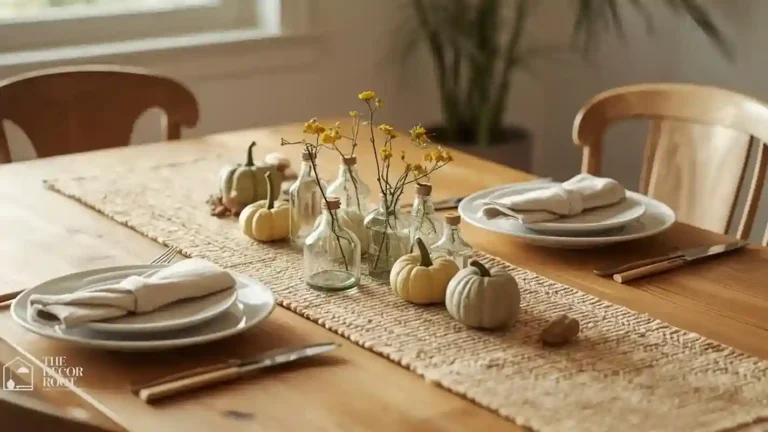
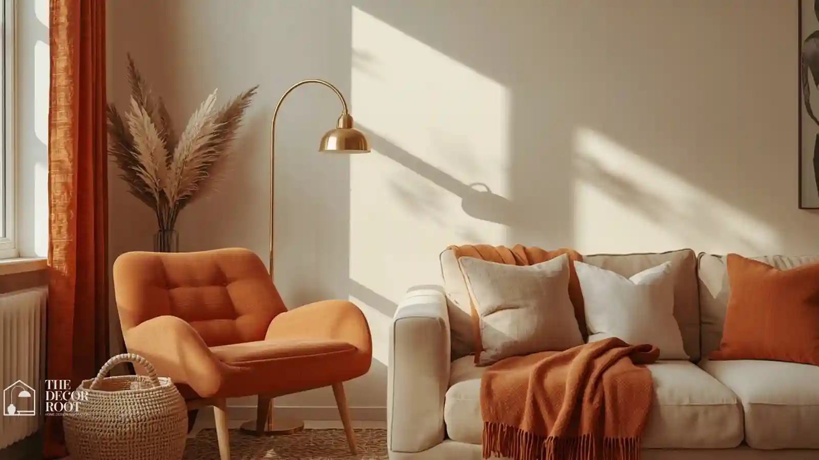
Anchor a room in warm cream on the walls, then bring terracotta in through pillows, a vase, or a single accent chair. This combination reads as sun-baked and Mediterranean-adjacent without tipping into full rustic. It works especially well in living rooms with a lot of natural light, since the cream keeps things from feeling heavy while the terracotta gives it seasonal weight. Try it on a north-facing room that usually reads cold; the warmth compensates for the lack of direct sun. Keep metal accents in brass or gold rather than chrome, which will clash with the softness of this pairing.
2. Rust and Charcoal
This is the moodier cousin of the terracotta palette, built for rooms that already lean dark or dramatic. Rust textiles a velvet throw, a set of dining chairs paired with charcoal walls or furniture create depth instead of gloom. The trick is balance: keep at least one large surface light (a pale rug or ceiling) so the room doesn’t swallow available light. This combination photographs beautifully in dining rooms and home offices where you want a sense of focus and warmth during shorter fall days, without the cheeriness of brighter autumn tones.
3. Amber and Espresso Brown
Amber glassware, honey-toned wood furniture, and espresso-brown upholstery create a palette that feels like golden hour trapped indoors. This works particularly well if you already have medium-to-dark wood floors, since the espresso tones tie directly into what’s already there. Add amber through lighting, glass pendant shades, and candle holders so the color shows up even after dark, when fall evenings get long. Avoid pairing this with cool-white bulbs; warm 2700K lighting is what makes amber tones actually glow instead of looking muddy.
4. Burnt Orange and Cream Linen
Burnt orange is fall’s most literal color, but it only works in small, textured doses think a linen cushion cover or a knit throw, not a full accent wall unless you’re committed. A set of textured throw pillow covers in burnt orange linen against a cream sofa does the job without overwhelming a room. This pairing is especially forgiving in rental spaces where you can’t paint, since it’s achieved entirely through textiles and can be swapped out again once the season changes.
EDITOR’S PICK
🛒Terracotta Throw Pillow Covers
Burnt orange linen pillows against a cream sofa add fall warmth without overwhelming the room, an ideal rental-friendly, seasonally swappable textile approach.
(paid link)
5. Deep Olive and Rust
Olive green has quietly become fall’s stand-in for traditional orange, and pairing it with rust gives you a palette that feels current rather than seasonal-cliché. Use olive on larger surfaces, such as a sofa or curtains, and rust in smaller accents like a table runner or ceramic vase. This combination works especially well in homes that already lean earthy or Japandi-influenced, since both tones sit comfortably in a muted, natural-material palette without introducing anything jarring.
6. Warm Gray and Cinnamon
If you’re not ready to commit to full warm tones, warm gray is the bridge. It reads neutral enough to work year-round but has enough brown undertone to pair naturally with cinnamon accents come fall. Use warm gray for big-ticket items like sofas or walls, then layer in cinnamon through smaller, swappable pieces. This is the safest palette on this list for resale-conscious homeowners who want seasonal warmth without alienating buyers who prefer neutral interiors.
7. Chestnut and Ivory
Chestnut brown paired with ivory creates a palette that leans more traditional and collected than trendy, which makes it a strong choice for dining rooms and studies. The ivory keeps the space from feeling like a hunting lodge, while chestnut in leather, wood, or velvet adds the gravity fall decor needs. This combination ages well; it’s not going to look dated in two years the way some of the brighter, trendier fall palettes might.
8. Golden Mustard and Deep Plum
This is the boldest pairing on the list, and it earns its place because it photographs exceptionally well for Pinterest and social; mustard and plum together read as rich, jewel-toned, and distinctly autumnal in a way softer palettes don’t. Use it sparingly: a mustard accent chair against a plum accent wall, or vice versa, in a room that can handle drama, like an entryway or powder room where you’re not living day-to-day.
What Makes the Difference
9. Camel and Black
Camel-colored furniture or textiles paired with black accents, frames, and hardware, and a coffee table gives a fall palette a slightly more polished, less rustic feel. A ceramic pumpkin decor set in a matte camel or cream finish sits perfectly on a black console table in this scheme, tying seasonal decor into a palette that doesn’t scream “fall” the way orange typically does.
EDITOR’S PICK
🛒Ceramic Pumpkin Decor Set
Camel furniture with black accents offers a refined fall palette, and matte camel or cream ceramic pumpkins on a black console tie in seasonal decor without the typical orange.
(paid link)
10. Sienna and Sage
Sienna’s reddish-brown warmth balances sage’s cool undertone in a way that keeps this palette from feeling either too hot or too cold. It’s a strong choice for kitchens and bathrooms where sage may already exist in cabinetry or tile, since it lets you lean into fall without a full redo; just add Sienna through towels, rugs, or small appliances.
11. Copper and Deep Forest Green
Metallic copper accents against deep forest green walls or furniture create a palette with real visual weight, ideal for rooms you want to feel enveloping rather than airy. This works particularly well in home libraries, offices, or dining rooms used mostly in the evening, when the copper catches lamplight, and the green recedes into a rich, moody backdrop.
12. Honey and Slate Blue
An unexpected but effective pairing: honey-toned wood or textiles softened against slate blue walls or upholstery. The blue keeps this from reading as a stereotypical “fall palette,” which makes it a smart pick if you want seasonal warmth without redecorating a room that’s already built around cooler tones.
13. Toffee and Cream
A softer, lower-contrast palette that works well in bedrooms and nurseries where you want coziness without visual noise. Toffee-brown bedding against cream walls creates warmth that reads as calming rather than bold, and it transitions easily into winter without needing to be swapped out.
14. Paprika and Warm White
Paprika is terracotta’s spicier sibling, slightly more red, slightly more saturated. A rust ombré table runner in this tone against a warm white tablecloth turns a dining table into the seasonal focal point of the room without touching walls or furniture at all.
EDITOR’S PICK
🛒Rust Ombré Table Runner
A rust ombré paprika runner on a warm white tablecloth creates an instant seasonal dining focal point without changing walls or furniture.
(paid link)
15. Walnut and Butterscotch
Two wood-adjacent tones that pair naturally because they share the same undertone family. Use walnut for furniture and flooring you already have, and introduce butterscotch through lighting, glassware, or textiles. This palette is essentially “enhance what’s already there” rather than “add something new,” making it the lowest-effort option on this list.
16. Brick Red and Oatmeal
Brick red has more brown in it than true red, which is what keeps this from reading as a Christmas palette instead of a fall one. Paired with oatmeal-toned textiles, it creates a grounded, slightly rustic look that works well in farmhouse-adjacent homes or anywhere with exposed wood beams or brick.
17. Mahogany and Blush
An unexpectedly elegant pairing: deep mahogany furniture against soft blush textiles or walls. This works because blush has enough warmth to sit comfortably next to mahogany’s red-brown tones, creating a palette that feels more like a boutique hotel than a typical autumn scheme a good pick for primary bedrooms.
18. Ochre and Charcoal Gray
Ochre’s yellow-gold warmth against charcoal gray creates strong contrast that photographs well and reads as confident rather than tentative. This pairing works especially well on accent walls, where ochre paint against charcoal trim or furniture creates a defined, gallery-like feel.
Where This Ties Together
19. Deep Rust and Navy
Navy might seem like a summer color, but paired with deep rust it becomes a rich, sophisticated fall combination think tailored menswear rather than cozy cabin. A warm-tone candle trio in amber and rust scents reinforces the palette through scent as well as sight, which matters more than most people account for when styling a season.
EDITOR’S PICK
🛒Warm-Tone Candle Trio
Navy and deep rust create a refined fall palette, best reinforced with amber and rust-scented candles for a complete sensory seasonal experience.
(paid link)
20. Clay and Vanilla
A gentler, more Southwestern-leaning palette. Clay-toned pottery, textiles, or paint against vanilla walls creates a warm, sun-washed feel that works particularly well in homes with a lot of natural wood and woven textures already present.
21. Bronze and Deep Merlot
Bronze metallics against deep merlot walls or furniture create one of the more dramatic pairings on this list, best suited to formal dining rooms or entryways where you want fall decor to feel elevated rather than casual.
22. Wheat and Espresso
Wheat-toned linens against espresso furniture is a quiet, understated palette that works in almost any room without demanding much attention a strong choice if you want subtle seasonal warmth rather than a statement.
23. Terracotta and Sage Green
Combining two of fall’s most popular individual tones, this palette balances terracotta’s heat with sage’s coolness, working especially well in kitchens or sunrooms with a lot of plant life already present.
24. Cinnamon and Cream Boucle
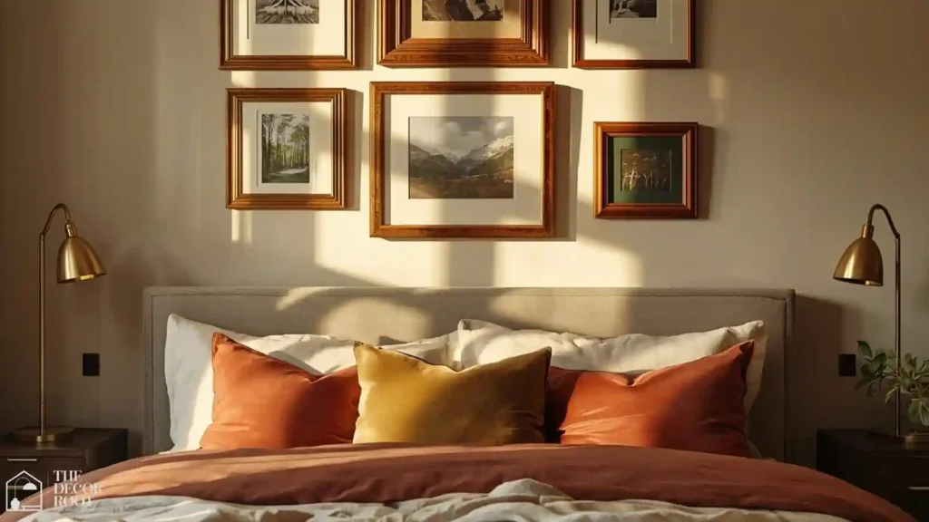
Closing the list with one of the coziest texture-meets-color pairings: cinnamon-toned accents against cream boucle upholstery. A cream boucle throw blanket draped over a cinnamon-toned accent chair captures exactly this feeling and instantly upgrades a room’s texture story for fall.
EDITOR’S PICK
🛒Cream Boucle Throw Blanket
Cinnamon accents with cream bouclé, like a throw on a cinnamon chair, instantly upgrade a room’s fall texture story.
(paid link)
Quick Action Plan
- Start with one room and one palette; don’t try to refresh your whole house at once. Pick a dominant neutral you already have (cream, warm gray, or oatmeal), add one accent color through textiles you can swap seasonally (terracotta, rust, or ochre), and ground it with one deeper tone through a single piece of furniture or a set of frames (espresso, charcoal, or merlot).
- Live with it for a week before adding more; most fall palettes fail not from wrong color choices but from adding too many accent tones at once, which makes a room feel busy instead of warm.
A fall color refresh is essentially an exercise in warm color psychology. These warm color psychology ideas explain the neuroscience behind why amber, rust, and terracotta make a home feel genuinely warmer and more welcoming as the external temperature drops, and how to use that knowledge to choose the specific tones that produce the strongest psychological effect.
Frequently Asked Questions
Conclusion
A fall color refresh isn’t about buying an entirely new set of decor; it’s about choosing 2-3 tones that relate to each other and repeating them with intention across a room you already know how to use. Pick the palette above that matches your existing furniture and light, and build from there.
💾 Save this to your Fall Home Decor board on Pinterest so you can reference these palettes as the season goes on.