23 Color Psychology Ideas for Home Offices That Sharpen Focus
Color Psychology Ideas for Home Offices: You’ve tried the noise-canceling headphones, the productivity app, the color-coded planner, and you’re still staring at your screen at 3 p.m. wondering where the last hour went. Before you buy another productivity tool, look at your walls. The color surrounding you for eight hours a day is either quietly supporting your concentration or actively working against it, and most home offices were decorated for aesthetics alone, with zero thought given to how the color would affect the brain sitting in that chair every single day. Color psychology ideas for home offices that sharpen focus are one of the most return-on-investment home decorating ideas available; the research on how wall colour, desk surface colour, and accent hues affect cognitive performance, working memory, and sustained attention gives home office designers a set of evidence-based tools that most workspace colour choices never use.
This post contains affiliate links. As an Amazon Associate, I earn from qualifying purchases. If you buy through these links, I may earn a small commission at no extra cost to you.
Where to Start Mentally
The colors that support focus and concentration are almost the mirror opposite of the colors that boost appetite or energy in a social space. Cool tones blues, greens, and grounded neutrals lower physiological arousal just enough to support sustained attention, while avoiding the sleepiness that can come with an overly calming bedroom palette. Blue in particular has the strongest research backing for cognitive performance and focus of any color in the spectrum, which is why it dominates this list. The home office and the kitchen share the morning hours, and color psychology affects how well each room supports that transition from waking to working; these color psychology ideas for morning energy show how an appetite-stimulating kitchen palette connects to a focus-supporting office palette for a morning routine that builds momentum rather than draining it.
Color Psychology for Home Offices
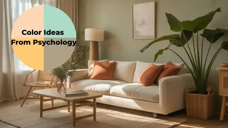
Home office color psychology is one application of a comprehensive body of environmental psychology research; these color ideas from psychology cover how every hue from red to blue affects human performance, mood, and physical state, providing the full theoretical framework behind the specific office color recommendations that follow. The home office and the bedroom form the two ends of the daily performance cycle; the quality of sleep achieved in the bedroom determines the quality of focus available in the office, and the psychological state achieved in the office affects the ease of switching off in the bedroom. These color psychology ideas for the daily performance cycle show how designing both room palettes in relation to each other amplifies the benefits of each colour choice.
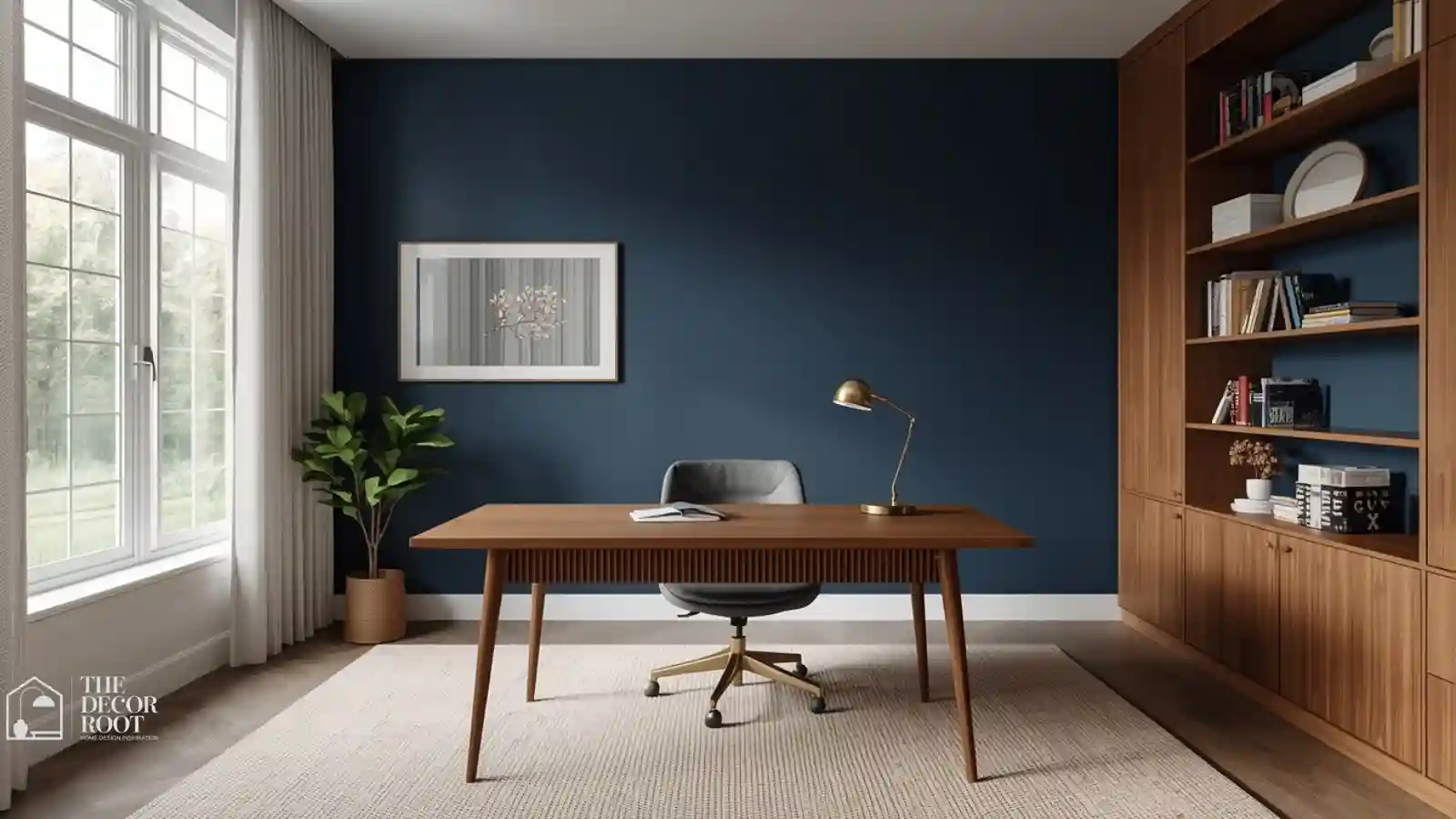
1. Deep Navy Blue
Navy is the single most research-backed color for cognitive focus, largely because blue triggers the release of calming neurotransmitters while still reading as alert and serious rather than sleepy. A full navy wall can feel intense in a small room, so consider it for a single accent wall behind your monitor, where it also reduces screen glare and eye strain. Balance the depth with warm wood furniture and a brass desk lamp so the space feels grounded and professional rather than cold or corporate.
2. Forest Green
Green combines blue’s calming cognitive benefits with an added restorative quality tied to nature exposure, which research consistently links to improved attention span and reduced mental fatigue. A deep forest green works particularly well in offices with a lot of natural light, since the richness of the color won’t wash out under strong daylight the way a paler green might. Add real or high-quality faux plants to reinforce the nature association the wall color is already signaling to your brain.
3. Charcoal Gray
Charcoal is the color equivalent of white noise visually quiet enough that it disappears into the background rather than competing for your attention while you’re trying to concentrate. This is an especially strong choice for anyone easily distracted by visual clutter, since a charcoal backdrop makes everything else in the room (your monitor, your notes, your work itself) stand out more clearly by contrast. Pair with warm brass or wood accents so the room doesn’t tip into feeling cold or uninviting during long work sessions.
4. Slate Blue
A step softer than true navy, slate blue keeps most of navy’s focus-boosting research benefits while feeling slightly more approachable for smaller or darker offices. It’s a strong all-walls option where a full navy might feel too heavy, giving you the cognitive benefit without the visual weight. Slate blue also photographs exceptionally well on video calls, which matters if your home office doubles as a backdrop for virtual meetings.
5. Mossy Sage Green
Sage carries the same restorative, nature-linked focus benefits as forest green but in a softer, more muted register that works well in smaller or lower-light offices. To support the room’s job even further, pair the wall color with an adjustable LED desk lamp, since consistent, glare-free task lighting is just as critical to sustained focus as the wall color itself; the two work together, not separately.
EDITOR’S PICK
🛒Adjustable LED Desk Lamp
Sage offers softer nature-linked focus benefits for low-light offices, and pairing it with an adjustable LED lamp ensures consistent glare-free lighting that works together with the wall color.
(paid link)
6. Cool Dove Gray
A true, slightly cool-leaning gray is one of the most neutral, distraction-free backdrops available for a home office, since it carries almost no emotional charge on its own. This is the safest pick for a shared home office where multiple people with different color preferences need the space to work equally well for everyone. Dove gray also pairs well with literally any accent color, so you can layer in personality through art, plants, or a rug without clashing with the walls.
7. Hunter Green
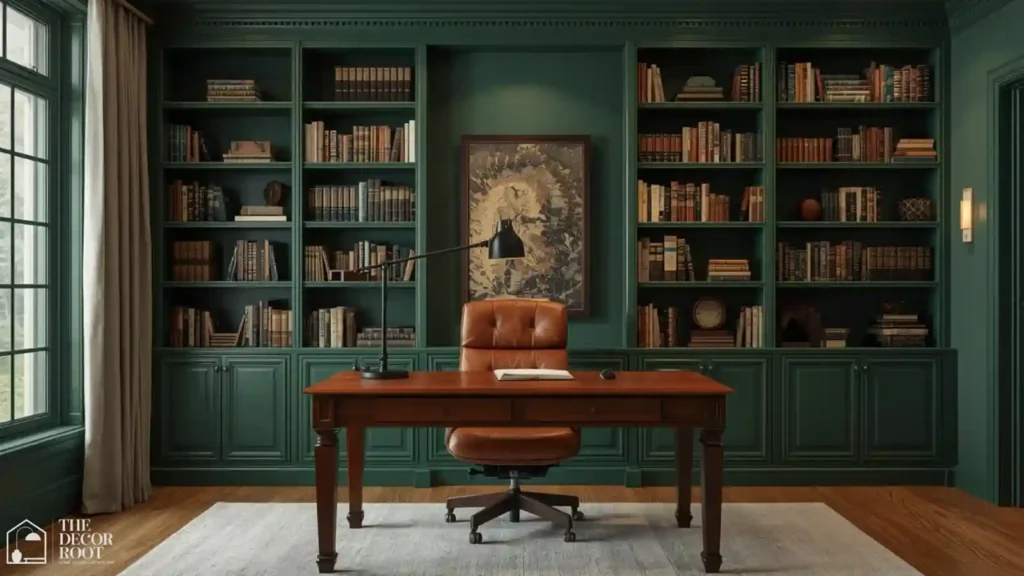
Deeper and more saturated than forest green, hunter green brings a rich, library-like gravitas to a home office that reads as serious and focused rather than casual. It works particularly well in offices with built-in shelving or a lot of books, since the color echoes a traditional study aesthetic that’s long been associated with concentration and intellectual work. Balance the depth with a lighter ceiling color to keep the room from feeling too enclosed.
8. Denim Blue
Slightly warmer and more casual than navy, denim blue keeps the cognitive focus benefits of the blue family while feeling more relaxed and approachable a good fit for a home office that also needs to feel welcoming for creative work, not just administrative tasks. It’s an especially versatile choice for offices used by more than one family member throughout the day, since it doesn’t read as overly formal or corporate.
9. Graphite
Darker and more saturated than charcoal, graphite creates an intensely focused, almost cocooning atmosphere well suited to deep work and minimal distraction. This isn’t the right choice for every personality can feel heavy in a small, low-light room, but for the right worker, particularly one who does their best focused work with fewer visual distractions, graphite removes almost all competing visual stimulation from the environment.
10. Muted Teal
Teal combines blue’s cognitive focus benefits with green’s restorative qualities, giving you a hybrid that supports both sustained attention and reduced mental fatigue during long work sessions. It works especially well as an accent wall behind your desk setup. To fully support long focused sessions in a teal-toned office, invest in an ergonomic mesh office chair, since physical comfort and color psychology work together; no wall color can compensate for a chair that’s actively distracting you with discomfort by hour three.
EDITOR’S PICK
🛒Ergonomic Mesh Office Chair
Teal as a desk accent wall enhances focus and reduces fatigue, but pairing it with an ergonomic mesh chair is essential because color alone cannot compensate for physical discomfort.
(paid link)
11. Warm Taupe
Taupe brings just enough warmth to keep a home office from feeling sterile, while staying muted enough to avoid pulling focus away from the actual work. It’s one of the most universally flattering neutrals on video calls, which matters increasingly as remote and hybrid work make your office background part of your professional presentation. Taupe also works well layered with both cool blue accents and warm wood furniture, giving you flexibility as your style evolves.
12. Deep Steel Blue
A step cooler and more industrial than slate blue, steel blue reads as modern and focused, particularly in offices with metal or glass furniture elements. This shade works well for anyone in a highly analytical or technical field, since the color’s coolness and clarity echo the kind of precise, structured thinking those roles require. Pair with black or brushed metal hardware for a cohesive, modern-professional look.
13. Cool Sage
A cooler, more blue-leaning take on sage than the mossy version earlier on this list, cool sage leans further into the calming, focus-supportive end of the green spectrum. It’s particularly effective in north-facing offices that get cooler natural light throughout the day, since the color harmonizes with rather than fights against the ambient light temperature. This is a strong pick for anyone who finds warmer greens feel a little too cozy and sleep-associated for a workspace.
14. Ink Blue
Darker and more dramatic than navy, ink blue creates an almost library-at-midnight atmosphere that some of the most focused home offices lean into deliberately. Reserve it for offices with strong task lighting, since a very dark wall color needs bright, well-placed light to avoid feeling gloomy rather than focused. Keep your workspace organized to match the intentional feel of the room with a modular desk organizer set, since visual clutter undercuts a focus-oriented color scheme no matter how well-chosen the wall color is.
EDITOR’S PICK
🛒Modular Desk Organizer Set
Ink blue offers a dramatic, library-at-midnight focus for well-lit offices, best supported by a modular organizer since clutter undermines even the best chosen wall color.
(paid link)
15. Pewter Gray
Slightly warmer than charcoal but still solidly in the neutral-gray family, pewter gray gives a home office a polished, professional look without any of the coldness a true cool gray can carry. It’s an excellent choice for offices that also serve as a video call backdrop, since pewter reads well on camera under a wide range of lighting setups. Pair with brass or warm wood accents to keep the overall room from feeling flat.
16. Eucalyptus Blue-Green
This cool, grayed hybrid between blue and green captures the cognitive benefits of both color families at once, making it one of the more scientifically well-rounded choices on this entire list. It works especially well in wellness-minded or creative home offices, where the goal is sustained, calm focus rather than high-intensity, deadline-driven output. Pair with warm wood and woven textures for a grounded, balanced feel.
17. Cobalt Accent
Most of this list leans muted, but a small, controlled pop of a more saturated cobalt blue on a single wall, a bookshelf interior, or furniture can add energy and visual interest without sacrificing the overall calming effect of a mostly neutral room. Use it sparingly, as an accent rather than the dominant color, since full-room saturated cobalt tips from “focused” into “visually loud” quickly.
18. Warm Stone Gray
A gray with just enough warmth to avoid feeling institutional, stone gray is one of the most flexible neutrals for a home office that needs to feel both professional and comfortable for long stretches of time. Ground the space with a low-pile wool area rug in a coordinating neutral tone, since a rug adds warmth and acoustic softness to a home office in a way that hard flooring alone can’t, further supporting the calm-focus atmosphere the color is creating.
EDITOR’S PICK
🛒Low-Pile Wool Area Rug
Warm stone gray offers a flexible, professional neutral for home offices, and pairing it with a wool rug adds warmth and acoustic softness to reinforce the calm focus.
(paid link)
19. Deep Indigo
Richer and slightly more purple-leaning than navy, indigo carries the same cognitive focus benefits with a bit more visual sophistication and depth. It works particularly well in a home office with limited natural light, since the depth of the color can make artificial lighting feel more intentional and cozy rather than harsh. Balance with a lighter desk surface to keep the workspace itself feeling bright and functional.
20. Muted Denim Chambray
Softer and more casual than true denim blue, chambray brings a relaxed, worn-in quality to a home office that can help ease the mental transition into work mode, particularly for anyone whose home office doubles as a guest room or multipurpose space. It’s a forgiving, low-commitment choice for renters who need something removable, like peel-and-stick wallpaper, rather than permanent paint.
21. Cool Sea Glass
A soft, grayed blue-green reminiscent of worn sea glass, this shade carries a quiet sophistication that works particularly well in a smaller home office where a deeper, more saturated color might feel overwhelming. It reflects light gently, helping a compact workspace feel more open than its actual square footage. Pair with warm wood shelving to keep the palette from feeling too cool overall.
22. Deep Olive
Olive’s earthy, grounded quality gives a home office a settled, focused feeling similar to hunter green but with slightly more warmth and versatility. It pairs particularly well with warm leather and brass accents for a study-like atmosphere. Finish the room’s focused, intentional feel with a set of framed minimalist wall art, since curated, calm artwork supports the same low-distraction goal as the wall color rather than adding visual clutter competing for attention.
EDITOR’S PICK
🛒Set Of Framed Minimalist Wall Art
(paid link)
23. Warm Greige
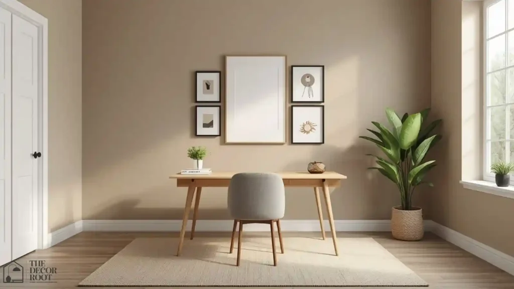
The final color on this list is a flexible, warm-leaning gray-beige that works as a base for nearly every accent color mentioned above, making it the safest starting point if you’re not ready to commit to a bold, saturated hue yet. Greige gives you a genuinely calm, low-distraction backdrop while leaving room to layer in a bolder focus color later through furniture, art, or a single accent wall, making it one of the most practical entries on this entire list for anyone easing into a more intentional home office.
Quick Action Plan
- Start by identifying whether your current office color is warm or cool. If it’s warm and you’ve been struggling to focus, that’s likely part of the problem, since warm tones are inherently more stimulating and social rather than concentration-focused.
- Repaint the wall directly behind or facing your monitor first, since that’s the color your eyes rest on most during the workday, choosing a deep blue, green, or grounded neutral from this list.
- Finish by pairing the new color with strong task lighting and an organized, low-clutter desk setup, since color psychology works best as part of a complete focus-supportive environment rather than a standalone fix.
Color psychology provides the evidence base; these home office color and design ideas show the practical application, translating the research findings on hue and cognitive performance into specific paint colours, accent choices, and material decisions that a real home office can act on immediately.
Frequently Asked Questions
Conclusion
Your home office color is one of the few productivity tools you only have to set up once: no subscription, no daily habit required, just a wall quietly supporting your focus every time you sit down to work. Choose two or three shades from this list that match your existing style, test them under your actual workspace lighting, and give your brain one less thing to fight against during the workday.
💾 Save this post to your Pinterest office board so these focus-boosting colors are ready when you repaint.