25 Color Psychology Ideas for Bedrooms That Improve Sleep
Color Psychology Ideas for Bedrooms: If you’ve repainted your bedroom three times and you’re still lying awake at 1 a.m. scrolling on your phone, the wall color might be working against you before your head even hits the pillow. Color isn’t just decoration; it’s a signal your nervous system reads the second you walk into a room. A bedroom painted in the wrong shade of anything, even a “pretty” one, can keep your brain in low-grade alert mode all night. The right shade does the opposite: it tells your body it’s safe to power down. Color psychology ideas for bedrooms that improve sleep are one of the most practically valuable home decorating ideas available; the research on how hue, saturation, and light temperature affect sleep onset, sleep depth, and morning cortisol levels gives bedroom designers a set of evidence-based tools that most paint choices never access.
This post contains affiliate links. As an Amazon Associate, I earn from qualifying purchases. If you buy through these links, I may earn a small commission at no extra cost to you.
The Real Reason This Works
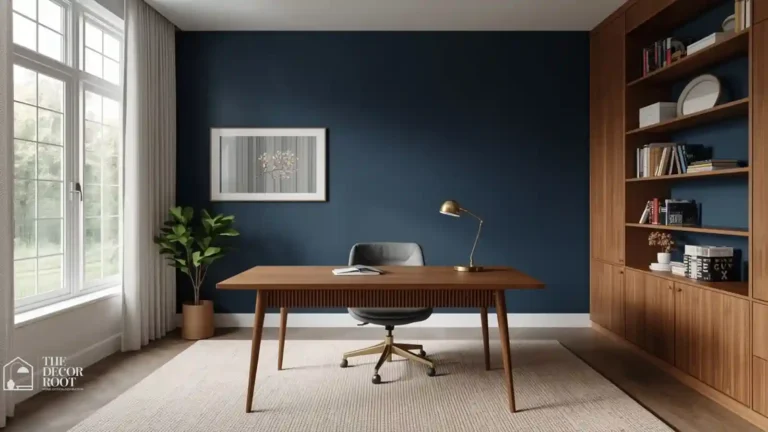
Color affects sleep because your eyes are still processing light and hue even after the lights are off and your eyelids are closed. Ambient color bounces around a dim room and interacts with your circadian rhythm far more than most people realize. Warm, saturated colors like red or bright orange raise heart rate and alertness, which is exactly why they work in a kitchen and exactly why they backfire in a bedroom. Cool, muted, low-saturation tones do the reverse: they lower cortisol, slow breathing, and cue the brain that it’s time to rest. The bedroom and the home office form a daily performance cycle; the colours that promote the deepest sleep in the evening directly affect the quality of focus available the next morning. These colour psychology ideas for daily performance show how designing the bedroom and the office palettes in relation to each other rather than independently produces measurably better outcomes in both rooms.
Unlock Bedroom Color Psychology
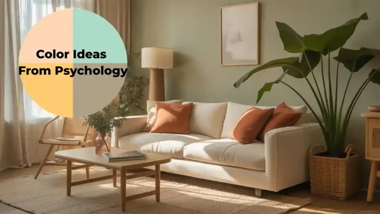
Bedroom colour is one application of a much wider body of colour psychology research; these colour ideas from psychology cover the full spectrum of how hue affects human behaviour, mood, and physiology across every room in the home. The colors that improve sleep in a bedroom and those that create a welcoming atmosphere in a living room overlap significantly; both benefit from warm-toned, low-saturation palettes that lower the nervous system’s arousal level. These color psychology ideas for relaxing spaces show how the same hue principles apply across every room in the home where rest and ease are the primary emotional goals.
1. Soft Powder Blue
Powder blue is consistently the most-studied “sleep color” in interior psychology research, and for good reason: pale blues have been shown to lower blood pressure and heart rate in ways almost no other hue family matches. Use it on the two walls that face your bed rather than all four, since a fully saturated blue box can start to feel cold and clinical instead of soothing. Pair it with warm wood furniture and brass hardware to keep the room from tipping into sterile territory. A linen-look duvet in a slightly darker blue-gray ties the palette together without adding visual noise. This is the shade to reach for if you wake up anxious or with a racing mind, since powder blue’s job is specifically to quiet mental chatter before you even lie down.
2. Sage Green
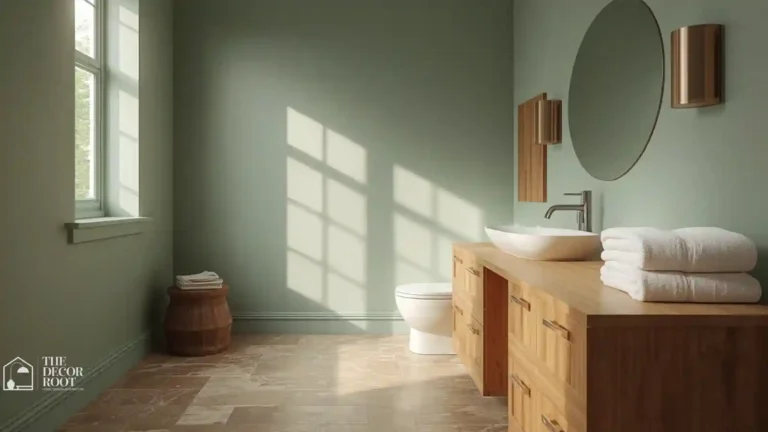
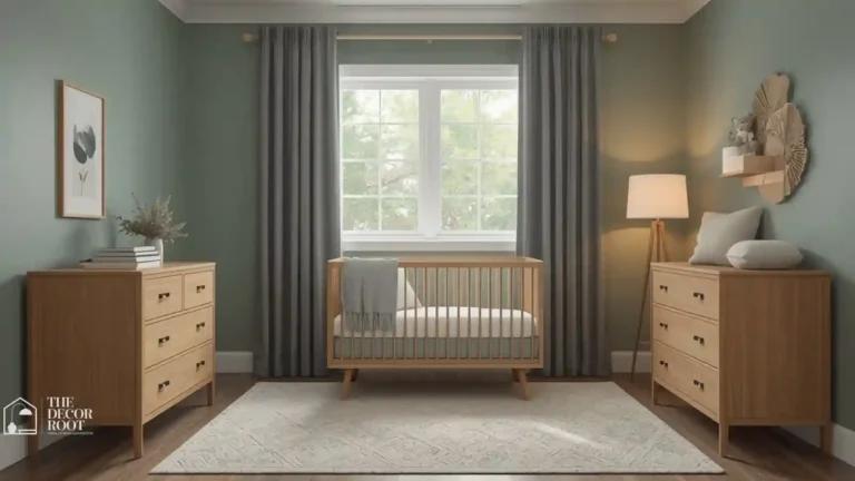
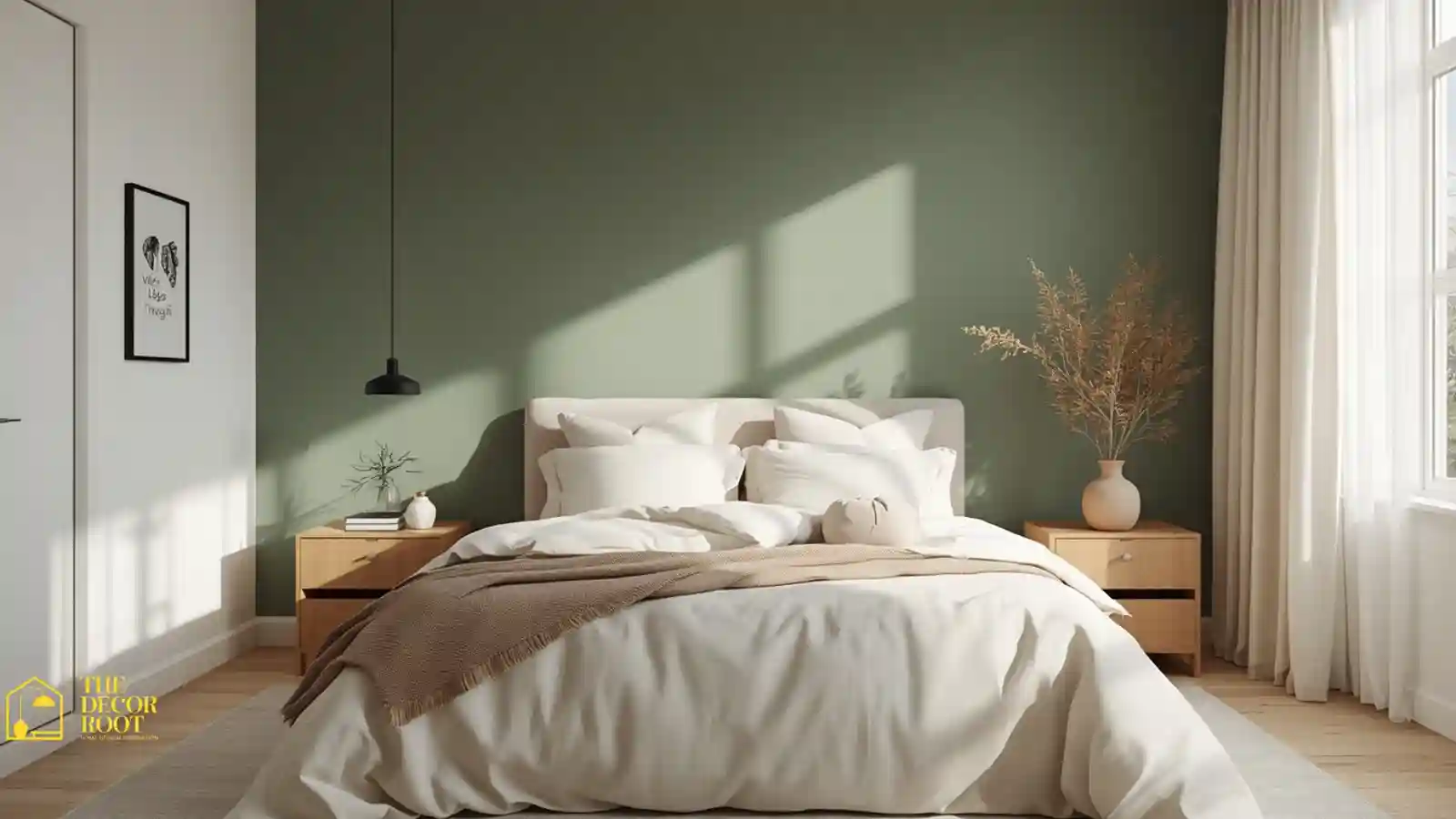
Sage sits right at the intersection of “trendy” and “genuinely restorative,” which is rare. Green is the color the human eye processes with the least effort, so a sage-painted room reads as visually restful the moment you walk in, long before you consciously register why. It also carries a nature association that lowers stress hormones, which is part of why biophilic design leans on green so heavily. Keep the sage muted and grayed-down rather than bright or minty a true sage should look almost dusty. Layer in cream bedding, a jute rug, and one or two real or realistic faux plants to reinforce the nature cue the color is already sending your nervous system.
3. Warm Greige
Greige that gray-beige hybrid every designer has used since 2015 earns its staying power because it’s genuinely low-stimulation without reading as boring or cold the way a stark gray can. It works because it doesn’t force your brain to categorize it as strongly “warm” or “cool,” so there’s less cognitive processing happening every time you glance at the wall. Choose a greige with warm undertones (test swatches at night under lamp light, not just daylight) so it doesn’t drift blue-gray and flat after sunset. This is the safest, most universally sleep-friendly choice if you share a bedroom with a partner who has different color preferences than you.
4. Dusty Lavender
Lavender the scent is famous for promoting sleep, and dusty, desaturated lavender the color carries a similar psychological association, likely reinforced by decades of pairing the two. The keyword is dusty; a bright, saturated purple reads as energetic and even a little theatrical, which is the opposite of what you want at 10 p.m. Go for a grayed lavender closer to a soft heather than a true violet. It pairs beautifully with warm brass lighting and pale wood, and it’s an especially good pick for a bedroom that gets strong afternoon sun, since the cooling effect balances out a warm-lit room.
5. Muted Slate Teal
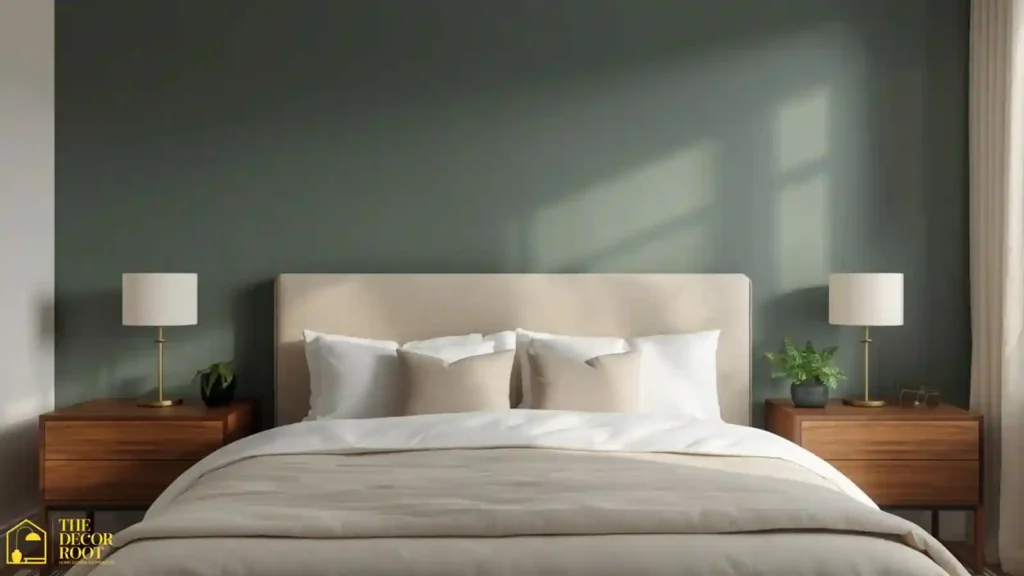
Teal sits between blue’s calming effect and green’s restorative one, giving you a hybrid that reads as deep and grounding rather than sharp or bright. A muted, slate-leaning teal- think the color of an overcast ocean rather than a tropical postcard works especially well as an accent wall behind the headboard, since it visually anchors the bed as the room’s focal point. To fully commit to the room’s job as a sleep sanctuary, layer in a blackout curtain panel set in a matching tone so no streetlight or early sunrise interrupts the calm the wall color is working to create.
EDITOR’S PICK
🛒Blackout Curtain Panel Set In A Coordinating Teal Or Neutral Tone
A muted slate teal accent wall behind the headboard grounds the room with a calm, deep tone, and matching blackout curtains reinforce it as a true sleep sanctuary.
(paid link)
6. Chalky Oat White
Not every sleep-friendly bedroom needs strong color; sometimes the psychology is in what you leave out. A chalky, warm off-white with an oat or wheat undertone avoids the sterile flatness of bright white while still keeping the room visually quiet. This is the go-to choice for small bedrooms where a deeper color might feel closing-in, since light warm neutrals expand a space rather than compress it. Add texture through bedding and a woven headboard instead of color, so the room still feels intentional rather than empty or unfinished. The white linen bedroom is the most widely adopted residential expression of sleep-supporting color psychology; these sleep-supporting bedroom design ideas show why warm whites and natural off-whites consistently outperform cool whites and saturated colours in sleep research, and how the white linen aesthetic instinctively applies that knowledge through material and palette choices that have been proven to work.
7. Dusty Rose
Pink has a reputation as either childish or overly romantic, but a dusty, muted rose closer to clay than bubblegum is a genuinely sophisticated, calming choice. Muted pink tones have been linked in behavioral studies to reduced aggression and lowered heart rate, which is part of why some detention and holding facilities have experimented with “Baker-Miller pink” walls. You don’t need anything nearly that saturated; a soft, grayed rose on an accent wall, paired with warm wood and brass, creates a bedroom that feels warm and enveloping without tipping into stimulating territory.
8. Deep Forest Green
For bedrooms with good natural light and higher ceilings, a deeper forest green can work beautifully as a cocooning, cave-like color that psychologically signals shelter and safety, both of which are prerequisites for deep sleep. This isn’t a color for a small, low-light room, where it can feel heavy instead of grounding. Balance a deep green wall with plenty of warm-toned wood, brass fixtures, and at least one layer of soft white or cream textile so the room doesn’t skew too dark and moody after sunset.
9. Soft Periwinkle
Periwinkle splits the difference between calming blue and gentle purple, giving you a soothing color without reading as cold. It’s an especially good fit for a bedroom used by someone whose mind tends to race at bedtime, since blue-purple hues have shown the strongest correlation with reduced pre-sleep anxiety in color psychology research. Keep the saturation low; a true periwinkle can skew bright and playful, which works in a nursery but not in an adult sleep space. Pair with warm-white trim to keep the palette from feeling too cool overall.
10. Warm Taupe
Taupe is the unofficial neutral of restful bedrooms because it carries just enough warmth to avoid feeling cold, while staying muted enough to avoid feeling stimulating. It’s particularly effective in bedrooms that double as a reading nook or small office corner, since it stays visually calm under both warm lamp light and cooler daylight. To reinforce the room’s rest-first purpose, add a weighted blanket in a matching taupe or cream tone; the combination of a grounding color palette and the physical pressure of a weighted blanket is one of the more evidence-backed pairings for easing anxious sleepers into deeper rest.
EDITOR’S PICK
🛒Weighted Blanket In A Neutral Tone
Taupe’s warm, muted neutrality suits bedrooms and multi-use spaces, and pairing it with a weighted blanket offers an evidence-backed way to promote deeper rest.
(paid link)
11. Misty Eucalyptus
This grayed, blue-leaning green sits between sage and slate teal, and it’s become a favorite in spa and wellness design for a reason: it reads as fresh without being energizing. Eucalyptus works especially well in bedrooms with a lot of natural wood furniture already in place, since the cool undertone balances warm wood rather than competing with it. Use it on the ceiling as a “fifth wall” if you want a subtler effect than a full accent wall; a soft eucalyptus ceiling reads almost like a canopy and adds to the room’s enclosed, secure feeling.
12. Cloudy Dove Gray
A true dove gray, cooler and softer than greige, but nowhere near as stark as a pure gray, is one of the most universally calming neutrals available, largely because it has almost no emotional charge at all. That neutrality is the point: a bedroom with a cloudy gray backdrop gives your brain nothing to process or react to, which is exactly the low-stimulation state you want right before sleep. It’s an excellent base for a monochromatic bedroom where all the visual interest comes from texture: a chunky knit throw, a linen headboard, a wool rug rather than color contrast.
13. Pale Chamomile Yellow
Yellow gets a bad reputation in bedroom design because bright yellow genuinely is too stimulating for a sleep space, but a very pale, chamomile-leaning yellow behaves completely differently. At low saturation, yellow reads as gentle warmth rather than energy, similar to early morning light, which makes it a good choice for bedrooms that feel cold or north-facing. Keep it strictly on the pale end think the color of weak tea, not a highlighter and use it primarily on trim or a single wall rather than throughout the whole room.
14. Muted Clay Terracotta
A dusty, muted terracotta is warmer and earthier than most “sleep colors,” but its grounding, natural association makes it work surprisingly well in a bedroom, particularly for people who find cooler tones like blue or gray sterile rather than calming. Keep the saturation low and lean into the “sun-baked clay” end of terracotta rather than a bright orange-red. This pairing works especially well in a bedroom with southwest or desert-inspired styling, where the color echoes the surrounding landscape and reinforces a sense of belonging in the space.
15. Soft Charcoal
For deep sleepers or anyone in a bright urban environment, a soft, not-quite-black charcoal can be one of the most effective bedroom colors available, since darker walls physically absorb more ambient light and visually shrink a room into a cocoon-like sleep chamber. This isn’t the right pick for every personality; charcoal can feel oppressive to people who need brightness to relax, but for the right sleeper, it removes visual stimulation almost entirely. Add a dimmable bedside lamp so you can control brightness gradually in the evening rather than going from bright overhead light straight to total darkness, which is a jarring transition for the eyes and brain.
EDITOR’S PICK
🛒Dimmable Bedside Lamp
Soft charcoal walls absorb light and reduce stimulation for deep sleepers, best paired with a dimmable lamp to ease the transition from brightness to dark.
(paid link)
16. Warm Ivory
Ivory splits the difference between white and beige, giving you brightness without the coldness of a stark white. It’s a strong choice for bedrooms that need to feel airy and open but still warm and inviting at night under lamp light. Ivory also does an excellent job of reflecting warm-toned lighting, so a room painted this color will look noticeably cozier once the sun goes down and the lamps come on, which is exactly when you need the calming effect most.
17. Dusty Moss
A grayed, muted moss green reads as older and more grounded than a brighter sage, giving a bedroom a slightly vintage, deeply settled feeling. Moss works particularly well in bedrooms with a lot of natural light, since the deeper pigment keeps the room from washing out in strong daylight while still reading as soft and quiet once evening falls. Pair with warm brass and aged wood tones for a bedroom that feels like it’s been lived in and loved rather than freshly staged.
18. Cool Denim Blue
A step deeper than powder blue, cool denim blue carries the same sleep-supportive research backing while giving a bedroom a bit more visual weight and maturity. It’s an especially good choice for a primary bedroom shared by a couple with different style preferences, since denim blue reads as neither overtly feminine nor masculine. Balance it with warm textures: a woven throw, a rattan headboard, warm-toned art so the coolness of the color doesn’t leave the room feeling flat or under-styled.
19. Blush Clay
Softer and pinker than dusty rose but still nowhere near bright pink, blush clay is one of the warmest colors on this list that still qualifies as genuinely calming rather than stimulating. This is a strong option for a bedroom that gets very little natural light, since the warmth compensates for what would otherwise feel like a cold, gray space. Use it on all four walls in a smaller bedroom for an enveloping effect, or on a single accent wall in a larger one to keep the warmth from overwhelming the room.
20. Stormy Blue-Gray
This is the color of an overcast sky right before rain deep enough to feel grounding, blue enough to stay calming, and gray enough to avoid feeling moody or cold. It’s a favorite among designers building bedrooms specifically marketed as “sleep sanctuaries” because it hits every psychological note at once: low stimulation, nature association, and enough depth to feel cocooning after dark. Complete the sensory environment with a 100% cotton sateen bedding set, since breathable, temperature-regulating fabric matters just as much as wall color for actually staying asleep once you’re calm enough to drift off.
EDITOR’S PICK
🛒100% Cotton Sateen Bedding Set
An overcast sky shade that is grounding, calming, and cocooning, favored for sleep sanctuaries and best paired with breathable cotton sateen bedding for temperature-balanced rest.
(paid link)
21. Warm Almond
Almond is a softer, creamier cousin of taupe, with enough warmth to feel cozy but not so much pigment that it reads as a “statement” color. It’s a low-risk, high-reward choice for anyone repainting a bedroom for the first time and unsure how committed they want to be to a bolder hue. Almond also photographs beautifully under both warm and cool lighting, which matters if your bedroom serves double duty for video calls or content creation during the day.
22. Faded Denim Chambray
Lighter and softer than true denim blue, chambray has a worn-in, textile-inspired quality that reads as instantly comfortable rather than crisp or new. This shade works exceptionally well in casual, layered bedrooms with a lot of mixed textiles, quilts, woven baskets, and linen curtains since it acts as a quiet backdrop rather than competing for attention. It’s also one of the more forgiving blues for bedrooms with cooler natural light, since it won’t tip into looking icy the way a brighter blue can.
23. Soft Sandalwood Beige
Warmer and slightly deeper than almond, sandalwood beige brings genuine coziness without sacrificing the low-stimulation quality that makes a color sleep-friendly in the first place. It’s an especially strong fit for bedrooms styled with warm wood tones and leather accents, since the palette stays cohesive rather than feeling like separate design decisions layered on top of each other. This shade also hides shadows and imperfections well, which matters in older homes with less-than-perfect walls.
24. Muted Plum
Plum is the deepest, most saturated color on this list, but a heavily grayed, muted version closer to eggplant than grape carries a rich, cocooning quality similar to charcoal while staying warmer. This is a bold but effective choice for a primary bedroom in a home with otherwise neutral, minimal decor, since it adds personality without sacrificing the room’s core job of promoting rest. To round out the sensory experience, add a ceramic essential oil diffuser with lavender or cedarwood oil, since scent and color together create a stronger pre-sleep cue than either one alone.
EDITOR’S PICK
🛒Ceramic Essential Oil Diffuser
A muted eggplant plum adds rich warmth and personality to a primary bedroom, and pairing it with a lavender or cedarwood diffuser creates a stronger pre-sleep cue than either alone.
(paid link)
25. Cloud Gray-White
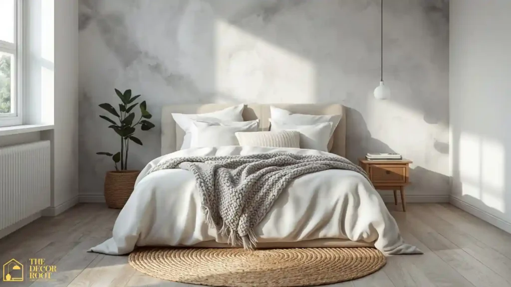
The final color on this list is less a bold statement and more a canvas: a soft, gray-leaning white that reflects light gently rather than harshly. This is the right choice if your bedroom already has strong color elsewhere, like a patterned rug or a wood accent wall, and needs a quiet backdrop rather than another competing hue. Cloud gray-white keeps a small bedroom feeling open while still avoiding the sterile, clinical quality of a pure white, making it one of the most versatile sleep-friendly shades on this entire list.
Quick Action Plan
If you only make one change tonight, start with the wall directly facing your bed, since that’s the color your eyes rest on longest before you fall asleep. Repaint it in a muted blue, sage, or greige from this list rather than trying to overhaul the entire room at once. Add blackout curtains and swap any harsh overhead lighting for a dimmable lamp next, since color psychology only works as well as the lighting conditions let it. Finally, layer in breathable bedding in a tone from the same family as your walls so the whole room reads as one calm, cohesive sleep environment instead of a collection of mismatched decisions.
Frequently Asked Questions
Conclusion
Your bedroom’s color palette is one of the few sleep tools you only have to set up once no app, no routine, no willpower required, just a wall that’s quietly working in your favor every single night. Pick two or three shades from this list that fit your existing style, test them under your actual bedroom lighting before committing, and give your nervous system one less thing to fight against at bedtime.
💾 Loved these bedroom color ideas? Save this post to your Pinterest board so you can revisit it next time you’re planning a repaint.