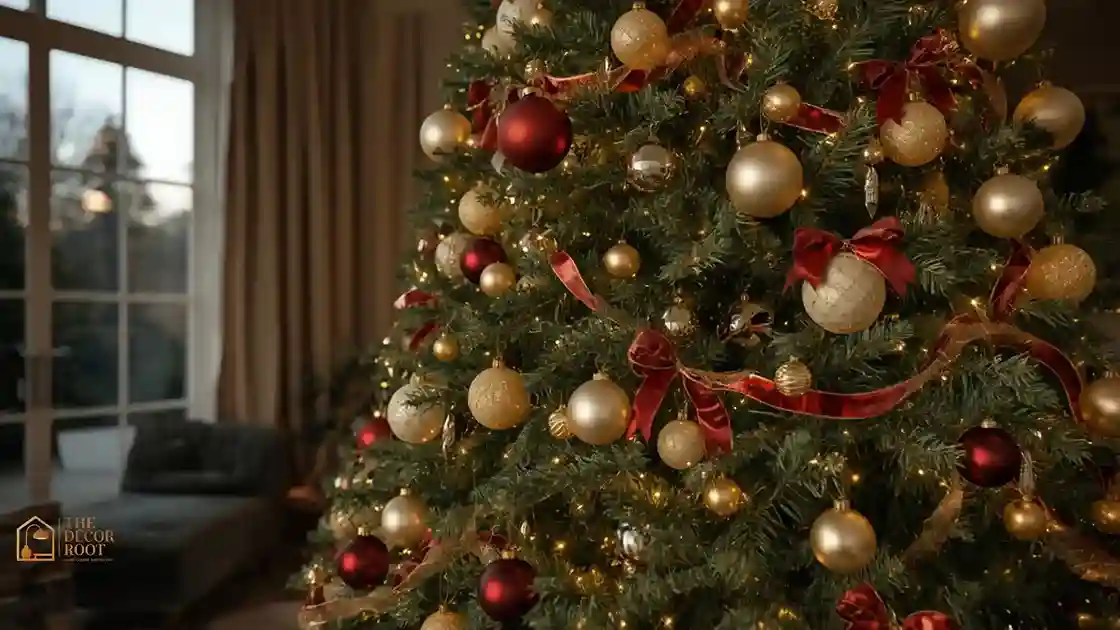
23 Christmas Tree Ideas: Holiday Wow Factor
You know the tree that makes people stop mid-conversation and just stare? That’s not luck. That’s not an unlimited budget either. It’s a handful of deliberate choices: layering, scale, color discipline stacked on top of each other until the tree stops looking “decorated” and starts looking designed. Most trees fall flat for one of three reasons: the lights are too sparse and too flat, the ornaments are all the same size so nothing has depth, or the color palette is trying to do five things at once. This list fixes all three. You’re getting 23 specific, buildable ideas, not vague inspiration, so you can walk up to your own tree this week and actually change something about it tonight.
This post contains affiliate links. As an Amazon Associate, I earn from qualifying purchases. If you buy through these links, I may earn a small commission at no extra cost to you.
🍃 The Real Reason This Works
The trees that get the “wow, who did your tree?” reaction almost always share the same underlying structure: light before ornaments, big before small, and a color story with a hard limit of three to four tones. When you skip the sequencing and just start hanging whatever ornament you grab first, the tree ends up busy instead of rich. Designers build in layers on purpose: lights first to create depth and glow, then large-format pieces (oversized ornaments, picks, ribbon) to establish rhythm, then small accent pieces last to fill gaps. Once you see a tree through that lens, you can’t unsee which trees skipped the steps. The good news: every idea below plugs into one of those three layers, so you can mix and match without worrying about clashing.
23 Christmas Tree Ideas With Serious Wow Factor
1. Layer Three Types of Lighting
A single strand of warm white lights reads flat under a camera and flat in person. Real depth comes from layering: a base layer of warm white mini-lights pushed deep into the branches near the trunk, a mid-layer of slightly warmer LED clusters through the outer branches, and a top accent of thin fairy-light strands draped loosely over the surface. The trunk-deep layer is the one most people skip, and it’s the one that makes the tree glow from the inside instead of just twinkling on the surface. Plan on roughly 100 lights per vertical foot of tree if you’re layering this way; a 7-foot tree wants 700+ total across all three layers. Turn off every other light source in the room when you test it; if the tree still looks a little dim, you need another 100-light strand before you touch a single ornament.
2. Commit to a Three-Color Palette, Not Five
The single fastest way to make a tree look expensive is to cut your color palette down. Pick three colors max say, burgundy, gold, and cream and every ornament, ribbon, and pick has to fit inside that palette. Five or six colors feels generous when you’re shopping but reads chaotic once it’s all on the tree at once, because your eye can’t rest anywhere. If you already own ornaments in ten different colors, don’t panic; sort them into piles by your chosen three tones first, and box up the rest for a different tree or a giveaway. The trees that photograph best for Pinterest almost always trace back to this one discipline move.
EDITOR’S PICK
🛒Warm White Cluster LED Lights
Warm white fairy lights on a dark green cable with 8 modes, memory, 30V low‑voltage safety, and IP44 rainproof rating for indoor/outdoor use.
(paid link)
3. Go Oversized With at Least One Ornament Size
Trees that feel flat almost always use only one ornament size throughout. Break that pattern by adding at least one round of oversized ornaments 4 to 6 inches in diameter spaced every 8 to 10 inches around the tree. These large-format pieces do the visual heavy lifting; they’re what your eye catches first from across the room, while your smaller ornaments fill in the detail once someone walks closer. A common mistake is scattering the oversized pieces randomly. Instead, mentally divide the tree into thirds vertically and place at least two to three large ornaments in each third so the scale reads as intentional rather than accidental.
4. Add a Ribbon Spiral Instead of a Straight Drape
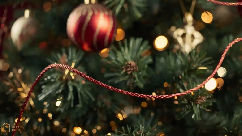
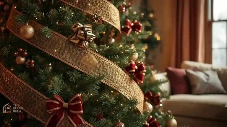
Most people drape ribbon in loose horizontal loops, which can look a little dated. A ribbon spiral winding one continuous length diagonally from the top of the tree to the bottom, following the natural cone shape, reads more current and adds movement the eye follows. Use wired ribbon, so it holds its curve instead of collapsing flat against the branches. Two spirals in complementary widths (one wide, one narrow) going in the same diagonal direction add richness without looking busy, since they’re moving in the same visual direction rather than competing.
5. Use a Tree Collar Instead of a Plain Skirt
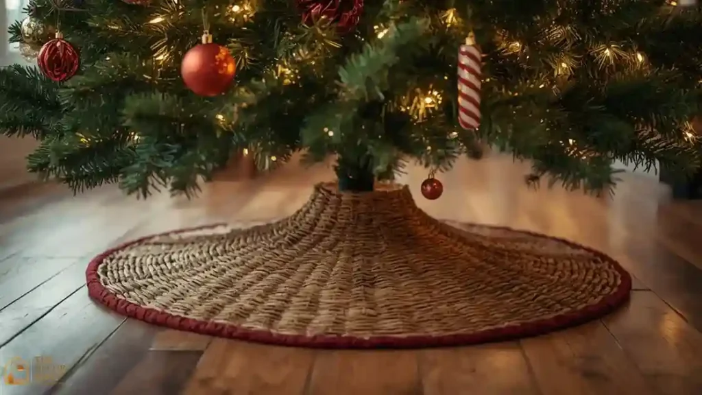
A fabric tree skirt pools flat on the floor and can look like an afterthought. A tree collar, a rigid, often woven or metal container-style base, gives the whole tree a “planted” look, like it’s growing out of something substantial rather than just standing in a room. Wicker, galvanized metal, and wrapped burlap collars in particular photograph well against most home color schemes. If you’re working with a smaller room, a collar also visually shrinks the footprint compared to a wide fabric skirt, since it hugs the tree stand tightly instead of spreading out.
6. Add Faux Botanical Picks for Texture
Ornaments alone can look one-dimensional because they’re all smooth, reflective surfaces. Faux picks eucalyptus stems, pine sprigs, berry clusters, or dried-look wheat stalks add a textural contrast that makes the shiny ornaments pop even more by comparison. Tuck picks deep into gaps between branches rather than laying them on top, angling them slightly outward so they read as part of the tree’s natural shape instead of an obvious add-on. Five to eight picks is usually enough for a 7-foot tree; more than that starts competing with your ornaments for attention.
7. Mix Matte and Glossy Ornament Finishes
A tree covered entirely in glossy ornaments looks plasticky under bright light; one covered entirely in matte looks dull. The wow-factor trees mix both finishes deliberately, usually in a rough 60/40 split favoring whichever finish matches your room’s overall vibe (glossy for a more traditional, high-shine look; matte for a more modern, textured look). The contrast between the two finishes is what actually reads as “layered” from a distance, even before anyone consciously notices why.
EDITOR’S PICK
🛒Oversized Ornament Set
Mix glossy and matte ornaments in a 60/40 split, glossy for traditional shine, matte for modern texture—to create layered contrast instead of plasticky or dull.
(paid link)
8. Build a Focal “Hero Zone” at Eye Level
Instead of spreading your best ornaments evenly, cluster your most striking pieces the ones with the most detail, sparkle, or size into a single band at eye level, roughly the middle third of the tree. This is the zone people actually look at first when they walk into the room, so it’s where your investment should go. The top and bottom thirds can carry simpler, more repetitive ornaments since they get less direct attention. This trick alone is why some trees look curated, and others look like everything was thrown on with equal weight.
9. Add a Ribbon Bow Cascade at the Top
Rather than a single bow near the topper, try a cascading arrangement of three to five graduated bows running down from the top, each slightly smaller than the one above it, with tails left long enough to brush the branches below. This draws the eye downward through the tree in a deliberate line, rather than letting attention scatter. Use the same ribbon as your spiral (Idea 4) so the two elements feel connected instead of like two separate design decisions competing for attention.
10. Use a Statement Topper, Not Just a Star
A plain star or bow topper is fine, but an oversized or unconventional topper a large fabric bow twice the usual size, a spray of faux branches and berries, or a sculptural finial instantly reads as more intentional. The topper is one of the first things a camera catches in any photo of the tree, so it’s worth spending slightly more here than on any single ornament. Keep it in your three-color palette so it doesn’t become the one clashing element at the very top of the tree.
11. Weave a Second Garland Type Through the Branches
Beyond ribbon, consider adding a beaded garland or a faux fur garland threaded through the same branches, positioned to run in the opposite diagonal direction from your ribbon spiral. Two garland types moving in different directions create a subtle woven effect rather than everything sliding the same way. Beaded garland in particular catches light differently than ribbon, adding another layer of sparkle without needing more lights.
EDITOR’S PICK
🛒Wired Ribbon Garland
Thread a beaded or faux fur garland in the opposite diagonal from your ribbon to create a woven effect, with beaded garland adding extra light‑catch without more bulbs.
(paid link)
12. Anchor With a Few Large-Scale Bows Directly on Branches
Beyond the topper and the ribbon cascade, tuck three or four standalone large bows directly onto sturdy inner branches, spaced apart rather than clustered. These act like mini focal points that break up any stretch of tree that’s starting to look repetitive. Choose branches strong enough to support the bow’s weight without drooping- usually branches closer to the trunk rather than the tips.
13. Add Warm Metallic Accents, Not Just Gold
“Gold” is doing a lot of work in most trees, but rose gold, antique brass, and warm copper all read as part of the same metallic family while adding subtle variation instead of one flat gold tone repeated everywhere. Mix two warm metallics rather than one for a richer effect that still photographs cohesively. Avoid mixing warm and cool metallics (gold with silver, for instance) unless that contrast is genuinely part of your palette; otherwise, it tends to look accidental rather than styled.
14. Use Floral or Berry Picks in Clusters, Not Singles
A single berry stem tucked in here and there reads as sparse. Instead, group three to five berry or floral picks together in two or three spots around the tree, creating small “bouquets” rather than scattered individual stems. This clustering trick applies to almost any accent piece on this list; clusters read as intentional, singles read as filler.
15. Choose a Topper That Continues the Ribbon Story
If you’re using a ribbon-based topper, choose one made from the same ribbon as your spiral and bow cascade so the whole tree reads as one connected design rather than three separate ribbon choices layered on top of each other. This kind of small consistency check is often the difference between a tree that looks put-together and one that looks like it was decorated in three different shopping trips.
EDITOR’S PICK
🛒Fabric Bow Tree Topper
Match your ribbon topper to your spiral and bow ribbon for a single, cohesive tree design instead of a mismatched layered look.
(paid link)
16. Add Faux Snow Sparingly at the Tips Only
Flocking the entire tree is a big commitment, but a light dusting of faux snow spray at just the branch tips gives a similar frosted effect without the mess or the full flocking cost. Focus the snow only on the outer six inches of each branch tip; snow closer to the trunk just looks smudged rather than intentional. This works especially well if your palette leans cream or white, since the snow blends rather than standing out as an obvious add-on.
17. Use Picks With Faux Ice or Glass Elements
Faux ice picks, glass icicle ornaments, or crystal-look sprigs add sparkle that behaves differently than metallic ornaments under warm light; they catch light in sharper, more scattered flashes rather than a steady glow. Tuck these in near your lighting layers so the light source is close enough to actually hit them; icy accents in dark, unlit corners of the tree don’t do much work.
18. Create Height Variation With Staggered Pick Lengths
Rather than tucking every pick to the same depth, vary how far each one extends past the branch tip some just an inch or two, others reaching six or more inches outward. This staggered depth creates a more organic, layered silhouette instead of a uniform “fringe” look where everything sticks out the same distance. It’s a small detail, but it’s one of the differences between a tree that looks professionally styled and one that looks assembled from a kit.
19. Choose a Tree Collar That Repeats an Ornament Material
If your ornaments lean heavily toward glass, choose a metal or mirrored collar; if they lean toward fabric or knit, choose a woven or burlap collar. Matching the collar’s material family to your dominant ornament material ties the base of the tree back to everything above it, rather than the collar feeling like an unrelated furniture piece parked at the bottom.
EDITOR’S PICK
🛒Woven Tree Collar
Match your tree collar material to your dominant ornament type (glass → metal; fabric → woven) to keep the base visually connected to the rest of the tree.
(paid link)
20. Add a Few “Surprise” Ornaments Off-Palette
Once your three-color palette is locked in everywhere else, one or two intentionally off-palette ornaments a single unexpected color or shape can act like a punctuation mark rather than a mistake, as long as it’s clearly a deliberate one-off and not scattered throughout. This works best tucked into your hero zone (Idea 8) where people are already looking closely enough to notice and appreciate the surprise rather than reading it as clutter.
21. Use Ribbon as Branch “Ties” for a Bundled Look
Instead of only draping ribbon loosely, try tying small ribbon bows directly around individual branch tips at regular intervals, mimicking the look of a bundled or gathered branch. This is a more subtle, textural use of ribbon than the spiral or cascade, and it works especially well on artificial trees with slightly sparse branch tips, since the ribbon adds visual bulk exactly where it’s needed.
22. Balance the Tree From All Viewing Angles
Most trees only get decorated with the “front” view in mind, which looks great in photos but leaves gaps and bare patches from the side. Walk a full circle around your tree during decorating and make sure every angle has at least some lights, ornaments, and one accent piece. You don’t need identical coverage on all sides, but no side should look like it was skipped.
23. Finish With a Final “Squint Test”
Step back ten feet, squint your eyes slightly so details blur, and look at the overall shape and color balance of the tree. Squinting removes the distraction of individual ornaments and shows you where the color, light, or scale balance actually breaks down: a bare patch, a color cluster that’s too heavy on one side, a section that’s too dim. This is the step almost nobody does, and it’s the fastest way to catch problems before guests do.
For more ways to make a smaller tree feel just as dramatic, our guide to 21 Small Christmas Tree Ideas for Tight Living Rooms breaks down scaled-down versions of several of these same layering tricks.
Quick Action Plan
- If you only have an hour this weekend, don’t try all 23 at once.
- Start with the three that change the most for the least effort: fix your lighting layers first (Idea 1), lock in a three-color palette and box up anything outside it (Idea 2), and add one round of oversized ornaments spaced evenly around the tree (Idea 3).
- Those three moves alone typically transform a flat tree into a noticeably richer one, and everything else on this list– ribbon spirals, collars, hero zones– builds naturally on top of that foundation once it’s in place.
Frequently Asked Questions
Conclusion
A tree with real wow factor isn’t about spending more; it’s about sequencing what you already have (or plan to buy) in the right order: light, then scale, then color, then texture. Pick two or three ideas from this list that fit your current tree and your current budget, and build from there next season.
💾 Save this to your Christmas Tree Ideas board on Pinterest so you can pull it back up while you’re decorating this week.