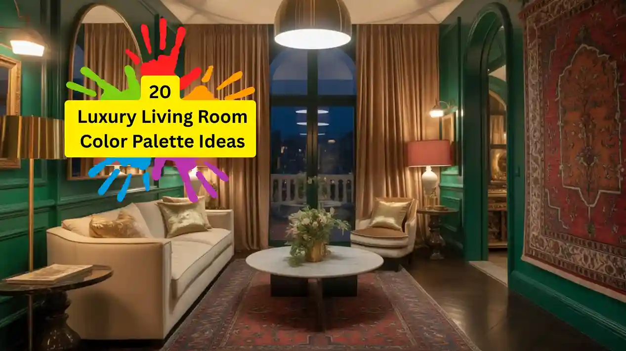
20 Luxury Living Room Color Palette Ideas That Make Every Room Look, Designer
Color is the single most transformative tool in interior design, and when used with intention, it’s what separates a pleasant room from a truly extraordinary one. A thoughtfully chosen luxury living room color palette communicates sophistication, comfort, and design intelligence before a single piece of furniture is even considered. These aren’t just about dark walls and velvet sofas (though we love both). They’re about the precise relationships between tones, the interplay of warm and cool, and the way a palette makes you feel the moment you step into a room. Here are 20 designer-approved palettes to inspire your next transformation. Behind every great palette is the intention to understand color psychology for home interiors, which explains why certain hues feel calm, energizing, or grounded, and how to use that knowledge, room by room.
What Makes a Color Palette Feel Truly Luxurious
The difference between an expensive-looking room and an ordinary one often comes down to palette construction rather than the price tag of individual items. Luxury palettes share several characteristics: they typically feature a dominant neutral that serves as a sophisticated base, one or two accent colors with genuine depth or complexity, and a metallic or textural element that catches and reflects light. They avoid jarring contrast in favor of tonal harmony, and they always include at least one unexpected choice that elevates the whole arrangement from predictable to memorable. Explore all our interior decorating ideas to see how color works alongside furniture arrangement, lighting, and texture for a fully cohesive room.
Why This Matters
Your living room is the primary social and restorative space in your home where you host guests, relax as a family, and spend the largest proportion of your leisure time. The color palette of this room has a profound daily impact on your mood, your perception of your own space, and the impression your home makes on everyone who enters it. Investing thoughtful attention in a luxury living room color palette is one of the highest-return decisions you can make in home design, often without any major renovation expenditure. Getting color right is the single most powerful home decorating idea you can act on. A well-chosen palette makes even budget furniture look intentional and expensive.
20 Luxury Living Room Color Palette Ideas
1. Midnight Navy, Champagne, and Warm Brass

The ultimate sophisticated masculine palette: navy-painted walls (try Farrow & Ball’s “Hague Blue”) anchored by champagne-colored linen sofas and warm brass hardware, lighting, and accessories. The cool depth of the navy makes the warm champagne and brass glow like candlelight. Add a Persian or Turkish rug in ruby and ivory for the final layer of opulence. This luxury living room color palette works equally well in period homes and contemporary open-plan spaces. Luxury interior paint brands offering deep, complex navy tones: Farrow & Ball, Benjamin Moore Historical Collection, and Clare Paint
2. Ivory, Warm Camel, and Rich Cognac
A tonal, all-warm palette built from the softest ivory through caramelized camel to deep cognac leather creates an enveloping, cashmere-soft atmosphere. This palette draws inspiration from the great suites of European design hotels. Use ivory on the walls and ceiling, camel in upholstered seating, and cognac in a leather armchair, coffee table books, and curtain tiebacks. The result is warm, sophisticated, and effortlessly refined.
3. Deep Forest Green and Antique Gold
One of the most beloved luxury living room color palettes of the decade: deep, slightly muted forest green walls paired with antique gold and warm brass fixtures. This palette has an almost Pre-Raphaelite richness to it, lush, deep, romantic, and vaguely nostalgic. Use large-format botanical prints in gilded frames, velvet sofas in a complementary moss tone, and antique brass floor lamps. Layer in cream and warm white for lightness.
4. Warm Terracotta, Cream, and Dusty Blush
A palette deeply rooted in Mediterranean and Middle Eastern design traditions, warm terracotta walls (matte finish for maximum softness) with cream linen upholstery, dusty blush accent cushions, and ceramics. This palette is the definition of effortless warmth: it’s never cold, never stark, and always welcoming. Add hand-woven kilim rugs, natural rattan accents, and terracotta planters for a cohesive desert-warm aesthetic.
5. Luxury Living Room Color Palette: Sage, Stone, and Soft Black
A sophisticated, cool-neutral palette with architectural restraint. Sage green on the walls (matte, softly grayed), warm natural stone in the floor and side tables, and a single black element, a lacquered coffee table, a black picture frame grouping, or a velvet black accent chair. This palette is deeply Japandi in spirit: calm, precise, and beautiful in its simplicity. It’s genuinely luxurious without a single overtly “expensive” material.
6. Blush Marble, Powder Pink, and Warm Rose Gold
A palette for romantic maximalism: inspired by the interiors of great Parisian salons and modern luxury boutique hotels. Powder pink on the walls, blush marble on surfaces, and rose gold metallic accents throughout in lamp bases, decorative objects, and hardware. This palette requires restraint in pattern let the color do the work. White plasterwork details and ivory silk cushions prevent it from becoming cloying.
7. Slate Blue, Putty, and Natural Linen
A quiet luxury palette with Scandinavian roots and timeless appeal. Slate blue, neither too saturated nor too pale, on a feature wall or all four walls, paired with putty-colored upholstery and natural linen curtains. The palette feels curated and expensive without a single dramatically priced element. Add warm rattan, bleached oak, and dried botanical arrangements for a complete coastal-Nordic aesthetic.
8. Chocolate Brown, Ivory, and Warm Amber
Deep, cocoa-brown walls represent one of the most daring and rewarding choices in the luxury living room designer’s toolkit. Against ivory upholstered pieces and warm amber-toned lighting (warm Edison or saffron-tinted glass pendants), the brown reads as rich, enveloping, and genuinely sensuous. This palette performs best in rooms with decent natural light; in darker rooms, use a mid-toned mocha rather than deep chocolate to avoid heaviness.
9. Luxury Living Room Color Palette: Inky Teal and Burnished Copper
An unexpected and utterly striking palette: deeply saturated teal somewhere between blue and green paired with burnished copper accents. This combination has a glamorous, adventurous quality reminiscent of the greatest Art Deco interiors. Copper-toned table lamps, a burnished copper tray on the coffee table, and teal velvet upholstery pulled together with a cream area rug. For restraint, keep the ceiling white and the woodwork warm ivory.
10. Greige, Warm White, and Whisper Gold
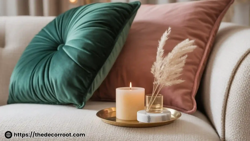
The foundational neutral palette is done at a luxury level. Greige, a perfect blend of gray and beige, is the workhorse of high-end interior design because it reads differently in different lights (cooler in morning north light, warmer in evening lamplight) and harmonizes with virtually everything. Pair with warm white on ceilings and woodwork, and introduce whisper gold accents, not brash metallic, but a quiet, dusty gold in textiles and accessories. Luxury velvet and boucle throw pillows and cushions in deep jewel tones and neutrals are the fastest way to update your living room color palette.
11. Dusty Mauve and Warm Charcoal
Dusty mauve is the interior design color story that keeps giving. It’s sophisticated in a way that pink never quite is, drier, more complex, sitting closer to gray or taupe on the spectrum. Paired with warm charcoal furniture and walls, and punctuated by warm brass and cream accents, it creates a palette that feels genuinely adult and designer-crafted. Use a statement mauve boucle sofa against charcoal walls for the most impactful version of this palette.
12. Saffron Yellow, Deep Plum, and Warm Ivory
A bold, jewel-toned palette with roots in Mughal and Persian design traditions. Saffron yellow walls bring warmth and light; deep plum velvet in cushions and occasional chairs provides the dramatic accent; warm ivory balances both. This palette is an act of confident, culturally-rooted design that creates a living room that genuinely feels like nowhere else. Add hand-knotted silk rugs and intricate brass lanterns for maximum impact.
13. Smoky Lilac and Warm Stone
Lilac, in its dusty, muted form, is one of the most underused colors in luxury interior design. Against warm Portland stone or natural travertine surfaces, it creates a palette that is simultaneously feminine and architectural, never saccharine. This palette works particularly well in light-filled rooms where the smoky quality of the lilac shifts beautifully throughout the day. Introduce warm walnut wood tones and aged brass to ground the palette.
14. Luxury Living Room Color Palette: All-White Tonal
All-white done at a luxury level is not simply the absence of color; it’s a masterclass in texture, finish, and tonal variation. Combine matte plaster walls in warm white, glossy white lacquered trim, sheer white silk curtains, ivory boucle upholstery, and cream wool rugs. The variety of white finishes creates depth and visual interest while maintaining serenity. This palette is transformative in rooms with beautiful natural light.
15. Rich Burgundy and Dusty Gold
A palette with the opulence of a Venetian palazzo: deep burgundy walls in a matte or eggshell finish, dusty antique gold in curtains, mirror frames, and accessories, and warm ivory in upholstery. It takes confidence to commit to burgundy, but the reward is extraordinary: a room that feels genuinely grand. Layer Persian rugs, tasseled cushions, and glass-fronted cabinetry for a complete, maximalist luxury effect.
16. Olive and Natural Oak
An earthy, nature-grounded palette with a distinctly contemporary luxury feel: deep olive green on walls and textiles, natural oak floors and furniture, raw linen upholstery, and simple ceramic accessories in cream and warm brown. This palette has the quality of a beautifully curated wabi-sabi home, imperfect, natural, and deeply restful. It photographs particularly well with natural afternoon light.
17. Muted Cobalt and Warm Sand
Cobalt blue at full saturation is arresting; in its muted form, softened with grey, it becomes something more refined and livable as a luxury living room color palette base. Warm sand tones in natural fiber rugs, linen upholstery, and oak furniture balance the cool blue without draining its impact. Add warm gold lighting and a single statement cobalt blue velvet sofa for a palette with genuine personality.
18. Ebony, Cream, and Metallic Bronze
High contrast done luxuriously: near-black (very dark charcoal or ebony) walls with cream upholstery and rich metallic bronze, not gold, not copper, but the specific warmth of aged bronze in lamps, frames, and decorative objects. This is the palette of great London private members’ clubs and Milanese design hotels. It requires the bravery to commit to dark walls, but the result is a room of exceptional sophistication.
19. Dusty Sage, Warm Blush, and Aged Brass
A softer take on luxury that remains distinctly sophisticated: dusty sage green with its grey undertone kept prominent, pairs with muted warm blush in textiles and aged (not shiny) brass in hardware and decorative accents. This palette is particularly suited to homes with a slower, more mindful aesthetic, Scandinavian, Japanese, or organic modern. Introduce natural materials throughout: jute, linen, raw ceramics, and dried botanicals.
20. Aubergine, Warm White, and Antique Silver
Closing with a palette of genuine drama and restraint: aubergine, the richest, darkest plum on a feature wall or all four walls, with warm white upholstery and trim and antique silver (not chrome, but aged, slightly dulled silver) in mirror frames, candlestick holders, and accessories. The combination of deep aubergine and cool silver has an almost nocturnal elegance, a palette made for long evenings of conversation, candlelight, and memorable hospitality. Premium area rugs in luxury colors and window treatment sets, designer-quality options to anchor and complete your luxury living room color palette
Quick Action Plan
This Weekend:
- Identify the mood you want your living room to convey: calm, dramatic, romantic, serene, or bold.
- Select 2–3 palettes from this list that resonate with your instinct.
- Order paint samples and fabric swatches, never commit to color without seeing it in the actual room, in actual light.
- Take a photograph of your current room and overlay your chosen colors using a digital tool or Pinterest board.
If your living room has a fireplace, it anchors the color palette by default. These fireplace color and surround ideas show how to build a scheme around the focal point rather than fighting it.
This Month:
- Begin with the largest surface: the wall color. Everything else follows.
- Introduce accent colors through the most affordable route first: throw pillows and accessories.
- Upgrade to larger investments (sofa, rug, curtains) once the core palette is confirmed.
FAQs
Conclusion
A truly beautiful luxury living room color palette is less about expensive materials and more about confident, informed color choices. From the inky drama of midnight navy and brass to the hushed sophistication of dusty sage and aged brass, these 20 palettes offer a route to a living room that feels genuinely designer-crafted regardless of budget. Pin this post to save your favorites and return to it every time inspiration strikes. A cohesive home starts with connecting interior and exterior palettes. These exterior color palette ideas show how to carry your living room’s color story through to the facade.
This post contains affiliate links. If you purchase through them, I may earn a small commission at no extra cost to you.
📌 Save this post to your Pinterest luxury home decor board. These are palettes worth revisiting every season!