25 Color Psychology Ideas for Nurseries That Calm Babies
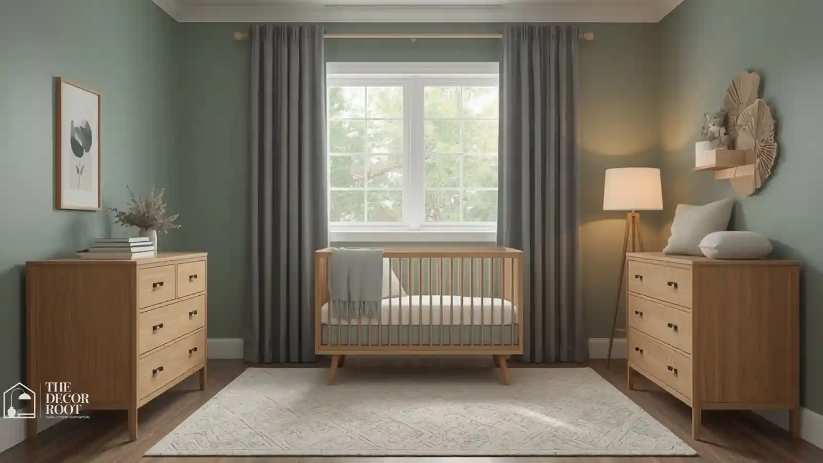
Color Psychology for Nurseries: You can spend hours on a nursery mood board and still end up with a room that looks adorable in photos but somehow makes bedtime harder, not easier. That gap usually comes down to one thing: choosing colors for how a room photographs instead of how it functions at 2 am. Babies are more visually and physiologically sensitive to color intensity than adults, which means the “cute but stimulating” palette that works in a living room can actively work against sleep in a nursery. These 25 ideas are chosen specifically for what calms an infant’s nervous system, not just what trends on a nursery mood board. Color psychology ideas for nurseries that calm babies are one of the most research-supported home decorating ideas available for a new baby’s room; infant color perception, developmental psychology, and sleep science converge on a very specific set of palette recommendations that are almost the opposite of the bright, primary-color nurseries that dominated baby room design for most of the twentieth century.
This post contains affiliate links. As an Amazon Associate, I earn from qualifying purchases. If you buy through these links, I may earn a small commission at no extra cost to you.
Where to Start Mentally
Before picking a single swatch, it helps to separate “cute” from “calming,” because they aren’t always the same thing. Saturated brights, high-contrast patterns, and busy accent walls stimulate a baby’s still-developing visual system, which can make settling harder regardless of how charming the room looks in a photo. Muted, low-saturation tones dusty blues, soft sage, warm neutrals, gentle blush support the calm state you’re trying to build at bedtime. Start by mentally splitting the room into a “daytime play zone,” where slightly more stimulation is fine, and a “sleep zone,” where the crib wall and surrounding palette should stay as low-saturation as possible. A nursery and an entryway share a specific design requirement: both need to create a particular emotional state the moment someone enters the room. These mood-setting color ideas for the home show how the same color psychology principles that help an entryway create the right first impression help a nursery create the right arrival experience for a baby transitioning from wakefulness to sleep.
Apply Nursery Color Psychology
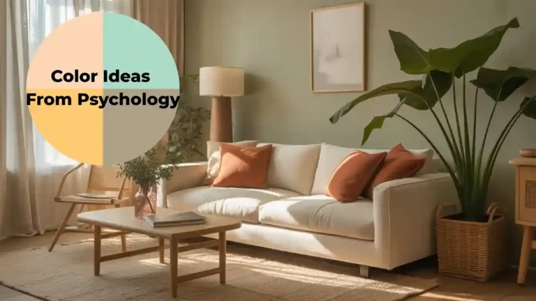
Nursery color psychology draws on infant developmental research as much as adult environmental psychology; these color ideas from psychology provide the foundational framework showing how color affects human physiology and mood across every life stage, including the developmental stages of early infancy where the effects are most pronounced. A spa-like bathroom and a calm nursery require almost identical palette decisions; both need colors that lower physiological arousal, support the parasympathetic nervous system, and create an environment of safety and ease. These calming color palette ideas show how the muted, low-saturation tones that make a bathroom restorative for adults create the same neurological calm in a baby’s developing nervous system.
1. Soft sage green as the primary wall color
Muted sage is one of the most consistently recommended nursery colors because it’s calming without being cold, and it works for any gender without leaning into traditional pink-or-blue defaults.
2. Dusty blue on a single accent wall behind the crib
Placing the calmest, most muted color directly behind the crib where a baby’s eyes land most during feeding and settling has more functional impact than scattering color evenly across the room.
3. Warm cream instead of stark white for the base palette
Stark white nurseries can look sterile in photos and read as visually flat in person; warm cream keeps the room bright without losing coziness.
4. Blackout-effect deep navy behind the crib, used sparingly
A small navy accent, not a full wall, paired with proper blackout curtains reinforces a “this is where sleep happens” visual cue without overwhelming a small room. Blackout curtain panels do double duty for both light control and color psychology.
EDITOR’S PICK
🛒Blackout Curtain Panels
A small navy accent with blackout curtains cues sleep in a small room, handling both light control and color psychology.
(paid link)
5. Muted blush pink instead of bright bubblegum pink
If you want pink, a muted, grayed-down blush keeps the calming benefit of pastels without the overstimulation of a fully saturated hue.
6. Soft periwinkle for a gender-neutral cool palette
Periwinkle splits the difference between blue and lavender, giving a cool, calming base that doesn’t default to traditionally gendered blue.
7. Warm oatmeal on the ceiling
A warm, slightly warm-toned oatmeal ceiling (rather than stark white) softens overhead brightness, which matters since babies spend much of their time in a nursery looking straight up. Nursery color psychology and nursery color ideas are complementary resources; these nursery color and soothing ideas show the specific hues and combinations that developmental research identifies as most calming for babies, translating the general principles of color psychology into concrete paint choices, fabric selections, and accent decisions for a real nursery.
8. Pale eucalyptus on cabinetry or a dresser
Painting furniture rather than walls is a lower-commitment way to bring a calming tone into a rented nursery or one you don’t want to fully repaint.
9. Warm 2700K nightlight instead of cool-white
Light temperature matters as much as wall color for nighttime calm; a warm nightlight avoids the alerting effect cool-white light has on melatonin production. A warm nightlight with dimmer lets you control both brightness and warmth.
EDITOR’S PICK
🛒Warm Nightlight With Dimmer
A warm dimmable nightlight controls brightness and warmth, avoiding the alerting effect of cool light on melatonin, as important as wall color for nighttime calm.
(paid link)
10. Soft celadon green for a shared sibling nursery
In a shared room, a single unifying muted green avoids the visual competition that happens when two separate “boy” and “girl” palettes get combined.
11. Dusty lavender for a calming reading corner
A dusty, muted lavender in a nursery reading nook supports the winding-down association parents build through a bedtime story routine.
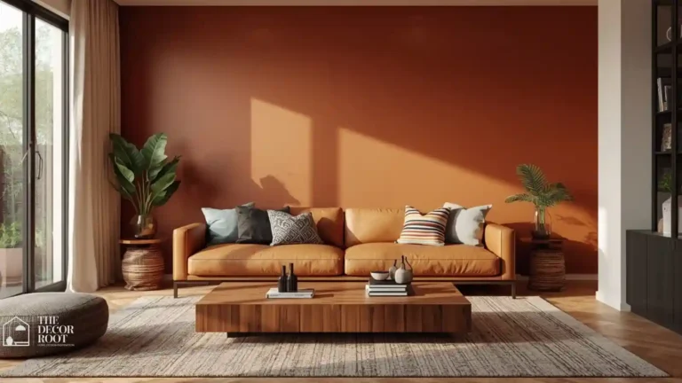
12. Warm terracotta used only as a small accent, not a wall
Warm, saturated tones like terracotta can add personality through a single frame, rug, or pillow without overstimulating a full wall.
13. Cool sage on closet interiors
Painting the inside of a nursery closet the same muted tone as the walls keeps the whole room visually continuous when the closet door is left open, which it usually is during diaper changes.
14. Soft sage muslin swaddles and crib textiles
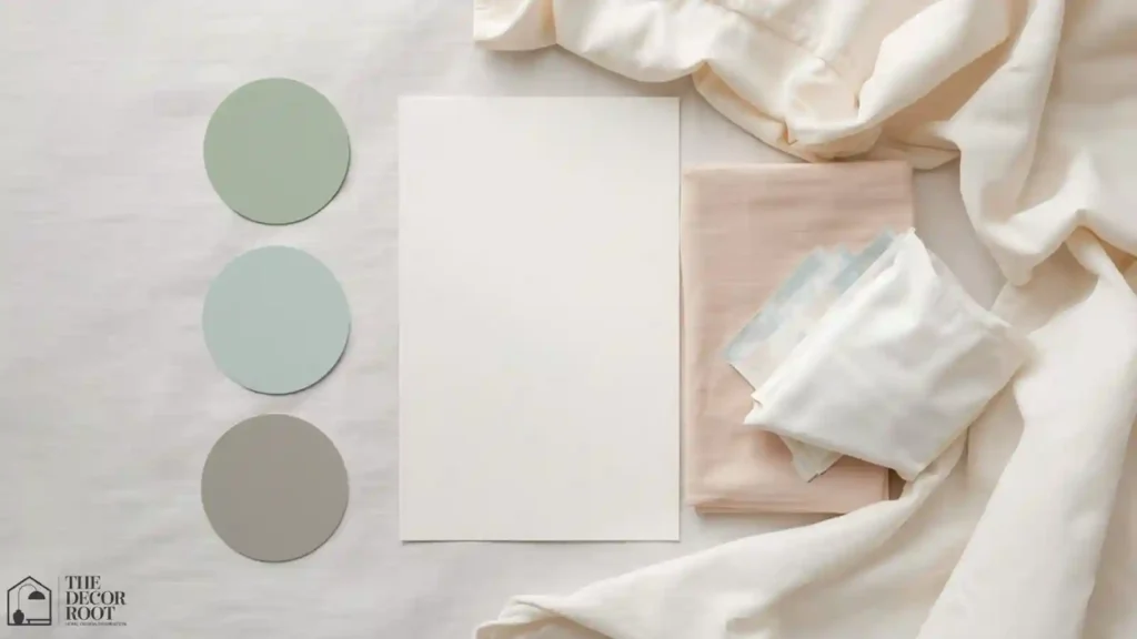
Extending the wall’s calming tone into swaddles and sheets reinforces the palette in the one place a baby is in closest visual contact with it. A muslin swaddle set in sage matches this exactly.
EDITOR’S PICK
🛒Muslin Swaddle Set In Sage
A sage muslin swaddle set extends the wall’s calming tone to the baby’s closest visual field, reinforcing the palette exactly.
(paid link)
15. Warm honey wood tones for crib and furniture
Warm wood furniture against a cool or muted wall color reintroduces coziness the same way it does in bathrooms and bedrooms, preventing an all-cool nursery from feeling clinical.
16. Pale gray-green for a nursery with north-facing light
North-facing nurseries lose warmth from natural light all day; a pale gray-green with a slight warm undertone compensates without needing a fully warm palette.
17. Soft dove gray as a neutral base for a maximalist family
For parents who want pattern and print elsewhere, dove gray walls give a calm base the eye can rest on between busier elements like a patterned rug or mobile.
18. Warm apricot in very small doses on a mobile or wall art
A single warm accent object, never a full wall, gives visual interest during awake, play-focused hours without disrupting the sleep-focused palette.
19. Layering warm light with white noise for full sensory calm
Color psychology works best paired with matching auditory cues; combining warm nightlight tones with consistent white noise reinforces the same calm-down signal on two senses at once. A white noise machine with warm light combines both in one device.
EDITOR’S PICK
🛒White Noise Machine With Warm Light
A white noise machine with warm light reinforces calming signals through both sight and sound, combining two sensory cues in one device.
(paid link)
20. Muted seafoam for a nursery doubling as a playroom
Seafoam holds enough energy for daytime play while staying muted enough not to work against naps in the same room, which matters in smaller homes where one room serves both purposes.
21. Warm ivory trim instead of bright white
As in other rooms, warm ivory trim against a muted wall color avoids the high-contrast boundary lines that stark white trim creates, keeping the whole room visually softer.
22. Cool soft teal for an accent rocking chair
A single furniture piece in a deeper, cool teal against pale walls gives the room a focal point without needing a full accent wall.
23. Pale champagne for a nursery with warm wood flooring
Champagne complements warm wood floors without competing with them, keeping the overall palette in the same warm-neutral family for visual consistency.
24. Dusty blue crib sheets against sage walls
Cool dusty blue textiles against muted sage walls are one of the most repeated calming combinations in nursery design because both colors sit in the same low-saturation family. A cotton crib sheet set in dusty blue completes this pairing.
EDITOR’S PICK
🛒Cotton Crib Sheet Set In Dusty Blue
A dusty blue crib sheet set pairs with muted sage walls for a low saturation, calming nursery combination that is widely used in design.
(paid link)
25. Consistent low saturation across every element in the sleep zone
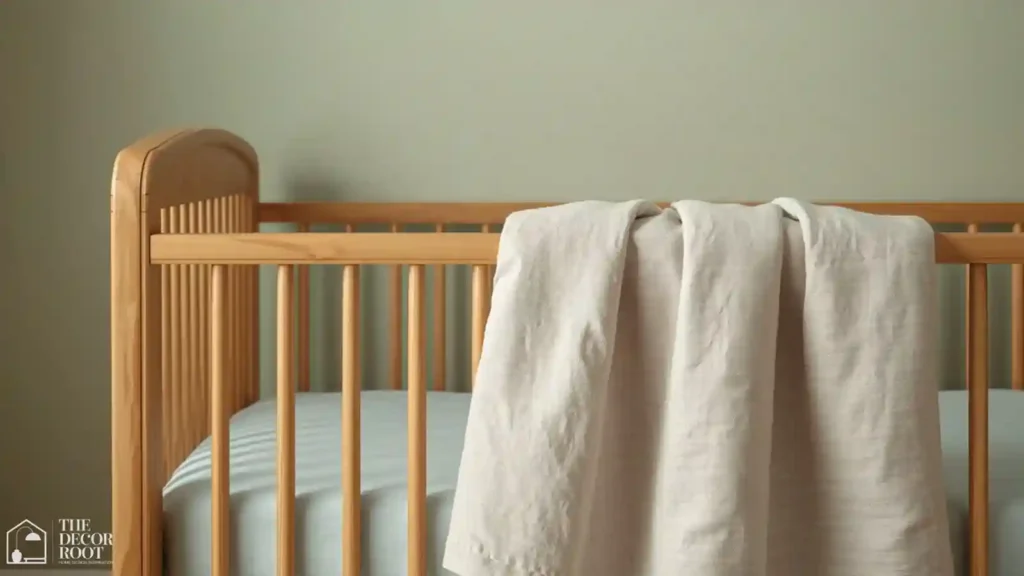
The biggest nursery color mistake is mixing one or two highly saturated “fun” elements into an otherwise calm palette right in the crib’s sightline; auditing saturation levels in that specific zone matters more than any single color choice.
Quick Action Plan
- Stand at the crib and look at exactly what’s in a baby’s direct line of sight, not the whole room, just that sightline.
- If anything there is highly saturated or high-contrast, that’s the first thing to soften, since it has more functional impact on settling than any other design decision in the room.
- Then check your nightlight’s color temperature before you touch a single paint swatch, since a cool-white light can undercut even a perfectly chosen wall color.
Frequently Asked Questions
Conclusion
The colors in a nursery aren’t decoration first; they’re doing a quiet job every single time your baby looks around that room.
💾 Save this to your nursery color board, so you have it ready before the crib even arrives.