23 Color Psychology Ideas for Dining Rooms That Encourage Connection
Color Psychology Dining Room Ideas. Ever notice how some dinner parties naturally stretch three hours past dessert, while others feel like everyone’s checking the clock by the second course? A lot of that comes down to the room itself, and specifically, the color wrapped around the table. Dining rooms are one of the only spaces in a home built entirely around slowing down and connecting with other people, which makes color psychology more important here than almost anywhere else in your house.
Most dining rooms default to safe, forgettable neutrals because homeowners are afraid of “getting it wrong” in a room used for entertaining. But the opposite is usually true: a flat, undecided color does more damage to the mood of a meal than a bold, intentional one ever could. Color psychology ideas for dining rooms that encourage connection are one of the most socially powerful home decorating ideas in the entire home; the colors surrounding a shared meal directly affect how long people stay at the table, how much they talk, and how connected they feel to the people they are eating with.
This post contains affiliate links. As an Amazon Associate, I earn from qualifying purchases. If you buy through these links, I may earn a small commission at no extra cost to you.
The Real Reason This Works
Dining rooms operate on a different psychological clock than the rest of your home. You’re not moving through the space quickly like a hallway, and you’re not relaxing passively like a living room; you’re sitting still, facing other people, for an extended stretch of time. That makes the room’s color a constant background presence during every conversation that happens at your table. Warm, saturated colors in particular have been shown to increase appetite and make time feel like it’s passing more slowly in a pleasant way, which is exactly the effect a great dinner party depends on. The 23 ideas below lean into that science rather than defaulting to the safe, forgettable neutral that so many dining rooms settle for. The warm versus cool principle has its clearest application in a dining room: warm tones universally lengthen time at the table and deepen social comfort, while cool tones, however aesthetically beautiful, consistently shorten meals and reduce the sense of connection. These warm dining room color ideas show exactly which warm tones produce the strongest connection effect and how to use them without making the room feel heavy.
Savor Dining Room Color
Dining room color psychology sits at the intersection of appetite research and social psychology; these color ideas from psychology provide the full theoretical framework showing how hue, saturation, and warmth affect both the pleasure of eating and the quality of social interaction in the same room. A dining room that encourages connection works best when the entryway has already begun the emotional preparation; these social home color flow ideas show how to design the color transition from entry to dining room so the palette shift feels like an invitation to gather deeper rather than an abrupt change of mood.
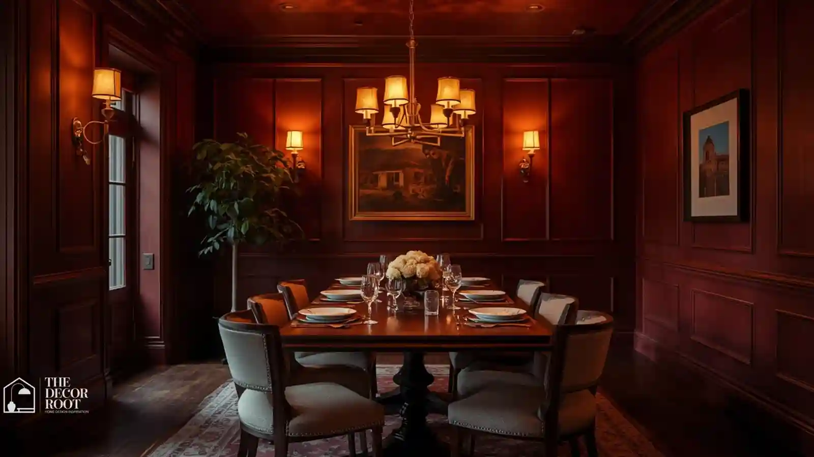
1. Deep Burgundy for Restaurant-Level Intimacy
Burgundy is one of the most effective dining room colors precisely because upscale restaurants have used it for decades; it triggers appetite and warmth at the same time. This deep red-purple absorbs light in a flattering way, softening how everyone looks under evening lighting, which naturally encourages people to relax and stay longer. It photographs beautifully against a wood table and brass or gold accents.
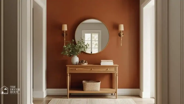
2. Terracotta for Earthy Gathering Energy
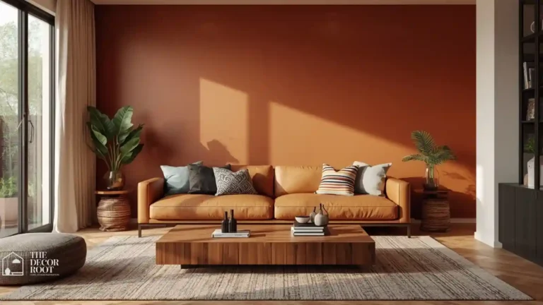
Terracotta brings a sun-baked, communal warmth that feels closer to a Mediterranean courtyard than a formal dining room, which is exactly the relaxed energy that encourages long conversations. This shade works particularly well with wood furniture, since the undertones share the same warm base and never fight each other visually.
3. Warm Charcoal for Moody Drama
A warm-toned charcoal (leaning brown rather than blue) creates a cocoon-like atmosphere that makes a dining room feel intentional and grown-up. It’s an especially strong choice for rooms used mostly for evening dinners, since the dark backdrop makes candlelight and pendant lighting glow more dramatically against the walls. The most elegant dining rooms are also the most psychologically considered ones; these dining room color and elegance ideas show how the warm tones that color psychology validates as connection-supporting happen to produce the richest, most visually resolved dining rooms available, and why the psychology and the aesthetics of a great dining room point toward the same palette decisions.
4. Rich Forest Green for Grounded Elegance
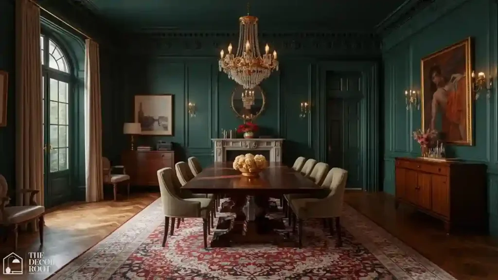
Forest green has surged in dining rooms because it strikes a rare balance: sophisticated enough for formal entertaining, calming enough for everyday family meals. This shade pairs beautifully with brass chandeliers and wood tables, and it holds up visually in both bright daylight and dim evening lighting without shifting character.
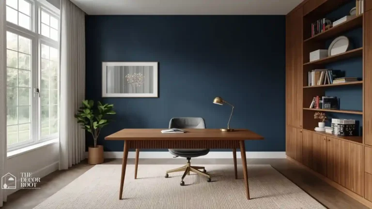
5. Deep Navy for Confident Formality
Navy dining rooms photograph like something out of a design magazine, and the psychological effect matches the visual one: navy reads as trustworthy, grounded, and quietly formal without feeling stiff. Pair it with a dimmable pendant light fixture so you can shift the mood from bright family dinner to moody dinner party with one switch.
EDITOR’S PICK
🛒 Dimmable Pendant Light Fixture
Navy dining rooms look designer-curated and feel grounded and refined, best paired with a dimmable pendant light to shift from family dining to intimate evenings.
(paid link)
6. Warm Blush for Unexpected Softness
A dusty, muted blush avoids feeling overly sweet and instead reads as genuinely warm and flattering under both daylight and candlelight. This is an especially strong choice for dining rooms with a lot of natural light, since the warmth intensifies pleasantly as the sun moves through the day.
7. Mustard Gold for Energetic Warmth
Mustard is a bold swing, but a muted, slightly brown-based mustard (rather than a bright yellow-gold) reads as rich and inviting instead of overwhelming. This color triggers energy and appetite simultaneously, making it a strong pick for households that use their dining room daily rather than only for special occasions.
8. Deep Plum for Luxurious Intimacy
Plum splits the difference between burgundy’s warmth and navy’s formality, giving you a color that feels genuinely luxurious without tipping into either extreme. It’s a particularly underused dining room color, which makes it stand out immediately against the sea of gray and white dining rooms most people have seen a hundred times.
9. Warm Taupe for Approachable Neutrality
If you want the psychological benefit of a warm color without committing to something bold, a genuinely warm taupe threads that needle. It photographs as sophisticated rather than boring, especially when paired with textured linens and warm wood tones on the table itself.
10. Rust Orange for Bold Appetite Appeal
Orange has a well-documented relationship with appetite stimulation, and a deeper rust tone delivers that effect without the “fast food restaurant” association that brighter oranges can carry. Layer in a natural linen tablecloth set to soften the boldness of the wall color with texture.
EDITOR’S PICK
🛒Natural Linen Tablecloth Set
A deep rust wall stimulates appetite without feeling commercial, best balanced by a natural linen tablecloth to soften the boldness with texture.
(paid link)
11. Sage Green for Fresh, Relaxed Meals
Sage brings a calming, garden-fresh quality that works especially well for households that eat most meals in this room rather than saving it for formal occasions. It’s forgiving with mismatched chairs and mixed wood tones, which makes it a practical choice as well as a psychologically sound one.
12. Deep Teal for Sophisticated Energy
Teal splits the difference between blue’s calm and green’s freshness, creating a color that feels alive and current without being chaotic. A muted, slightly gray-toned teal photographs beautifully against brass and warm wood, and it holds its own in both bright and dim lighting conditions.
13. Warm Camel for Tailored Warmth
Camel occupies an underused middle ground between beige and brown, delivering warmth without the heaviness of a full dark color commitment. It pairs exceptionally well with black dining chairs and a natural wood table, creating a tailored, restaurant-quality look.
14. Dusty Rose for Romantic Undertones
A muted, dusty rose (rather than a bright pink) creates a genuinely romantic quality that works beautifully for dinner parties and date nights at home. This shade is particularly flattering under warm lighting, since it enhances rather than competes with candlelight and pendant fixtures.
15. Matte Black for Editorial Drama
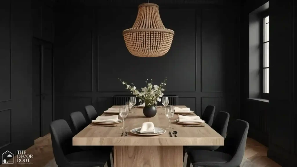
A fully black dining room sounds intense, but paired with a light wood table and a statement chandelier, it becomes one of the most photographed dining room looks in modern design. A wood bead chandelier softens the drama with natural texture, keeping the room from feeling cold.
EDITOR’S PICK
🛒Wood Bead Chandelier
Bold black dining walls, balanced by a pale wood table, call for a standout fixture; a wood bead chandelier adds organic texture, tempering the drama and ensuring the room feels inviting.
(paid link)
16. Warm Olive for Grounded Sophistication
Olive has fully shaken its dated reputation and re-emerged as one of the most sophisticated earth tones available for dining spaces. It grounds a room in a way that feels intentional and collected rather than trendy, especially against black or brass hardware.
17. Deep Wine for Cozy Formality
Slightly darker and more purple-leaning than burgundy, a true wine tone creates an almost velvet-like richness on dining room walls. This color performs beautifully in rooms that get moderate natural light, since the depth reads as intentional rather than cave-like.
18. Soft Terracotta-Clay Blend for Understated Warmth
A dustier, more muted version of terracotta leans into a clay-like softness that photographs beautifully against linen and natural wood. This tone works especially well for households wanting warmth without the visual intensity of a fully saturated orange.
19. Deep Aubergine for Bold Sophistication
Aubergine, a near-black purple, delivers drama with more warmth than a true black would provide. This is a genuinely rare dining room color choice, which makes it an immediate conversation starter appropriate given the room’s whole purpose.
20. Warm Gray-Brown (“Greige”) for Timeless Balance
A genuinely warm greige (leaning brown, not pink) offers the psychological benefit of warmth while staying flexible enough to update your table styling seasonally without a full room overhaul. Velvet dining chairs add a layer of tactile warmth that plays beautifully against this understated wall color.
EDITOR’S PICK
🛒Warm Brown Leaning Greige Wall
A warm brown leaning greige wall allows seasonal styling flexibility, and velvet dining chairs add tactile warmth that perfectly complements the muted palette.
(paid link)
21. Deep Chocolate Brown for Grounded Intimacy
Chocolate brown has re-entered dining room design as a genuinely sophisticated choice rather than a dated one, especially paired with cream linens and brass accents. It creates an enveloping, cocoon-like feeling that naturally slows down a meal.
22. Warm Coral for Energetic Gathering
A muted, dustier coral (rather than a bright, beachy coral) brings genuine warmth and energy without overwhelming a room used for both daily meals and formal entertaining. It’s an especially good fit for dining rooms that double as a workspace during the day, since it stays energizing without being distracting.
23. Cream with a Bold Ceiling for a Statement Twist
Keep the walls a soft, warm cream and paint the ceiling a bold, saturated color like deep burgundy or forest green. This “fifth wall” approach gives you drama and psychological warmth without committing an entire room to a bold color, and it creates a genuinely surprising moment when guests look up.
Try This Before You Repaint the Whole Room
- Pick the two or three colors from this list that pulled at you the most, and test them directly on your dining room wall rather than a random spot in your home.
- Dining rooms often get a mix of daylight and evening artificial light that behaves differently than other rooms.
- Paint a swatch near where your table sits, and observe it during an actual meal, both during the day and after dark with your lights on, before committing to a full room.
Frequently Asked Questions
One Last Thing Before Your Next Dinner Party
The color on your dining room walls is quietly doing more work than your table settings, your playlist, or even your menu when it comes to how long people want to stay at your table. Pick the shade that matches the kind of gathering you actually want to host.
💾 Save this to your Dining Room Inspiration board before your next round of painting decisions.