21 Color Psychology Ideas for Entryways That Set the Mood
Color Psychology Entryway Ideas: You know that feeling when you walk into someone’s house, and something just feels off before you can even explain why? Nine times out of ten, it’s the entryway color talking. Your foyer is the emotional handshake of your entire home; it tells visitors (and you, every single day) what kind of mood they’re about to step into. If your entryway is doing nothing but sitting there in flat builder-beige, it’s wasting the single highest-impact wall in your house. Color psychology ideas for entryways that set the mood are one of the highest-leverage home decorating ideas in the entire home. The entryway is the first color experience a visitor has, and the hue, value, and temperature of that color determine the emotional state they bring into every room that follows.
This post contains affiliate links. As an Amazon Associate, I earn from qualifying purchases. If you buy through these links, I may earn a small commission at no extra cost to you.
What Ties These Ideas Together
Every color on this list was chosen because it does a specific psychological job: it either slows people down, energizes them, grounds them, or makes a cramped hallway feel more generous than it is. Entryways are transitional spaces, which means the color has to do double duty; it needs to feel like an extension of the outside world while still signaling “you’re home now.” That’s a narrower design brief than most people realize, and it’s why so many entryways default to safe neutrals instead of doing anything intentional. The ideas below skip the safe route in favor of colors that actually work psychologically, whether your entryway is a full foyer or a three-foot landing strip inside your front door. The entryway sets the emotional tone and the dining room sustains it; these social space color psychology ideas show how designing the entry and dining room palettes in relation to each other creates a home that feels genuinely welcoming from the first step inside to the last bite of a shared meal.
First Impressions Entryway Color
Entryway color psychology is a first-impression exercise; these color ideas from psychology explain the full mechanics of how color affects initial emotional response, social comfort, and the unconscious judgements visitors make about a home in the first seconds after crossing the threshold. The warm versus cool decision is more consequential in an entryway than in any other room; these color temperature ideas for entryways show why a warm-toned entry makes visitors feel immediately welcome while a cool-toned one, however beautiful, creates a subtle but persistent sense of being assessed rather than received.
1. Terracotta for Grounded Warmth
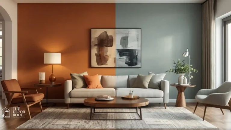
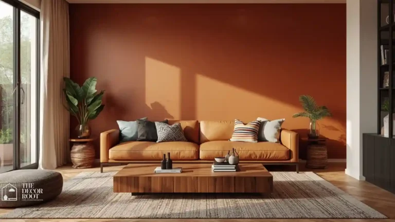
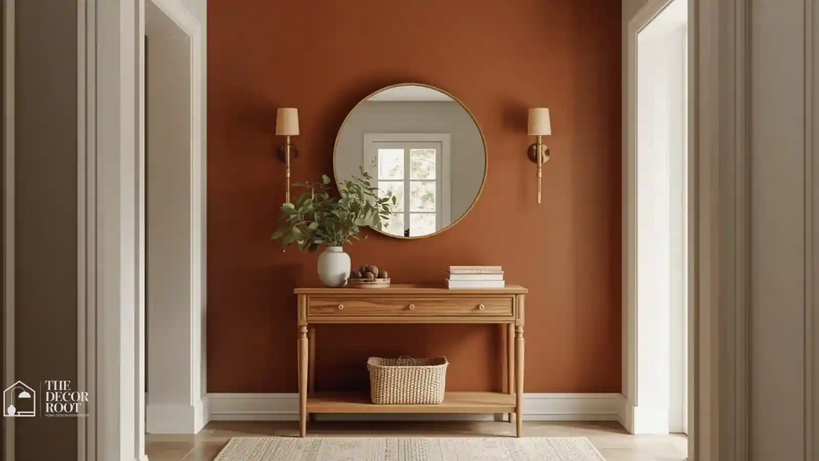
Terracotta reads as earthy and sun-baked, which makes it one of the fastest ways to make an entryway feel instantly warmer without adding a single light fixture. Psychologically, this burnt-orange family sits close to skin tones, which is part of why humans respond to it as comforting rather than aggressive the way pure red can feel. It works especially well in entryways that get a lot of natural light, since the undertones shift subtly throughout the day. Pair it with black hardware and natural wood for a look that feels intentional rather than trendy. A terracotta paint sample kit lets you test the shade against your actual entry light before committing to a full gallon.
EDITOR’S PICK
🛒Terracotta Paint Sample Kit
Terracotta instantly warms an entryway with its earthy, skin-tone-close hue, works best in natural light, and pairs well with black hardware and wood, best tested first with a sample kit.
(paid link)
2. Deep Forest Green for Instant Calm
Dark green is one of the only colors that reads as both sophisticated and calming at the same time, which is a rare combination. In an entryway, it acts almost like a decompression chamber between the chaos of outside and the calm of home; your nervous system reads it as “nature,” even indoors. This works especially well in entryways with a lot of natural wood trim, since green and warm wood tones share undertones that never clash. Keep the ceiling white to prevent the space from feeling like a cave.
3. Warm Butter Yellow for Genuine Cheerfulness
Yellow gets a bad reputation in interior design circles for being hard to pull off, but a muted, warm butter yellow avoids the neon-highlighter trap entirely. This shade triggers an almost automatic smile response; it’s the color most associated with morning light, which is exactly the emotional cue you want when someone opens your front door. It performs best in entryways that don’t get much direct sun, since it manufactures the missing warmth.
4. Charcoal for Confident Drama
A near-black charcoal entryway sounds risky until you see it in person it makes every other color in the space (brass, wood, white trim) pop dramatically by contrast. Psychologically, deep neutrals like charcoal read as confident and grounded rather than gloomy, especially when balanced with a light floor or a large mirror to bounce light back into the room. This is the pick for homeowners who want their entryway to feel like a design statement, not a placeholder.
5. Dusty Blue for Quiet Reassurance
Blue is the most universally calming color across color psychology research, and a dusty, slightly gray-toned blue avoids feeling cold the way a brighter navy can in a small space. It’s an especially good choice for households with a lot of daily foot traffic, since it visually lowers the emotional temperature the second the door opens. Layer in warm brass fixtures to keep the blue from tipping into sterile territory.
6. Rich Burgundy for Old-World Richness
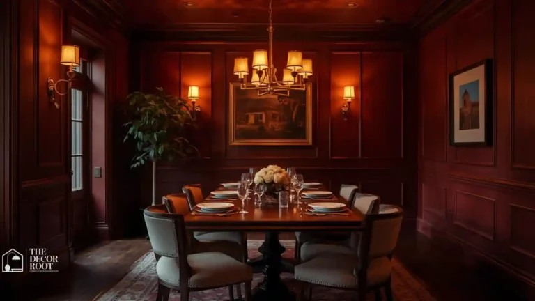
Burgundy carries a sense of history and weight that most modern paint colors don’t attempt anymore, which is exactly why it stands out. This deep red-purple triggers a subtle sense of luxury without the aggression of a pure red, making it ideal for entryways in older homes with existing millwork or wainscoting. It photographs beautifully against brass and dark wood, and it hides scuffs from daily traffic far better than a pale color ever could.
7. Soft Sage for Effortless Freshness
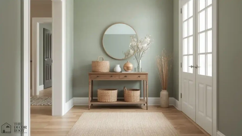
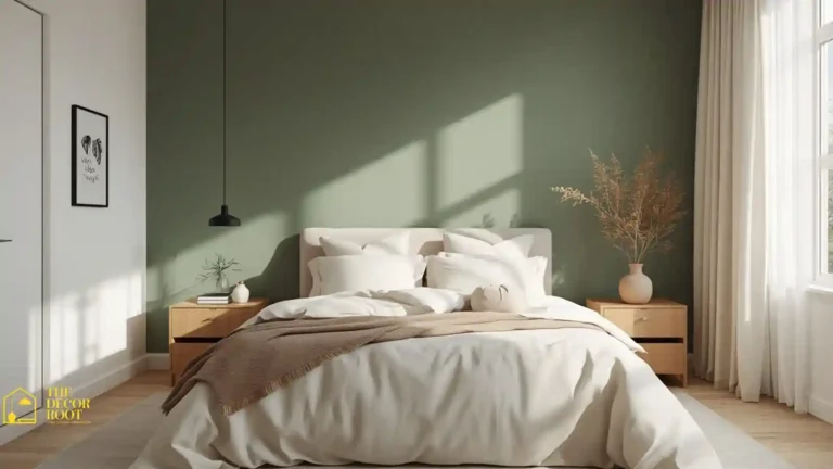
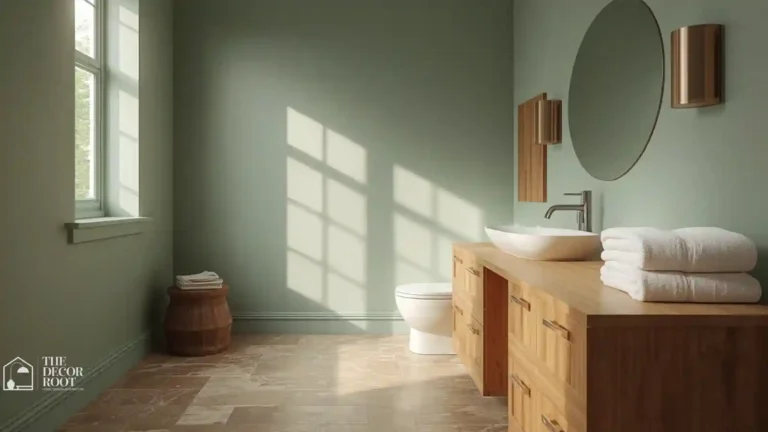
Sage green has become a design darling for a reason: it reads as fresh and clean without the sterility of white, and it pairs with nearly every wood tone on the market. In entryways, sage functions as a visual palate cleanser between the outdoors and the rest of your home’s color story. It’s particularly forgiving in spaces with mixed metal finishes, since its muted undertone doesn’t compete with brass, black, or nickel.
8. Warm Camel for Cozy Sophistication
Camel occupies a sweet spot between beige and brown that most homeowners overlook entirely, and that’s a missed opportunity. This tan-driven neutral reads as tailored and warm at the same time, almost like a well-worn leather jacket in paint form. It’s an especially smart pick for entryways that connect directly to a living room, since it bridges warm and cool undertones without forcing a hard color transition at the doorway.
9. Matte Black for Editorial Impact
A matte black entryway wall, even just below a chair rail, delivers an outsized visual punch for very little paint. Psychologically, black in small controlled doses reads as intentional and high-end rather than heavy, especially when it’s balanced by a light floor or large window nearby. This pairs beautifully with matte black hardware on doors and light switches to keep the whole space cohesive rather than looking like an afterthought.
EDITOR’S PICK
🛒 Matte Black Hardware Set
A matte black wall below the chair rail delivers a high-end, intentional look with minimal paint, best balanced with light elements and paired with matching black hardware throughout.
(paid link)
10. Blush Pink for Unexpected Softness
A dusty, grown-up blush avoids the nursery-pink trap and instead reads as warm and welcoming in a way most homeowners don’t expect from pink. This shade works particularly well in entryways with a lot of natural light, since it can shift from warm to slightly gray depending on the time of day. It pairs surprisingly well with black and brass, giving the space an editorial, magazine-shoot quality.
11. Deep Navy for Grounded Elegance
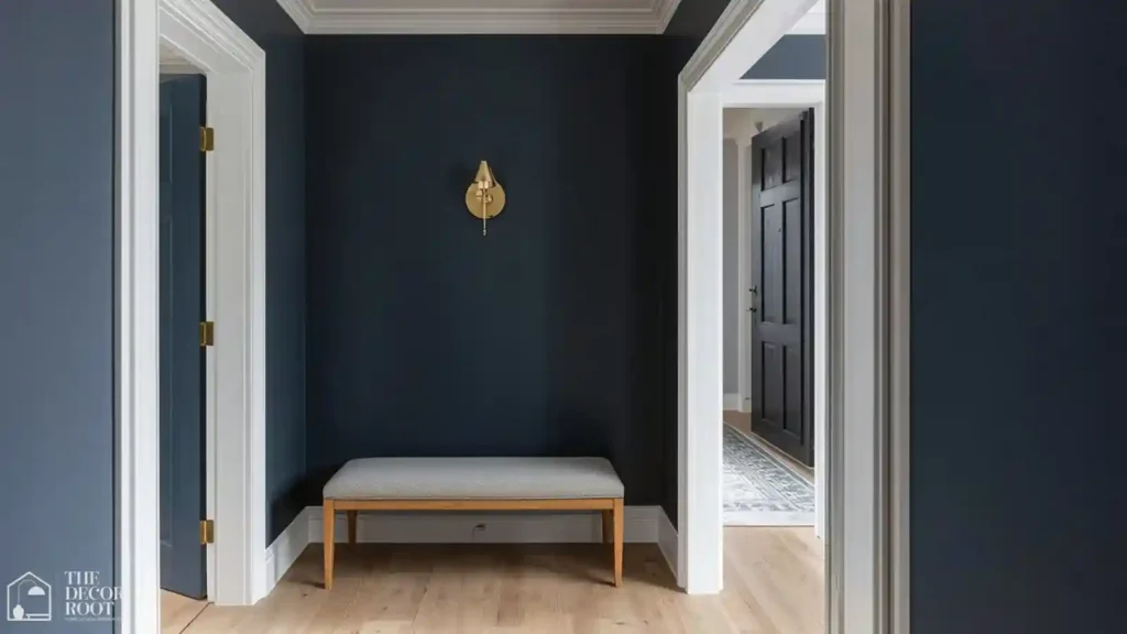
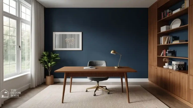
Navy is the entryway color equivalent of a tailored coat; it never looks dated, and it works in nearly every architectural style, from craftsman to colonial. Psychologically, navy sits close enough to black to feel dramatic while staying warmer and more approachable. It’s an excellent choice for entryways that lead into an open floor plan, since it creates a clear visual boundary without a physical wall.
12. Warm Terracotta-Clay Blend for Southwestern Warmth
A slightly more muted, clay-forward version of terracotta leans softer and dustier, which works beautifully in entryways with a lot of natural wood or stone flooring. This tone reads as sun-warmed and lived-in rather than trend-driven, and it ages gracefully instead of looking dated the way brighter oranges can within a few years.
13. Soft Gray-Green for Understated Calm
This in-between shade splits the difference between gray’s neutrality and green’s calming effect, giving you a color that recedes into the background in the best possible way. It’s an ideal choice for entryways that already have a lot of visual noise patterned tile, a busy runner, multiple coat hooks since it won’t compete for attention.
14. Warm White for Maximum Light Bounce
Not all whites are created equal, and a warm white with creamy undertones (rather than a stark, blue-based white) does more psychological work than people expect. It makes small, dark entryways feel larger and brighter almost instantly, and it creates the perfect blank canvas for a statement light fixture. A warm-tone LED entry sconce reinforces the cozy effect after dark, when natural light disappears.
EDITOR’S PICK
🛒 Warm-Tone LED Sconce
Warm white with creamy undertones brightens small entryways and pairs perfectly with a warm LED sconce to maintain a cozy feel after dark.
(paid link)
15. Rust Orange for Bold Confidence
A slightly deeper, more saturated cousin of terracotta, rust orange skips subtlety entirely in favor of impact. This shade works because it’s warm enough to feel inviting but dark enough to avoid the “traffic cone” effect that brighter oranges can create. It’s best suited to entryways with strong architectural bones beadboard, arched doorways, exposed brick that can stand up to a bold color choice.
16. Muted Teal for Sophisticated Energy
Teal splits the difference between calming blue and energizing green, giving you a color that feels alive without tipping into chaos. A muted, slightly gray-toned teal (rather than a bright jewel tone) keeps the space feeling current rather than dated. It’s particularly effective in entryways with black-framed windows or doors, since the two tones share a similar cool-toned confidence.
17. Warm Taupe for Timeless Neutrality
Taupe gets dismissed as boring, but a genuinely warm taupe (not the pink-gray “greige” that dominated the last decade) reads as calm and sophisticated rather than flat. It’s the safest bold choice on this list, a color that photographs beautifully and never fights with existing furniture, flooring, or trim work.
18. Deep Plum for Moody Richness
Plum occupies a fascinating middle ground between red’s energy and purple’s introspection, which makes it feel dramatic without being aggressive. This is a genuinely underused entryway color, and that rarity alone makes it stand out in a sea of gray and greige foyers. It performs best with warm gold or brass accents to keep the overall effect luxurious rather than dark.
19. Sandy Beige for Coastal Calm
A genuinely warm, sand-toned beige (as opposed to the cool “greige” that’s dominated the last decade) evokes a beach-house calm that works well beyond coastal homes. This tone is especially forgiving for entryways with mixed wood finishes, since its warmth bridges gaps between different stains. A natural jute entry runner reinforces the organic, sun-warmed feeling this color is going for.
EDITOR’S PICK
🛒Natural Jute Entry Runner
Warm sand beige evokes coastal calm and bridges mixed wood stains, best grounded with a natural jute runner for an organic finish.
(paid link)
20. Olive for Earthy Sophistication
Olive has moved well beyond its 1970s reputation and re-emerged as one of the most sophisticated neutral-adjacent colors available. It reads as grounded and intentional, especially against black hardware and warm wood tones, and it has enough depth to hide daily scuffs from shoes, bags, and pets brushing the wall.
21. Cream with a Colored Ceiling for a Design Twist
Instead of choosing one wall color, this idea flips the usual formula: keep the walls a soft, warm cream and paint the ceiling a bold color like deep green or navy. This “fifth wall” trick creates a surprising, editorial moment the second someone looks up, and it’s an easy way to introduce a bold color without committing an entire room to it.
Try This Before You Buy a Single Can
- Before you commit to any of these 21 colors, pick the three that pulled at you the most while reading and get sample pots of each.
- Paint a two-foot swatch directly next to your front door, not on an interior wall, since entry light behaves differently than the rest of your home due to the door’s shadow and glass.
- Live with each swatch for at least 48 hours, checking it in morning and evening light, before making a final call.
- If you’re renting or hesitant to commit to paint at all, several of these moods can be approximated with a bold front door color plus a neutral wall, giving you most of the psychological effect with none of the permanence.
Color psychology provides the evidence base for entryway design decisions that the farmhouse aesthetic has instinctively got right for decades; these entryway design and color ideas show how the farmhouse palette of warm white, aged wood, and natural material creates exactly the physiological welcome response that color psychology research predicts.
Frequently Asked Questions
One Last Thing Before You Grab a Paintbrush
Your entryway only takes a few hours to transform, but the emotional payoff happens every single day, every time that door opens. Pick the color that matches the feeling you actually want your home to give off, not just the one trending on Pinterest this week.
.
💾 Save this to your Entryway Inspiration board, so you have it ready when paint season rolls around.