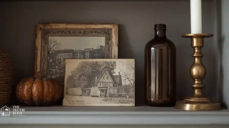
20 Black and Orange Color Palette Ideas Done Right
Black and orange color palette ideas are one of the boldest color pairings you can bring into a home, and also one of the easiest to get badly wrong go one shade too bright on the orange or use too much of it, and a living room starts reading more like a sports team locker room or a Halloween store than a designed interior. That’s the exact problem you’re trying to solve when you search for this palette done “right”: you want the drama and warmth of the combination without it tipping into costume territory or looking dated the way 2000s-era burnt orange kitchens eventually did. The fix is almost entirely about ratio and undertone, and both are things you can control precisely.
This post contains affiliate links. As an Amazon Associate, I earn from qualifying purchases. If you buy through these links, I may earn a small commission at no extra cost to you.
Where to Start Mentally
Before picking a single paint chip or throw pillow, reframe the palette in your head: this isn’t “black plus orange,” it’s “a neutral base plus one warm accent, grounded with black.” That mental shift changes everything about how you’ll actually shop and decorate. Orange should rarely cover a large surface a whole wall, a sofa, a rug because at that scale, tone matters enormously and mistakes are expensive and hard to undo. Black, likewise, works best as a grounding, structural color: trim, hardware, frames, a single furniture piece, rather than large expanses. Once you treat orange as a spice and black as a frame instead of two equal competing colors, the whole palette becomes much easier to get right in any room of the house.
20 Black and Orange Color Palette Ideas
1. Use an 80/20 Ratio, Not a 50/50 Split
The single most important rule for this palette: let neutrals cream, warm white, wood tone make up roughly 80 percent of any given room, with black and orange combined filling the remaining 20 percent. A room that’s half orange and half black will almost always feel aggressive and one-note, no matter how nice the individual pieces are. Start by imagining your room in only cream and wood, then ask where a single orange accent and a single black accent could go. That constraint alone prevents the vast majority of black-and-orange decorating mistakes before they happen.
2. Choose Burnt Orange Over Bright, True Orange
Undertone is everything with this color. True, saturated orange think traffic-cone or pumpkin-patch bright reads as playful at best and costume-like at worst in a living space. Burnt orange, terracotta, and rust all shift the same hue toward brown, which instantly reads as sophisticated and earthy instead. When shopping for any orange piece, hold it next to a piece of raw wood or leather; if it looks harmonious rather than jarring against that warm brown, you’ve got the right shade for interior use.
3. Let Black Ground the Room, Not Highlight It
Black works best in this palette as a visual anchor rather than a feature color think window frames, a black metal coffee table base, or door hardware, rather than a black accent wall or black sofa. Grounding elements like these give the eye a resting point and add structure to a room, especially one that already has warmth and softness from the orange and neutral tones. When black shows up at the base or edges of a room instead of its center, the whole space reads as more architecturally considered.
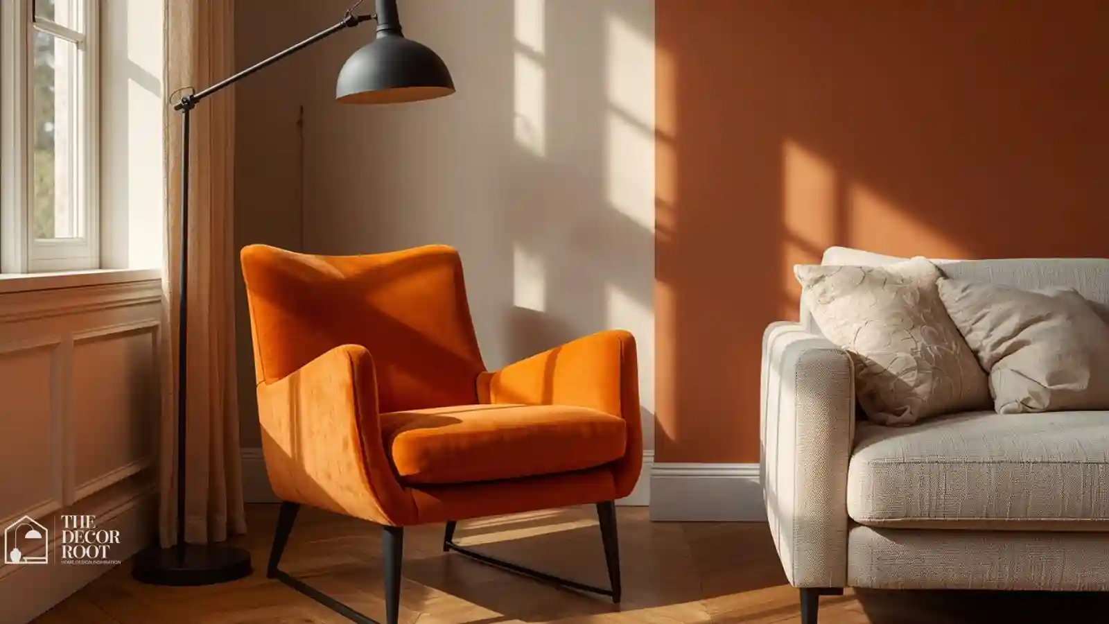
4. Add Orange Through a Single Statement Chair
One upholstered piece an accent chair, an ottoman, or a bench in burnt orange velvet or boucle can carry an entire room’s color story on its own. Place it where it naturally draws the eye, like facing the room’s main seating or near a window, and keep every other upholstered piece in the space neutral. This single-piece approach also makes the whole look far easier to update later; if your taste shifts, you’re reupholstering or replacing one chair, not repainting a wall or replacing a sofa.
5. Use Black Trim or Molding as an Architectural Anchor
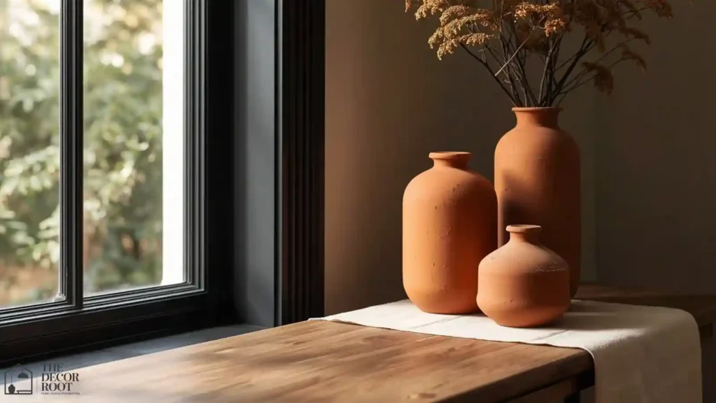
Painting window trim, door frames, or crown molding in a matte black paint gives a room instant definition and pairs beautifully with warm orange and neutral tones elsewhere. A quality matte black interior trim paint creates crisp, graphic lines that make the rest of the room’s softer, warmer colors feel more intentional by contrast. This works especially well in older homes with existing millwork, where the black paint highlights architectural detail that white trim tends to flatten visually.
EDITOR’S PICK
🛒Matte Black Interior Trim Paint For Architectural Definition
Matte black trim paint crisply defines woodwork, making warm orange and neutrals feel more intentional while highlighting architectural detail.
(paid link)
6. Introduce Orange Through Ceramics, Not Textiles
Ceramic vases, bowls, and pottery in burnt orange or terracotta glazes are a lower-commitment way to bring in color than furniture or large textiles, and they’re easy to move, swap, or store seasonally if you want the palette to feel more prominent in fall than in spring. Cluster two or three pieces of varying heights on a console, coffee table, or open shelf rather than scattering single pieces throughout the house, so the color reads as a considered grouping instead of a random accent.
7. Balance the Palette With Warm Wood Tones
Wood floors, furniture, and shelving act as a third neutral that bridges black and orange beautifully, since most warm wood tones already sit somewhere between the two on the color wheel. Oak, walnut, and reclaimed wood all work well here. If your existing furniture leans toward cool-toned gray wood, consider whether a single warm wood piece, like a live-edge coffee table or a rattan chair, could help unify the black and orange elements you’re adding rather than fighting them.
8. Use Matte Black Hardware for Quiet Cohesion
Cabinet pulls, faucet fixtures, light switch plates, and door hinges in matte black are one of the easiest, most affordable ways to weave the “black” half of this palette throughout an entire home without a single dramatic design decision. Because hardware swaps are small and reversible, this is a great low-risk entry point if you’re not ready to commit to a full black-and-orange room yet, but want the palette present in a subtle, ongoing way.
9. Add a Single Orange Art Piece
A framed print, painting, or piece of textile wall art in burnt orange tones can do the same job as the statement chair in idea #4, but for a room where furniture changes aren’t practical, like a rental or a home office. Choose a black or dark wood frame to tie in the palette’s grounding color at the same time. One well-chosen piece, given plenty of wall space around it, has far more impact than a gallery wall crowded with several smaller orange-toned prints.
10. Layer In Cream to Soften the Contrast
Cream and warm white are the palette’s essential third color, and without enough of it, black and orange together can feel heavy or overly saturated. A chunky cream knit throw blanket draped over a black or orange piece of furniture does more to soften and balance the room than almost any other single addition. Aim to have cream or warm white present in at least one large surface in every room using this palette: a rug, a sofa, or wall color.
EDITOR’S PICK
🛒Chunky Cream Knit Throw Blanket To Soften The Palette
Cream knits balance black and orange, anchoring the palette with warm white in every room.
(paid link)
11. Use Black in Small Doses: Frames, Lamp Bases, Hardware
If a full black furniture piece feels like too much for your space, start smaller: picture frames, a single lamp base, drawer pulls, or a black-framed mirror. These small doses add the same grounding visual weight as larger black pieces, distributed across a room instead of concentrated in one spot. This approach also makes the palette very easy to build gradually, a piece or two at a time, rather than requiring a full room overhaul in one pass.
12. Choose Rust Instead of True Orange for Bedrooms
Bedrooms benefit from an even softer, more muted version of this palette than living spaces, since the goal there is calm rather than energy. Rust, a slightly redder, dustier cousin of burnt orange, works beautifully on a single bedding layer a duvet cover or a folded blanket at the foot of the bed paired with black-framed art or a black metal bed frame. Keep walls neutral in a bedroom using this palette; let the rust and black stay confined to textiles and small furniture pieces instead.
13. Add Black Through Textiles, Not Just Furniture
Beyond furniture and hardware, black shows up beautifully in textiles: a black-and-cream patterned rug, black piping on a neutral sofa, or black-trimmed curtains. This gives you the grounding effect of black without committing to a large black furniture purchase, and it’s easier to change out later if your preferences shift. A black-bordered jute or wool rug is one of the highest-impact textile choices here, since it anchors an entire room’s furniture arrangement.
14. Use Orange in the Kitchen via Accessories Only
Kitchens are one of the trickiest rooms for this palette, since cabinetry and countertop changes are expensive and permanent. Stick to accessories instead: burnt orange dish towels, a ceramic utensil crock, or a set of glass tumblers. These are inexpensive, seasonal-friendly ways to bring warmth into a kitchen that otherwise stays neutral, and they can be swapped out easily if your taste changes or if you want a different color story for spring and summer.
15. Add a Black Pendant Light as a Focal Point
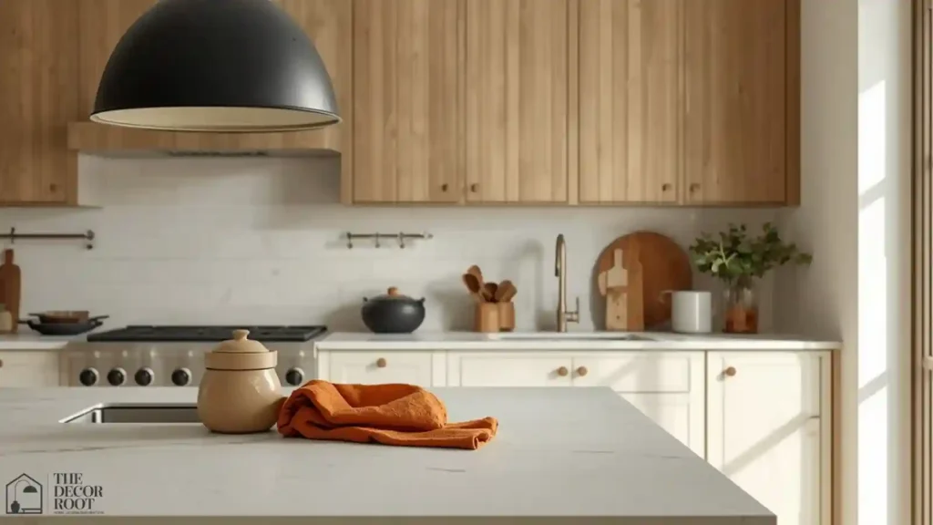
Lighting fixtures are one of the best places to introduce black as a true focal point rather than a background detail, since a fixture is meant to draw the eye by design. A matte black pendant light over a kitchen island, dining table, or entry hall gives the room real architectural presence, and it pairs naturally with the burnt orange and cream tones used elsewhere without competing for attention the way a black sofa or accent wall might.
EDITOR’S PICK
🛒Matte Black Pendant Light Fixture As A Room Focal Point
A matte black pendant over an island, table, or entry acts as an architectural focal point, pairing naturally with burnt orange and cream.
(paid link)
16. Balance the Palette With Plants as a Third Neutral
Green, via real or high-quality faux plants, functions as an unexpected but highly effective third neutral in a black-and-orange room. A large fiddle leaf fig, snake plant, or trailing pothos softens the boldness of the palette with organic texture and living color, and it keeps the overall room from feeling like it’s built entirely around a “theme.” Choose a black or terracotta planter to keep the plant visually tied into the rest of the palette rather than introducing an unrelated pot color.
17. Use Orange Sparingly in Bathrooms via Towels
Bathrooms respond well to this palette in very small, easily-changed doses: a set of burnt orange hand towels against black matte fixtures and a cream or white tile base. Because bathroom textiles are inexpensive and simple to launder or replace, this is a low-commitment way to test whether you actually like the palette in a smaller space before investing in it anywhere larger. Add a single black-framed mirror to complete the look without any additional cost or effort.
18. Add Black Picture Frames in a Gallery Wall
A gallery wall using uniform black frames, even around mismatched art or photos, creates a strong, cohesive black presence on a wall without requiring paint or large furniture. Include one or two pieces with burnt orange or rust tones within the artwork itself to tie the gallery into the room’s broader palette. Keep frame styles consistent (all black, all matte, similar thickness) even if the art inside varies, since consistency in the frames is what makes a gallery wall look designed rather than accumulated.
19. Use Burnt Orange Curtains for Warmth
Floor-to-ceiling curtains in a burnt orange linen or velvet add both color and genuine coziness to a room, softening hard light and adding a sense of warmth even on gray days. Because curtains cover a large surface area, this is one of the few places on this list where orange is used at real scale, but it still works within the 80/20 principle from idea #1, since curtains occupy a relatively narrow vertical band of a room rather than a full wall or floor.
20. Finish With a Black and Orange Entry Vignette
Bring the whole palette together at your home’s entry: a black console table, a burnt orange ceramic vase or bowl, and a neutral tray to ground it all. A black metal and wood entry tray is a small, inexpensive way to unify the grouping and give guests an immediate, confident preview of the palette used throughout the rest of your home.
EDITOR’S PICK
🛒Black Metal And Wood Entry Tray To Anchor The Vignette
A black entry tray unifies a burnt orange vase and neutral accents, giving guests an instant preview of your home’s palette.
(paid link)
For more on layering warm, earthy tones throughout a home, see our Neutral Autumn Color Palette Ideas and 21 Elegant Halloween Decor Ideas Without the Kitsch.
Quick Action Plan
- Start with the free, reversible changes: swap any bright hardware for matte black, and add one burnt orange textile, a throw pillow or a set of towels, somewhere in your home to see how the undertone reads in your actual lighting.
- From there, commit to one statement piece, whether that’s the accent chair, a pendant light, or curtains, and build the rest of the room’s neutrals around it.
- Save any paint decisions, like black trim, for last, since paint is the most permanent and highest-effort change on this entire list and benefits from living with the smaller pieces first.
Frequently Asked Questions
Conclusion
Black and orange is a genuinely striking palette when it’s built on ratio and undertone instead of matching a Halloween store’s color scheme. Keep neutrals dominant, let burnt orange do the warming, and black do the grounding, and build the look one piece at a time.
💾 Save this to your Color Palette & Home Styling Pinterest board for your next room refresh.