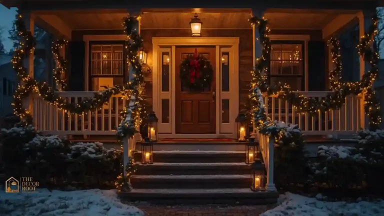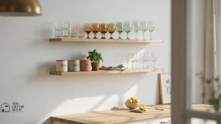
22 Color Psychology Ideas for a Calmer Christmas Home This Year
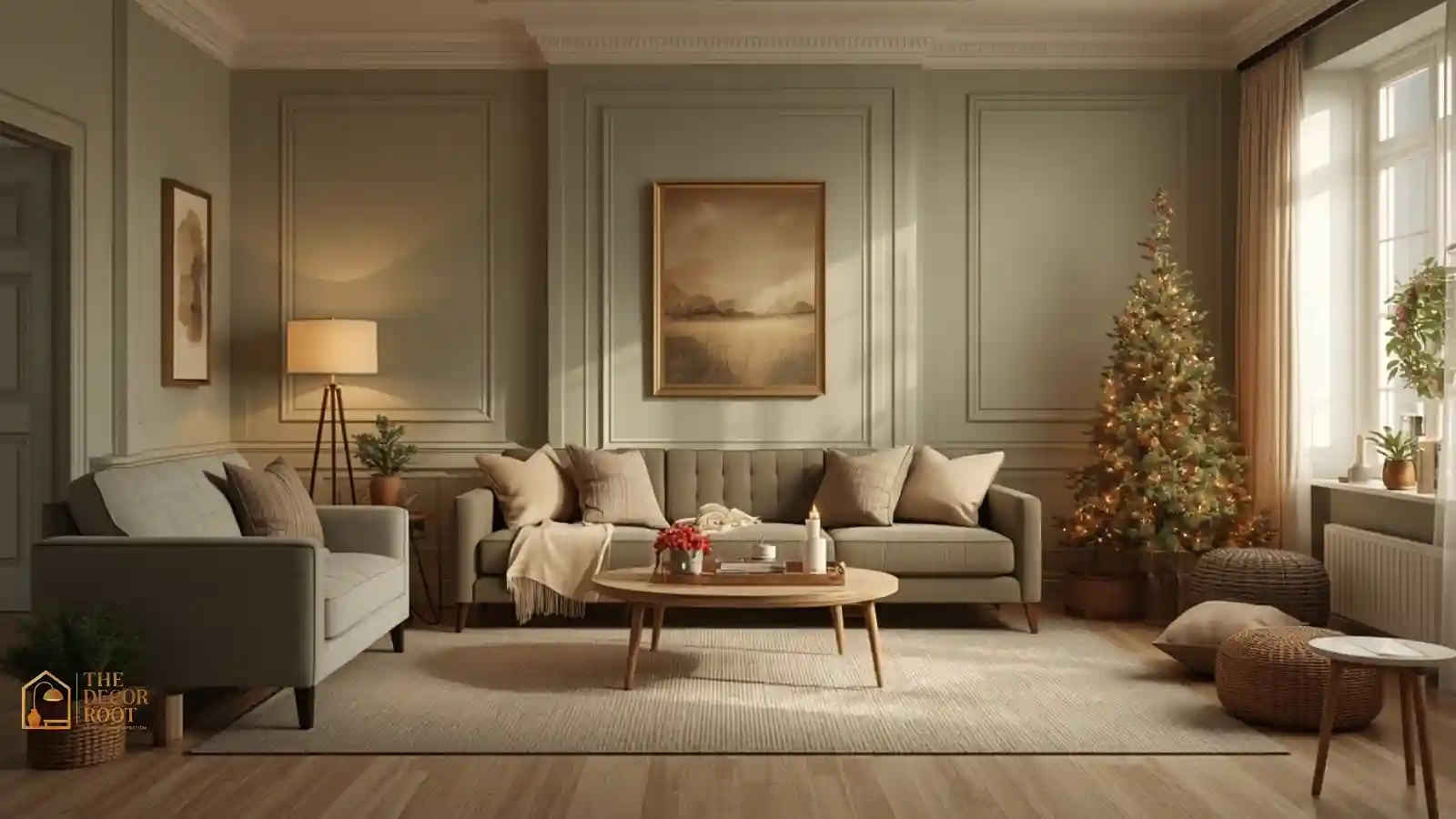
A sage green and cream palette shows how color psychology can make Christmas decor feel calmer, not less festive
A genuinely calmer Christmas home comes down to color choices most people never question. The default red-gold-green combination is loud by design, and swapping even part of it changes how a room feels within minutes. If you’ve ever finished decorating and felt more overstimulated than festive, the palette is very likely the reason, not the amount of decor itself. Color psychology research consistently links cooler, muted tones to lower stress and warmer, softer lighting to a sense of coziness rather than visual noise, and this list applies that directly to holiday styling. Visit TheDecorRoot.com’s homepage for more evidence-based approaches to making a room feel the way you actually want it to.
This post contains affiliate links. As an Amazon Associate, I earn from qualifying purchases. If you buy through these links, I may earn a small commission at no extra cost to you.
What Ties These Ideas Together
Every idea below follows the same underlying logic: swap a high-saturation, high-contrast color choice for a muted or desaturated version of the same seasonal idea, without losing the “it’s Christmas” signal entirely. Browse all our color psychology for home decor guides for the year-round version of this approach, but the holiday-specific version boils down to three moves: lower the saturation, warm up the light temperature, and reduce the number of competing hues in any single view. None of that requires spending less on decor; it just requires choosing differently.
1. Sage Green Instead of Traditional Holly Green
Traditional holly green is deeply saturated and, paired with bright red, creates one of the highest-contrast color combinations used in interior decorating anywhere in the calendar year. Sage green, a muted, gray-toned green, carries the same “evergreen” seasonal association while sitting in a much lower saturation range that reads as calming rather than stimulating. Use it for tree ribbon, throw pillows, or a table runner, anywhere the traditional bright green would otherwise dominate a room’s visual field.
EDITOR’S PICK
🛒Sage Green Instead of Traditional Holly Green
A roll of sage green ribbon swaps in for traditional holly green in a matter of minutes.
(paid link)
2. Warm Cream Instead of Bright White Lights
Bright white LED string lights, while common, actually sit closer to daylight on the color temperature scale and can read as clinical or alerting rather than cozy when used indoors at night. Warm amber or “soft white” bulbs, closer to candlelight in tone, trigger the same relaxation response associated with firelight, and swapping your existing lights for a warmer bulb temperature is one of the single highest-impact, lowest-effort changes on this entire list.
EDITOR’S PICK
🛒Warm Cream Instead of Bright White Lights
A warm-white bulb swap is one of the cheapest lighting changes on this entire list.
(paid link)
3. Sage Green Velvet Throw for the Sofa
A single sage green velvet throw draped over a sofa arm does double duty; it introduces the calming green tone from idea one while also adding a soft, tactile texture that psychologically reads as comfort. Velvet in particular has a light-absorbing quality that keeps the color from feeling flat or plasticky the way a shinier fabric might, which matters more than people expect when a color is meant to soothe rather than stimulate.
EDITOR’S PICK
🛒Sage Green Velvet Throw for the Sofa
A 50×60 velvet throw in this tone works as a year-round sofa staple, not just a holiday accent.
(paid link)
4. Dusty Blue as a Cooling Counterpoint
A small amount of dusty or slate blue, used in a single accent like a vase, a few ornaments, or a throw pillow, works as a cooling counterbalance to the warmth of cream and gold elsewhere in the room. Blue is one of the most consistently studied calming colors in color psychology research, associated with lowered heart rate and reduced perceived stress, and even a small dose of it in a holiday palette does real psychological work.
EDITOR’S PICK
🛒Dusty Blue as a Cooling Counterpoint
A single dusty blue vase adds this cooling note without committing to a full color change.
(paid link)
5. Matte Finishes Over Glossy Ornaments
Glossy, high-shine ornaments reflect and scatter light in a way that can feel visually busy, especially under string lights, while matte-finish ornaments in the same colors absorb light more evenly and read as calmer and more grounded. This is a purely textural swap; you can keep your existing color palette the same and simply prioritize matte over glossy finishes when replacing or adding ornaments this season for an instantly quieter tree.
EDITOR’S PICK
🛒Matte Finishes Over Glossy Ornaments
A matte ornament set swaps in for glossy ones without changing the existing color scheme at all.
(paid link)
6. Reducing Color Count Per Room
One of the simplest, most overlooked color psychology principles is that visual calm often comes from limiting the number of distinct hues in a single sightline, generally three or fewer, rather than choosing “calming” colors individually. Walk through each room and count how many different colors are competing for attention in your holiday styling; if it’s more than three or four, consolidate rather than adding a calming color on top of an already busy palette.
EDITOR’S PICK
🛒Reducing Color Count Per Room
This one’s a rearranging fix using decor already on hand, not a new purchase.
(paid link)
7. Soft Gold Instead of Bright Metallic Gold
Bright, high-shine metallic gold reflects light aggressively and can read as showy or attention-grabbing rather than warm. A matte or brushed “soft gold” or “antique brass” finish carries the same luxurious seasonal association without the same visual intensity, and it pairs more naturally with the muted sage and cream tones running through the rest of a color-psychology-driven holiday palette.
EDITOR’S PICK
🛒Soft Gold Instead of Bright Metallic Gold
A brushed brass ornament set skips the glare that standard shiny gold pieces tend to have.
(paid link)
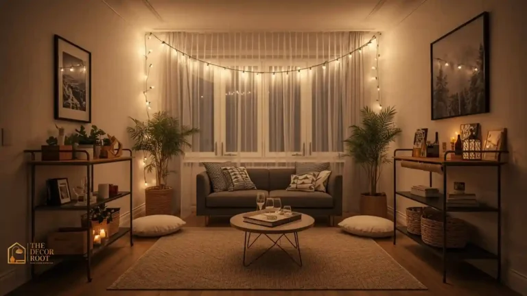
8. Warm Dimmable String Lights Throughout
Beyond the tree, running a single strand of warm, dimmable string lights along a mantel, bookshelf, or window frame extends the calming, candlelight-adjacent lighting effect into the rest of the room rather than concentrating it in one spot. A dimmer function matters specifically because it lets you lower the light intensity in the evening, when a bright, high-lumen light source can feel jarring rather than cozy, without needing to turn any lights off entirely.
EDITOR’S PICK
🛒Warm Dimmable String Lights Throughout
A 33-foot dimmable strand covers a mantel, window, and bookshelf from a single box.
(paid link)
9. Blush and Dusty Rose as a Red Alternative
If traditional bright red feels too stimulating but you still want a warm accent color, blush or dusty rose offers a much lower-saturation alternative that still reads as warm and celebratory. Use it sparingly in a single throw pillow, a few ornaments, or ribbon, since even a muted pink can start to feel busy in large quantities; the goal is a gentle warm note, not a full color swap from green to pink.
EDITOR’S PICK
🛒Blush and Dusty Rose as a Red Alternative
A few blush ornaments swap in for red without needing to rebuy the whole ornament set.
(paid link)
10. Natural Wood Tones as a Neutral Base
Unfinished or lightly stained natural wood, in ornaments, tray styling, or furniture, functions as a visual “resting point” for the eye between more saturated colors elsewhere in the room. Color psychology research on biophilic design consistently finds that natural material tones, including wood grain, register as calming largely because they don’t compete for attention the way a solid, uniform color does, giving the eye somewhere neutral to land.
EDITOR’S PICK
🛒Natural Wood Tones as a Neutral Base
A set of unfinished wood ornaments gives the eye a resting point between busier colors.
(paid link)
11. Limiting Red to a Single Accent Color
If red is non-negotiable for your holiday palette, use it as a single, small, repeated accent rather than a dominant color- one ornament color, a ribbon, or a single ceramic piece- rather than red walls, red stockings, and red wrapping paper all at once. Red is the most visually stimulating color on the spectrum in terms of perceived arousal, and concentrating it into a small, deliberate dose rather than spreading it broadly keeps its energy from overwhelming an otherwise calm palette.
EDITOR’S PICK
🛒Limiting Red to a Single Accent Color
One ribbon roll in red is often all this particular idea actually requires.
(paid link)
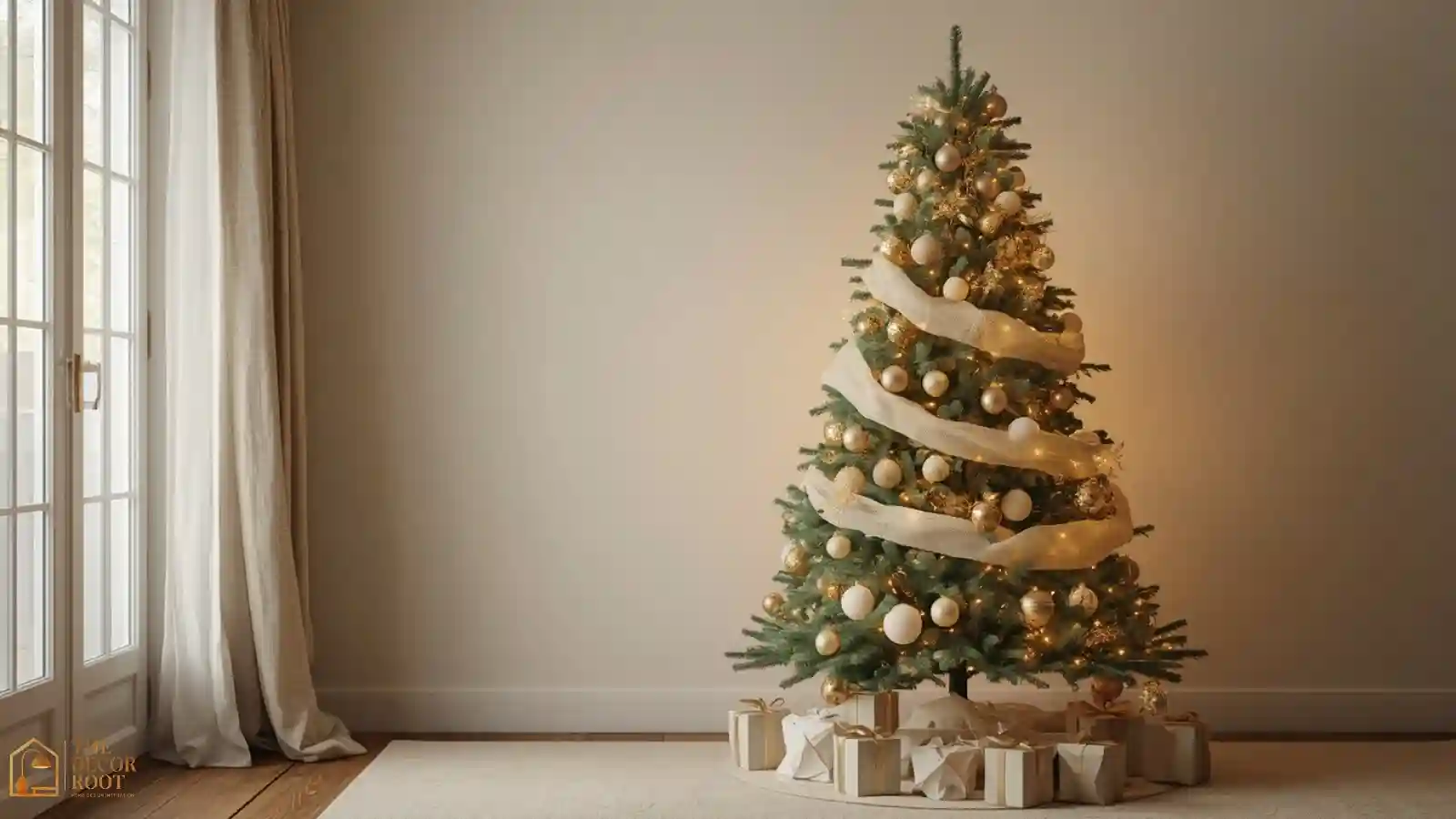
12. Cream and Off-White Tree Base
Swapping a traditional bright white tree skirt for a cream or oatmeal-toned one softens the visual anchor point at the base of the tree, where light and color tend to pool and draw the eye. This small swap works especially well paired with the warm gold and sage accents elsewhere on this list, since it keeps every “neutral” element in the room in the same warm-toned family rather than mixing cool white with warm gold, which can read as slightly mismatched.
EDITOR’S PICK
🛒Cream and Off-White Tree Base
A cream tree skirt is one of the least expensive single swaps on this whole list.
(paid link)
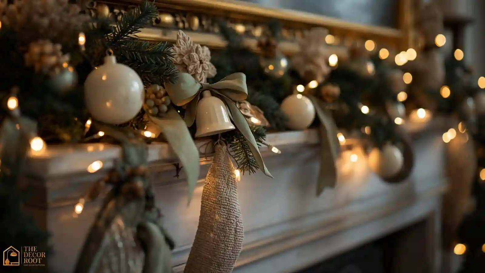
Cream, sage, and warm light replace bright red and gold for a calmer mantel display
13. Cream Ceramic Ornaments for Texture Without Color
A set of cream or off-white ceramic ornaments, in simple shapes like bells, stars, or spheres, adds texture and dimension to a tree without introducing any additional hue to the overall palette. This is particularly useful for filling in visual gaps on a tree that already has enough color; cream ceramic pieces let you add volume and interest purely through shape and texture rather than another competing color.
EDITOR’S PICK
🛒Cream Ceramic Ornaments for Texture Without Color
A set of 8 cream bell ornaments fills tree gaps without adding a single new color.
(paid link)
14. Warm-Toned Candlelight Over Overhead Lighting
Wherever possible during evening hours, favor candlelight (real or flameless) and warm lamp lighting over bright overhead fixtures. Overhead lighting, especially at a cooler color temperature, tends to flatten a room and increase perceived brightness and stimulation, while lower, warmer light sources concentrated at seating height create the kind of ambient, layered lighting that color psychology research consistently associates with relaxation and lower reported stress during evening hours.
EDITOR’S PICK
🛒Warm-Toned Candlelight Over Overhead Lighting
A set of warm-toned bulbs for existing lamps costs far less than new light fixtures.
(paid link)
15. Sage and Cream Wrapping Paper
Extend the calming palette to gift wrapping by choosing sage green or cream paper with a simple, minimal pattern, or no pattern at all, rather than the traditional bright red-and-gold foil papers common in stores. A stack of gifts wrapped this way under the tree becomes part of the room’s calm visual field rather than a bright, high-contrast focal point competing with everything else you’ve carefully toned down elsewhere.
EDITOR’S PICK
🛒Sage and Cream Wrapping Paper
A roll of unpatterned cream paper works for every gift under the tree, no matching required.
(paid link)
16. Muted Plaid Instead of Bright Buffalo Check
If plaid is part of your holiday aesthetic, a muted, tonal plaid in sage, cream, and soft brown reads as calmer than the classic high-contrast black-and-red buffalo check. The pattern itself still carries a cozy, seasonal association, but the color relationship between the plaid’s threads matters just as much as the individual colors; low-contrast plaid registers as textural and warm, while high-contrast plaid registers as visually loud even from across a room.
EDITOR’S PICK
🛒Muted Plaid Instead of Bright Buffalo Check
A tonal plaid throw swaps in for high-contrast buffalo check without losing the pattern entirely.
(paid link)
17. Single Statement Color in the Entryway Only
Rather than spreading a bold color like deep red or emerald throughout the entire house, concentrate it in a single, contained space like the entryway or front door wreath. This gives guests a genuine, memorable “wow” moment on arrival without requiring the rest of the home’s living spaces to carry that same visual intensity, effectively using color psychology’s contrast principle strategically rather than applying it uniformly.
EDITOR’S PICK
🛒Single Statement Color in the Entryway Only
A single bold wreath is often the only piece this particular idea calls for.
(paid link)
18. Dusty Blue Table Linens for Dinner
For a holiday meal, a dusty blue linen tablecloth paired with cream napkins and natural wood or cream-toned dishware creates a calming table setting that still feels distinctly wintery and seasonal. This palette also photographs particularly well under warm candlelight, since the cooler blue linen and warm gold candlelight create a gentle, balanced contrast rather than the high-intensity red-and-gold combination typical of a traditional holiday table.
EDITOR’S PICK
🛒Dusty Blue Table Linens for Dinner
A 60×120 linen cloth fits most holiday tables without needing a custom size ordered.
(paid link)
19. Avoiding High-Contrast Black and White Accents
Stark black-and-white patterns, buffalo check, stripes, or checkerboard prints register as visually high-energy due to the extreme contrast between the two tones, regardless of the pattern’s seasonal association. If black-and-white decor is already part of your year-round aesthetic, consider swapping it for softer charcoal-and-cream versions of the same pattern during the holiday season specifically, keeping the graphic quality while lowering the overall visual intensity.
EDITOR’S PICK
🛒Avoiding High-Contrast Black and White Accents
A charcoal-and-cream version of an existing pattern is often a same-brand swap away.
(paid link)
20. Grouping Similar Tones Rather Than Scattering Accents
When placing ornaments, candles, or small decor objects around a room, group pieces of similar tone together rather than scattering a little bit of every color into every corner. A cluster of cream and gold candles on one shelf, paired with a cluster of sage and green pieces on another, reads as organized and restful, while the same items scattered individually throughout the room create a busier, more fragmented visual field even with the same items.
EDITOR’S PICK
🛒Grouping Similar Tones Rather Than Scattering Accents
This is a rearranging step using decor already on hand, not a new purchase.
(paid link)
21. Soft Lavender-Gray as a Winter Accent
An unexpected but genuinely calming choice, a small amount of soft lavender-gray, in a throw pillow or a few ornaments, introduces a cool, quiet tone associated with rest and lowered stimulation in color psychology research. It reads as unmistakably wintery without leaning on the more common blue or silver, giving a Christmas palette a slightly unexpected, sophisticated edge while still supporting the room’s overall calming intent.
EDITOR’S PICK
🛒Soft Lavender-Gray as a Winter Accent
A single lavender-gray pillow adds this tone without a full room color change.
(paid link)
22. Dimming Everything by 20 Percent Before Guests Arrive
The simplest, least decor-dependent idea on this list: before guests arrive for an evening gathering, walk through and dim every light source in the main living space by roughly 20 percent from your everyday setting. This single lighting adjustment does more to shift a room’s perceived calm than almost any color swap on this list, since light intensity and color temperature together account for a large share of how “loud” or “quiet” a space feels regardless of the actual colors used.
EDITOR’S PICK
🛒Dimming Everything by 20 Percent Before Guests Arrive
A plug-in dimmer switch is a one-time, low-cost way to control this room-wide.
(paid link)
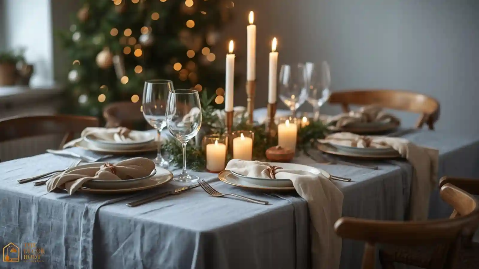
A dusty blue and cream table setting keeps a holiday dinner calming instead of visually loud
If the living room still feels a touch busier than you’d like once these swaps are in, our 20 Neutral Christmas Living Room Ideas That Still Feel Festive guide walks through the same restrained approach room-wide, and for guests arriving at the front door, 22 Christmas Entryway Ideas That Welcome Guests shows how to apply this same calming palette to the very first space people see. When it’s time to set the table, 23 Christmas Table Setting Ideas That Aren’t Fussy carries the same low-stimulation approach straight through to dinner.
Quick Action Plan
- This weekend, make the three changes with the biggest psychological payoff: swap any bright white bulbs for warm dimmable lights, replace one high-saturation red item with a sage green or dusty blue equivalent, and physically count and reduce the colors competing in your main living space to three or fewer.
- These three moves cost little to nothing if you’re just rearranging existing decor, and they shift the room’s felt temperature from “loud holiday display” to a genuinely calmer Christmas home almost immediately.
Frequently Asked Questions
Conclusion
A calmer Christmas home isn’t about doing less; it’s about choosing more deliberately where color intensity, light temperature, and visual complexity show up in a room. Swapping saturated red and green for sage, cream, dusty blue, and warm gold keeps every seasonal cue intact while removing the visual noise that makes so many holiday rooms feel more stressful than cozy by the second week of December. Start with lighting since it affects the entire room’s mood instantly, then work through the color swaps room by room as time allows. By the time the season’s in full swing, the house will feel like a place to actually relax in, not just decorate.
Save this post to your Pinterest calming Christmas board and come back to it when you’re ready to build your most beautiful, most peaceful holiday home yet!